Unlock a world of possibilities! Login now and discover the exclusive benefits awaiting you.
Data Integration & Quality
Forums for Qlik Data Integration solutions. Ask questions, join discussions, find solutions, and access documentation and resources
Explore Qlik Gallery
Qlik Gallery is meant to encourage Qlikkies everywhere to share their progress – from a first Qlik app – to a favorite Qlik app – and everything in-between.
About Qlik Community
Get started on Qlik Community, find How-To documents, and join general non-product related discussions.
Qlik Resources
Direct links to other resources within the Qlik ecosystem. We suggest you bookmark this page.
Qlik Academic Program
Qlik gives qualified university students, educators, and researchers free Qlik software and resources to prepare students for the data-driven workplace.
Recent Blog Posts
-
Release Notes > Product Filter
Hello Qlik Community, An issue has been identified with the ‘Product’ filter on the Release Notes page. The vendor is actively working on a fix. Until... Show MoreHello Qlik Community,
An issue has been identified with the ‘Product’ filter on the Release Notes page. The vendor is actively working on a fix. Until the issue is resolved, we have temporarily removed the ‘Product’ filter.
In the meantime, please use the ‘Release’ filter to narrow down the list.
We appreciate your patience as we work through the issue with the vendor. Please let us know if you have any questions or need any assistance finding a specific release.
Have a great weekend!
Your Qlik Community Admins,
Melissa, Sue, Jamie and Nicole
@Melissa_Potvin @Sue_Macaluso @Jamie_Gregory @nicole_ulloa
-
Gaining Perspective with Pivot Tables
Pivot Table Update In previous blogs, I wrote on several visualizations throughout Qlik Sense, and our journey continues today. While in a previous... Show MorePivot Table Update
In previous blogs, I wrote on several visualizations throughout Qlik Sense, and our journey continues today. While in a previous blog we covered Buttons, Tables and KPIs, which can be found here, today we are going to look at a relative to the Table chart, Pivot Tables. In this blog we will be covering what puts the pivot in Pivot Tables, differences between Tables and Pivot Tables, and finally see how we can put Pivot Tables in action for your data.
What are Pivots? How are they different from Tables?
As we covered in my previous blog, Tables are a wonderful tool for visualizing your data, their simplistic nature allowing users to visualize a wide range of data easily. Tables are a wonderful tool for displaying and interacting with your raw data.
Pivot Tables provide another level of flexibility, offering users the ability to reorganize, or pivot, your data dynamically. But what does ‘Pivot’ mean? In Pivot Table, Pivot means users can interchange Dimensions to either side. In our chart, our first layer is the Year, with Product Type and Product Sub Group under all on the same side. With Pivot Tables, we can reorder our Dimensions, changing the focus of our chart.With a Pivot Table, users can drag a Dimension from one side, to the other, giving a different perspective of their data.
In the above example we have moved the Providing a Row and Column interaction between the Product Type and the Year, as opposed to a Column and Column collapse as before.
When and how should I use Pivot Tables?As said above, Pivot Tables are wonderful for getting a different perspective on your data. When working with Pivot Tables, remember their strengths are a change in perspective and organization. Below we have both a Table and Pivot Table with the exact same data shared between them, with the same Measures and Dimensions.
Both Table and Pivot Table visualizations serve a purpose. The Table display all of the data, all of the time, which can be useful in its own circumstances. The Pivot Tables shows a collapsed view, allowing users dynamically choose which data is shown to them. If we oversaw ordering for this company, we could quickly see which Product Type had the most Sales, Cost and Margins.
In our Pivot Table, we could drill down to see which Product Sub Groups are the highest in the Baking Goods Type. Drilling further, we can see the metrics for each year as well.
Perhaps the comparison between years is important to which products we will be ordering more of in the future. Using Pivot Tables, we can quickly ‘Pivot’ the Year Dimension to the other side of the chart to make comparison easier.
Now our chart has all three years on display, making it easy to compare the Sales, Cost and Margins of each year against each other. Additionally, we can move the Product Sub Group to the other side, to get views of each year, and the Sales, Cost and Margins of each Sub Group as well.
Again, the keys to the use of a Pivot Table are their ability to organize and their perspective changes, allowing you to view and use your data how you would like.
Conclusion
As you can see Pivot Tables by their very nature are extremely dynamic and flexible. How could you use Pivot Tables to visualize your data more effectively? Do you have any revelations that you’ve made because of Pivot Tables? If so, tell the community about it in the comments section below! -
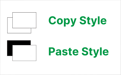
Copy & Paste Style
There have been new Qlik Sense features the past few months that I was excited to see. One of my favorites, which I am sure you are aware of, is the l... Show MoreThere have been new Qlik Sense features the past few months that I was excited to see. One of my favorites, which I am sure you are aware of, is the layout container. If you have not heard about it, check out Michael’s blog post here. Another favorite of mine is the copy and paste style feature which allows developers to copy and paste styles from one visualization to another. With all the styling options available in visualizations, being able to copy and paste styles saves time and eliminates the need to go into the styling properties of each visualization and set all the styling options you would like to use.
Some of the latest charts that have been upgraded to the new styling property panel are the Grid, Funnel and Sankey, giving users the ability to customize the title, subtitle, footnote, and background of a chart as well as the style the axes, labels, legends, and values in a visualization. Borders and shadows can be added to these visualizations as well.
The Filter Pane now has font styling for the title, subtitle, footnote, and header as well as font header and content styling. Like the charts above, borders and shadows can be added as well. Developers can change the background color or use an image in the background and control the color of the selected state. Here are a few examples.
With all these styling options, it is awesome that developers can now copy and paste the style from one visualization to another. If you remember the QlikView days, you know how valuable this feature is. Assume I have an app with a theme applied and have made some styling changes to the Margin KPI (see image below). If I want to apply the same styling changes to the Margin %, I have two options. One option is to open the styling properties of the Margin % KPI and make the same changes to the background color, border color and shadowing.
The second option and the easiest option is to right click on the Margin KPI while in Edit mode, click on the three dots (…) and select Copy style.
Then right click on the Margin % KPI, click on the three dots (…) and select Paste style.
That is a lot easier than styling the KPI manually, especially if there are multiple visualizations to update.
There are a few limitations to using the copy and paste style - you cannot copy and paste the style in a map or a master visualization. New styling properties for visualizations are being add all the time, giving users many options to style and make their app stand out. The copy and paste functionality is a great addition to Qlik Sense and makes designing and styling apps easier.
Thanks,
Jennell
-
Connector Factory – April 2024 releases
Qlik Data Integration New SAP ODP Connector We are continuing to expand our connectivity to the SAP Operational Data Provisioning (ODP) framework. L... Show MoreQlik Data Integration
New SAP ODP Connector
We are continuing to expand our connectivity to the SAP Operational Data Provisioning (ODP) framework. Last November, we released an SAP ODP Connector for our Qlik Data Integration Client-Managed product. Last month we added an SAP ODP Connector for Qlik Cloud Analytics.
This month, we’ve introduced an SAP ODP Connector for Qlik Cloud Data Integration.
All of these connectors provide many benefits to SAP users vs. previous, existing SAP connectors including:
- Simplified access to CDS Views and HANA Views
- Access to Extractors, without the use of standalone network service
- Usable with an SAP Runtime license
- Does not require any separate Qlik SAP Connector license
- No need for an SAP transport installation, particularly useful with an SAP managed cloud system
- Up to 25% faster performance vs. Qlik’s existing SAP connectors
Learn more about the latest SAP ODP connector here.
Additional SAP HANA Support
In addition to the SAP HANA connector, Qlik Cloud Data Integration now includes support for SAP HANA as the backend database for the SAP Application connector. This release also provides Add Business Group Management capabilities. Business groups allow SAP users to create groups of tables that are recognized by the Data Movement gateway, providing additional context when selecting data artifacts to be replicated.
Learn more about the SAP Application connector
Qlik Data Analytics
Access SAP ODP source via Direct Access gateway
The Qlik Data Gateway - Direct Access eliminates the need to open inbound firewall ports by operating behind your organization’s firewall. It allows Qlik Sense SaaS applications to securely access behind-the-firewall data, over a strictly outbound, encrypted, and mutually authenticated connection.
This month we released a new version of the gateway that includes the SAP ODP connector as an additional option to access an on-premises SAP system.
You can learn more about the Gateway here.
Qlik Application Automation
New Qlik Application Automation connectors for Qlik Cloud Government
Qlik Cloud Government now supports the following Qlik Application Automation connectors:
- Amazon SNS
- GitHub (including GitHub Government)
-
Recipe for a 4-4-5 Calendar
The 4-4-5 calendar is a week-based calendar, where the year is divided into 4 quarters, each with 3 months. The first month has 4 weeks, the second ha... Show MoreThe 4-4-5 calendar is a week-based calendar, where the year is divided into 4 quarters, each with 3 months. The first month has 4 weeks, the second has 4 weeks, and the last has 5 weeks. Occasionally the 12th month has an additional week.
However, these quarters and months have nothing in common with the standard months. First, they are not in sync with the Gregorian calendar. The 4-4-5 year can for example start in the last week of August. Further, the 4-4-5 months do not have the same lengths as the Gregorian months.
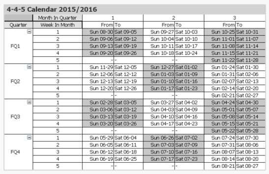
One major advantage over a regular calendar is that the end date of the period is always the same day of the week, which is useful in planning. Similarly, the beginning of the year, the quarters and the months are all on the same day of the week. This means that different years start on different dates. In the table below this is clearly visible. The end of the year is blue and the beginning of the new year is green.
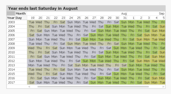
The definition of when the year starts is often described in a phrase like “the year ends on the last Saturday of August”. But this is the same as saying that
- All weeks start on Sundays.
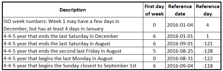
- September 1st always belongs to week 1. This is the Reference Date.
These two bullets can be expressed as integer parameters, which can be used when generating the calendar in the Qlik script. For the first day of the week, 0 is used to denote Monday and 6 is used to denote Sunday. Further, the number of days between the reference date and the Dec 31st is used to define the beginning of the year.
Finding the reference day may sometimes take some thinking. To help you, I have compiled some examples:
Once the two parameters have been defined, a calendar can be created using e.g. the script that is found on Calendars. This script also creates some other calendars, e.g. 4-5-4, 5-4-4 and Broadcast calendars.
The logic in the script has many steps, but is still fairly straightforward. For each date, the script needs to
- Find the week start of the date
- Use the week start to find the reference date of the input date. Note that the relevant reference date sometimes is after the date itself.
- Use the reference date to find which fiscal year the date belongs to. The start date of the year is also calculated.
- Use the start of the year to calculate the day number within the year
- Finally, the day number of the year can be used to calculate the remaining fields.
Summary: It is possible to create a script that generates a correct 4-4-5 calendar. Don’t hesitate to download the script example and modify it, if you need a 4-4-5 calendar.
Further reading related to this topic:

-
Talend Login Credentials Moving to Qlik Unified Login This May
As part of Qlik’s ongoing effort to unify our presence with Talend offerings, we are moving Talend login credentials to use the same authentication me... Show MoreAs part of Qlik’s ongoing effort to unify our presence with Talend offerings, we are moving Talend login credentials to use the same authentication mechanism as other Qlik web properties. This will improve our overall customer experience and provide Talend customers greater access to data integration, quality, and analytics capabilities.
Starting May 14, 2024, the login mechanism for Talend Cloud customers will change to use the Qlik Account authentication infrastructure. This is not a forced migration to using Qlik Cloud applications or services; no other infrastructure is changing. Existing Talend Cloud login credentials will switch to a new authentication provider.Review our most frequently asked questions below:
What is Qlik Account?
Qlik Account helps users access multiple Qlik services using one set of credentials. Once registered Qlik customers and partners can access their Qlik Cloud applications, Talend Cloud, Support Portal, and the Downloads page. Users can also access Qlik Community and Qlik Continuous Classroom (QCC). Additionally, partners can use their Qlik Account to access the Partner Portal.
When will the conversion take place?
The migration timing depends on your geographic region as follows
- May 14th – Asia Pacific, including Australia and Japan
- May 16th – Europe
- May 21st – Americas
Do I need to take any proactive action?
No, but you can create a Qlik Account before the conversion dates.
Note: You must use the email address listed in your Talend Cloud profile when creating your Qlik Account. Do not use your Login Name.
What happens during the conversion process?The following video explains the process of moving to a Qlik Account, referred to as Qlik ID.
Can I create and use a Qlik Account before May 14th?
Yes. Follow this link for instructions on creating your Qlik Account.
Note: If you create a Qlik Account before May 14th, then you must use the same email address listed in your Talend Cloud profile (see Figure 1.) and not your Login Name.
Figure 1. Talend Cloud Profile
What if I have multiple Talend Cloud tenants?
A web page displaying your currently active Qlik Cloud and Talend Cloud tenants will be displayed after a successful login. You can then navigate to a specific tenant by clicking on the appropriate tile (see Figure 2.)
Figure 2. Tenant Selection Page
What if I already have a Qlik Account?
Great! No further action is required.
What if I use single sign-on (SSO) to log in?
Single sign-on functionality is not changing, and you do not have to switch authentication providers.
Do I need to recreate any bookmarks?
No. Your existing bookmarked pages should redirect to use the new login mechanism.
What is the Qlik Account login page URL?
To access the new Qlik Cloud login page visit https://login.qlik.com
Who do I contact if I experience login difficulties?
If you experience login difficulties, then contact us at the customercare@talend.com
If you have additional questions, comment below!
-
Direct Query now available in Qlik Sense SaaS!
Differing from our industry leading analytics engine, Direct Query generates SQL queries on the fly against the source and executes the query and comp... Show MoreDiffering from our industry leading analytics engine, Direct Query generates SQL queries on the fly against the source and executes the query and compute at the database level. From big data to near real time use cases, Direct Query empowers users of any level to easily explore and analyze the most recent data right from the database, increasing the speed to insight and decision-making.
Direct Query complements our best-in-class analytics engine and extends the range of consumption techniques for analyzing data from cloud databases. The first connector rolling out for Direct Query will be for Snowflake with Databricks next on the roadmap and others planned, so stay tuned.
Can't see this video? - View it on the Qlik Video Page - Direct Query Part 1 - Overview and Operation
Can't see this video? - View it on the Qlik Video Page - Direct Query Part 2 - Building Hybrid Analytic Solutions
How does Direct Query work?
Direct Query can be activated at the database connection level. So, using Snowflake as the example, when building a new application and starting with a data connection, you will have the option to use Direct Query versus our analytics engine.
The user can then select certain components of the source database –in the Snowflake connector users will see the options for role, database, and schema. Authentication for Direct Query is governed at the database level so users will only have access to what is granted from the source database.
The user can then select a single view or multiple tables with the option of choosing the type of relationship between the data sets like full outer join or inner join.
Once the relation is designated, an import live statement is inserted into the script in the load editor on the back-end and the visualizations can begin being built on the front-end. Since this is a SQL pushdown tool, users will need to use the function library of the underlying database. As of this blog, we will support the major 5 aggregations of sum, avg, min, max, and count. Also, some simple forms of set analysis will be available for filtering within measures of charts.
After the charts and objects have been built, users can filter and interact with data in real time as Direct Query generates SQL on the fly and pushes the query and compute down to the source database. Keep in mind that every selection or filter within the app from a user, results in a query pushed down to the database and compute.
Direct Query will also feature a seamless transition into our analytics engine for advanced interactivity and the full suite of capabilities. Check out Part 2 ‘Building Hybrid Solutions’ from the videos below.
To learn more, check out these two videos on Direct Query:
Part 1: Overview and Operation
Part 2: Building Hybrid Analytics Solutions with On Demand App Generation (ODAG)
To learn more about how Qlik and Snowflake together can optimize your investment into data and analytics, read our corporate blog here.
Join us for the webinar series, Do More with Qlik, on August 24th where our very talented Mike Tarallo will be showcasing Direct Query for Snowflake.
-

-
Creating a Collapsible Filter Panel
In my last blog / video. I showed you how to easily create visual buttons to apply selections and change their visual selection state so they can appe... Show MoreIn my last blog / video. I showed you how to easily create visual buttons to apply selections and change their visual selection state so they can appear enabled or disabled (selected, not-selected). In this video I'll show you how to setup a filter panel using buttons and the layout container to create a simple collapsible filter panel that is both esthetic and functional while also providing real estate for your dashboard objects.
Resources:
- Sample attached
- More Tips and Tricks
-
Updates to Qlik Cloud Security Roles
On April 16th, 2024, Qlik is launching a highly anticipated capability: custom security roles. What do custom security roles do? Custom security roles... Show MoreOn April 16th, 2024, Qlik is launching a highly anticipated capability: custom security roles.
What do custom security roles do?
Custom security roles introduce fine control of data export and access permissions within Qlik apps. This allows you to tailor permissions to your specific needs, enhancing data security and compliance.
The first delivery on April 16th includes the capability to control who can export content. Additional capabilities will be added soon after, such as who can create data connections, reports, and similar.
What does this mean for me?
As part of this update, the existing "has restricted view" space role will gain the ability to export data to Excel. This adjustment is in line with Qlik's capacity-based pricing model, ensuring basic users have essential tools.
If you do not wish for users with the "has restricted view" space role to be able to export data, you will need to create a custom role on the release date to maintain the desired restrictions.
Stay tuned for more information and resources leading up to the April 16th launch. We are excited about these enhancements and the value they will bring to your data management and security efforts within Qlik.
Thank you for choosing Qlik,
Qlik Support -
QlikView - New Security Patches Available Now
Update 21st of March 16:00 CET: published CVE numberUpdate 27th of March 10:45 CET: added FAQ Hello Qlik Users, A security issue in QlikView has been ... Show MoreUpdate 21st of March 16:00 CET: published CVE number
Update 27th of March 10:45 CET: added FAQHello Qlik Users,
A security issue in QlikView has been identified and patches have been made available. Details can be found in the Security Bulletin High Severity Security fix for QlikView (CVE-2024-29863).
Today, 20th of March 2024, we have released two service releases across the latest versions of QlikView to patch the reported issue. All versions of QlikView prior to and including the releases below are impacted:
- QlikView May 2023 SR1 (12.80.20100)
- QlikView May 2022 SR2 (12.70.20200)
Call to Action
As no workarounds can be provided, Customers should upgrade QlikView to one of the following versions that contain the fix:
- QlikView May 2023 SR2 (12.80.20200)
- QlikView May 2022 SR3 (12.70.20300)
This issue only impacts QlikView. Other Qlik data analytics products including Qlik Cloud and Qlik Sense Enterprise on Windows are not impacted.
Additional Details
- All Qlik software can be downloaded from our official Qlik Download page (customer login required). Follow best practices when upgrading QlikView.
- Qlik provides patches for major releases until the next Initial or Service Release is generally available. See Release Management Policy for Qlik Software.
- Notwithstanding, additional patches for earlier releases may be made available at Qlik’s discretion.
- The information in this post and Security Bulletin High Severity Security fix for QlikView (CVE-2024-29863) is disclosed in accordance with our published Security and Vulnerability Policy.
The Security Notice label is used to notify customers about security patches and upgrades that require a customer’s action. Please subscribe to the ‘Security Notice’ label to be notified of future updates.Frequently Asked Questions
Q: Is the vulnerability present in the QlikView Plugin or other QlikView products?
A: The vulnerability is related to the MSI files on disk.Q: Will deleting the MSI files mitigate the issue?
A: Qlik does not consider removing the MSI files a complete workaround. A server user can restore them. -
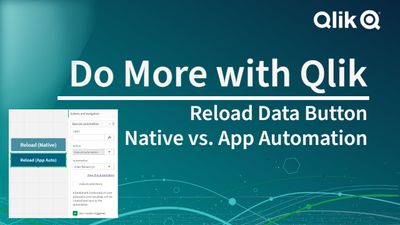
Button + Reload Data or Button + Execute App Automation - which do I use?
When creating Qlik Sense Apps - you can use a Button object and configure a variety of actions or navigation settings to it. One of those actions is ... Show MoreWhen creating Qlik Sense Apps - you can use a Button object and configure a variety of actions or navigation settings to it. One of those actions is the ability to Reload Data for the app you are in. This comes in handy during development, but also can be used where users require new data on demand.
However, when using the Reload Data action - other users may not be able to perform the reload action as they don't have ownership of the app or reload rights to the app / space the app is developed in. Here is an approach when using Qlik Cloud and Qlik Application Automation that can workaround that. This approach will also work for any App Automation that you want any user to execute.
-
New Set Analysis syntax
Set analysis is a way to define an aggregation scope different from current selection. Think of it as a way to define a conditional aggregation. The c... Show MoreSet analysis is a way to define an aggregation scope different from current selection. Think of it as a way to define a conditional aggregation. The condition – or filter – is written inside the aggregation function. For example, the following will sum the amounts pertaining to 2021:
Sum({<Year={2021}>} Amount)
This syntax however has a couple of drawbacks: First, it is not easy to combine a master measure with different set expressions, since the set expression is hard-coded inside the master measure. Secondly, if you have an expression with multiple aggregations, you need to write the same set expression in every aggregation function.
Therefore, we introduce an additional position for set expressions: They can now be written outside the aggregation function and will then affect all subsequent aggregations. This means that the below expression is allowed:
{<Year={2021}>} Sum(Amount) / Count(distinct Customer)
For master measures, this change will allow a very powerful re-usability: You can now add set expressions to tweak existing master measures:
{<Year={2021}>} [Master Measure]
Lexical scoping
The outer set expression will affect the entire expression, unless it is enclosed in round brackets. If so, the brackets define the lexical scope. For example, in the following expression, the set expression will only affect the aggregations inside the brackets - the Avg() call will not be affected.
( {<Year={2021}>} Sum(Amount) / Count(distinct Customer) ) – Avg(CustomerSales)
Position
The set expression must be placed in the beginning of the lexical scope.
Context and inheritance
Aggregation functions that lack set expression, will inherit the context from the outside: In earlier versions the context was always defined by the current selection. Now we have added the possibility of having the context defined by a set expression. So, now “context” means current selection or an outer set expression.
Inner set expression
If an aggregation function already contains a set expression, this will be merged with the context. The same merging rules as today will apply:
- An inner set expression with a set identifier will NOT inherit from the context. It will inherit the selection from the set identifier instead.
- An inner set expression that lacks set identifier – it has only a set modifier – will inherit from the context.
- How the merge is made depends on the set assignment for the field; whether it is made with an equals sign “=” or with an implicit set operator, e.g. “+=”. The logic is identical to how current selection is merged with a set expression.
Examples:
{<OuterSet>} Sum( {<InnerSet>} Field )
The OuterSet will be inherited into the InnerSet, since the inner set lacks set identifier.{<OuterSet>} Sum( {$<InnerSet>} Field )
The OuterSet will not be inherited into the InnerSet, since the inner set expression contains a set identifier.Aggr()
The set expression of the outer aggregation will never be inherited into the inner aggregation. But a set expression outside the outer aggregation will be inherited into both.
Examples:
Sum({<Set1>} Aggr(Count({<Set2>} Field )))
The Set1 will not be inherited into Set2.{<OuterSet>} Sum({<Set1>} Aggr(Count({<Set2>} Field )))
The OuterSet will be inherited into both Set1 and Set2.Summary
Nothing changes for existing set expressions – they will continue to work. But with this additional syntax we hope to simplify your work and your expressions and allow you to re-use your master measures more effectively.
This change affects all Qlik Sense editions from the August 2022 release. It will also be included in the next major QlikView release, planned for late spring 2023.
See more on
https://community.qlik.com/t5/Qlik-Design-Blog/A-Primer-on-Set-Analysis/ba-p/1468344HIC
-
Entitlement Analyzer for Qlik Sense Enterprise SaaS (Cloud only)
We are happy to share with you the new Entitlement Analyzer for Qlik Sense Enterprise SaaS! This application will enable you to answer questions like:... Show MoreWe are happy to share with you the new Entitlement Analyzer for Qlik Sense Enterprise SaaS! This application will enable you to answer questions like:
- How can I track the usage of my Tenant over time? How are my entitled users using the Tenant?
- How can I better understand the usage of Analyzer Capacity vs. Analyzer & Professional Entitlements?
The Entitlement Analyzer app provides insights on:
- Entitlement usage overview across the Tenant
- Analyzer Capacity – Detailed usage data and a predication if you have enough
- How users are using the system and if they have the right Entitlement assigned to them
- Which Apps are used the most by using the NEW "App consumption overview" sheet
- And much more!
The Entitlement Analyzer uses a new API Endpoint to fetch all the required data and will store the history in QVD files to enable even better Analytics over time.
A few things to note:
- This app is provided as-is and is not supported by Qlik Support.
- It is recommended to always use the latest app.
- Information is not collected by Qlik when using this app.
The app as well as the configuration guide are available via GitHub, linked below.
- QVF: https://github.com/qlik-oss/qlik-cloud-entitlement-analyzer/releases/latest/download/entitlement-analyzer.qvf
- Release Notes: https://github.com/qlik-oss/qlik-cloud-entitlement-analyzer/releases/latest
- Installation Guide: https://github.com/qlik-oss/qlik-cloud-monitoring-apps/releases/latest/download/qlik-cloud-monitorin...
Any issues, questions, and enhancement requests should be opened on the Issues page within the app’s GitHub repository.
Be sure to subscribe to the Qlik Support Updates Blog by clicking the green Subscribe button to stay up to date with the latest Qlik Support announcements. Please give this post a like if you found it helpful!
Kind regards,
Qlik Platform Architects
Additional Resources:
Our other monitoring apps for Qlik Cloud can be found below.
- App Analyzer
- Reload Analyzer
- Access Evaluator
- OEM Dashboard (for OEM Partners and multi-cloud tenants)
-
Welcome back Javier Leon - Qlik Educator Ambassador for 2024!
Since we last spoke to Javier for our Academic Program blog he has successfully completed his PHD in data science and is now teaching at 5 universitie... Show MoreSince we last spoke to Javier for our Academic Program blog he has successfully completed his PHD in data science and is now teaching at 5 universities! Javier is an adjunct professor at Saint Joseph's University, Villanova University, Drexel University, Rowan University and Southern New Hampshire University.
In 2024, Javier aims to leverage his knowledge in data science, business intelligence, analytics, and data visualization to enhance students' professional competencies and readiness. One of his aims as an educator is to bridge the gap between theoretical knowledge and practical application, so that students develop the necessary skills to excel in the data driven business landscape. He is already putting this into practice in his Data visualization class at Drexel University:
“In that class I am having students create projects that leverage the capabilities of Qlik…..My teaching is currently focusing on practical, hands-on projects that mirror real-world business challenges, encouraging students to apply Qlik's powerful analytics and visualization features to derive actionable insights. In one of the projects, the students must identify relevant data sets to tell a story about a movie that they like. To do this, they must ensure that the data they find meets the criteria for quality data. Next, they must tell a story about the movie: how much it grossed, how it performed versus movies in the same year, in the same genre, etc.”
One of Javers significant achievement from the past year has been his role in the creation of an Academy called Bright Future Schools of Professional Development, “we have an entire course dedicated to Qlik’s Essentials. The idea is to help students understand the basics of data visualization with a user-friendly software that will enable them to grow professionally.”
Javier believes that I the most important thing happening on at the moment is the AI revolution, “I think it will significantly reshape the landscape of analytics and higher education. …AI technologies like machine learning and deep learning are augmenting human capabilities by automating routine tasks, providing insights from large datasets, and enhancing decision-making with predictive analytics. And what is most important, we are barely scratching the surface of AI capabilities. We can augment ourselves as professors, students, and professionals with the use of AI.”
Javier believes that AI may revolutionize the way educators teach and students learn, “For instance, AI can personalize learning experiences, adapt to individual learning paces, and provide real-time feedback, thereby enhancing student engagement and outcomes. The demand in higher education is shifting towards graduates who are not only proficient in analytics but also in the application of AI and its subset, machine learning, within analytics.”
Javier decided to apply for his fourth year as an educator ambassador because of the knowledge sharing and networking that the program offers, “It is a great way to be surrounded by excellent professionals who are dedicated and passionate about teaching and helping students achieve their academic and professional goals. Also, to be recognized by Qlik, a leading company in BI, offers credibility in an ever-changing and competitive industry. This in turn, can be used to reach more students and help them in their data literacy journey. Aside from all that, I believe in Qlik’s Mission of getting the most value out of data by revealing hidden patterns and addressing today and tomorrow’s complex challenges in the industry.”
To learn more about the Academic Program go to qlik.com/academicprogram.
-
Traffic Accidents in Brazil
Traffic Accidents in Brazil Hyperscale This dashboard was developed with the aim of studying the new layout Container and design possibilities i... Show MoreTraffic Accidents in BrazilHyperscale This dashboard was developed with the aim of studying the new layout Container and design possibilities it offers. The data used originated from a survey of accidents on federal highways in Brazil.
Discoveries
Types of accidents most common on Brazilian highways, which highways are the most dangerous and require an action plan to reduce accidents, the times and days with the highest occurrence of accidents.
Impact
Mapping the most dangerous highways for a future action plan to reduce accidents, monitoring the most critical times on the roads.
Audience
Traffic enforcement agencies, municipalities, and states
Data and advanced analytics
Ease of visibility of Brazilian highways and comparison between states and highways.
-
Qlik Analytics connectors: Twitter connector to be updated
Update April 18th 2024: As of April 2024, the Twitter Connector will be permanently removed from Qlik Sense SaaS. The removal from Qlik Sense client-m... Show MoreUpdate April 18th 2024: As of April 2024, the Twitter Connector will be permanently removed from Qlik Sense SaaS. The removal from Qlik Sense client-managed is scheduled for the August 2024 release, and the removal from the standalone Qlik Web Connector is targeted for fall 2024.
There are currently no plans to introduce a new Twitter Connector, although this was previously the intention.Twitter has changed the structure for the available API access levels and removed broader access to analytics via Twitter API v1.1. Due to this change, the Qlik Sense connector for Twitter has recently stopped working. The Twitter API v2 is now required, but the current Qlik connector only supports API v1.1.
Additionally, Qlik has managed a common Twitter App for all users’ authentications, which with this change can no longer be used to support the requests made via the connector.
Qlik will introduce a new connector against the Twitter API v2. This new connector will support customer-managed Twitter Apps, allowing you to acquire the API access level specific to your needs and access the analytics data with your own account. Consequently, there will be no API access provided by Qlik.
Unfortunately, this means that the current connector for Twitter will be deprecated, and it will be removed from Qlik Cloud Analytics. It will also be removed from Qlik Sense Enterprise on Windows in the August 2023 release and the standalone Qlik Web Connectors package in December 2023.
You can find detailed information about the Twitter access levels and versions in the Getting started page in the Twitter developer portal. There is also a Step-by-step guide to making your first request to the new Twitter API v2, which explains how to manage and create a Project and connect an App within your Twitter account.
Thanks for choosing Qlik!
Qlik Global Support -
Welcome back Angelika Klidas - Qlik Educator Ambassador Class of 2024!
This week we would like to introduce Angelika Klidas, who happens to be a returning Educator Ambassador. We are excited to select Angelika as an Amba... Show MoreThis week we would like to introduce Angelika Klidas, who happens to be a returning Educator Ambassador. We are excited to select Angelika as an Ambassador for the 3rd year in a row due to her continued enthusiasm for Qlik’s Academic Program and her efforts in 2023.
Angelika’s journey with Qlik began in 2008 when she started out installing and managing a successful QlikView Competence Center as a team manager of the team for a Governmental Organization in the Netherlands. Since then, she has always been a huge Qlik Advocate in both her day job and her university teaching. Angelika works currently as an Advisor & Trainer and the Business Data Challengers and is responsible for the BDC Academy, sales and account management along with some innovative work! She also teaches Data and Analytics at the University of Applied Sciences in Amsterdam which is her part time role. She is a conceptual thinker who lives by the phrase “think big, act small, and scale fast” which she uses to inspire others to evolve in their use of data and analytics.
In 2022, Angelika began writing a book together with Qlik’s Chief Learning Officer Kevin Hanegan about Data Literacy. The book was formally launched on the 30th of November 2022 and is called “Data Literacy in Practice”. The book is available through Amazon.com and Packt.com.
Angelika applied to become a Educator Ambassador with the Qlik Academic Program as she is passionate about educating students in data analytics and championing the cause of Data & AI Literacy. Due to the change in situation in the field of education, she included new aspects in her teaching style which include setting up training materials “how to use Qlik Sense from an analysis perspective so that students know and understand the full power of Qlik Sense, using AHA Slides (to make the lectures more interactive) and the book “Data Literacy in Practice”. Her book is now also a mandatory book for the University. With the help of the techniques from the book and learning to work with Qlik Sense helps her students not only to analyze the data in a better manner but also how to help organizations form a data strategy, develop organizational KPI’s and build amazing dashboards & reports.
Angelika is proud of the fact that she is the Qlik Academic Program Ambassador and has included the Educator Ambassador badge, mentioned it on her resume and highlights it in her presentations! This year again she is presenting twice at Qlik Connect and is also a Panelist for around the topic ethical handling of data.
In Angelika’s words, “I love the power of grey, love the academic program and the great benefit that it gives to me and my students. My students can pursue their dreams when they would like to work in data and analytics .” She is excited about the fact that some of her students got a job in the data and analytics world, which is amazing! An interesting fact is that since 2008, 34% of her 295 students are working in the field of data and analytics. Her main goal for 2024 is to work on new training materials for Data & AI Literacy in Dutch and English. Angelika has developed several Generative AI trainings that help people (at school and in her commercial work field) to use the Gen AI tools, but also she trains them to question the outcome. Questioning the results, either from insights that we create or the results that we get from the Gen AI tools we use is mega important. Next to that Angelika has developed a “Serious Data Training” where she combines a the first basic concepts of Data & AI Literacy, a Data Escape Room and a session of reflecting on the soft skills that people need during the process of data informed decisions.
Angelika feels that more and more organizations are now emphasizing the importance of Data & AI Literacy. She loves to work with the four pillar system which should be the basis of every organizations journey towards “Active Intelligence” so they will be future ready!
In Angelika’s words, “I love the Qlik Academic Program, it helps the students in gaining analytics knowledge for my students. They can learn at their own pace and look for solutions through the learning platform, but also use the knowledge from the community and demos.qlik.com where they can find all kinds of cool solutions”
We are looking forward to working closely with Angelika during her tenure as an ambassador yet again and creating more links with Universities in the Netherlands.
For more information about our Ambassador Program, please visit: qlik.com/us/company/academic-program/ambassadors
-
The new Qlik Google Analytics 4 (GA4) Connector
Google's Universal Analytics will stop processing new hits on July 1st 2023 and makes room for Google Analytics 4. Continue loading your data using Ql... Show MoreGoogle's Universal Analytics will stop processing new hits on July 1st 2023 and makes room for Google Analytics 4.
Continue loading your data using Qlik's new GA4 connector, available for Qlik Cloud and Qlik Sense Enterprise on Windows as of today: Google Analytics 4 (Cloud) | Google Analytics 4 (on-premise)
The new Google Analytics 4 connector is also included in the Qlik Web Connector Standalone package: Google Analytics 4 (standalone)
Related Content and Relevant Sources:
[GA4] Introducing the next generation of Analytics, Google Analytics 4 | support.google
Prepare for the future with Google Analytics 4 | blog.google -
Complete your Qlik Nation challenges in Qlik Community
Transformational. Innovative. Powerful. These are just a few of the inspiring terms customers use to describe Qlik and our product suite. Customer fee... Show MoreTransformational. Innovative. Powerful. These are just a few of the inspiring terms customers use to describe Qlik and our product suite. Customer feedback and input are critical to Qlik’s success, and we regularly hear directly from our most active users through Qlik Nation, our gamified customer engagement hub.
Through interactive challenges and activities, Qlik Nation members connect, learn, and engage with Qlik and with each other. By completing challenges in the platform, members can receive early notification of new product features, boost knowledge through quality educational content, and have opportunities to influence the product roadmap. Qlik Nation also allows customers to demonstrate skills, network with peers, and amplify their personal brand. All while having fun and being rewarded!
And now, Qlik Nation members will be able to complete challenges while visiting Qlik Community. Current members will see a new carousel on the Qlik Community homepage inviting them to complete challenges, making it even easier for you to engage and earn points.
Customers are at the heart of everything we do, and Qlik Nation offers an exclusive experience for our most dedicated and passionate fans (Qlik Nation is a complementary platform to Qlik Community, which has open membership). What do our members say about their experience in Qlik Nation?
- “It’s a fantastic opportunity to link up with technologists and data enthusiasts across a wide array of industries to learn and promote the best use of the Qlik product suite.” – Howard Teall, Enterprise Architect, HSBC & Qlik Luminary
- “Qlik Nation brings together all the news and knowledge in one place, keeping me up to date with Qlik and the world of data & analytics” – Mark Little, Senior Business Intelligence Specialist, Mayborn Group
- “Qlik Nation has provided me with a platform to keep me motivated and try and do better with our analytics platform and capabilities. The community joins you with like-minded individuals to share and promote everything Qlik.” - Willem Jacobs, Head of Analytics, OneLogix
If you’re a Qlik end-user and want to learn more about how to join Qlik Nation, please email QlikNation@qlik.com. We’d love to hear from you!