Unlock a world of possibilities! Login now and discover the exclusive benefits awaiting you.
- Qlik Community
- :
- All Forums
- :
- QlikView App Dev
- :
- Re: Meaningfull sales information in bar graph
- Subscribe to RSS Feed
- Mark Topic as New
- Mark Topic as Read
- Float this Topic for Current User
- Bookmark
- Subscribe
- Mute
- Printer Friendly Page
- Mark as New
- Bookmark
- Subscribe
- Mute
- Subscribe to RSS Feed
- Permalink
- Report Inappropriate Content
Meaningfull sales information in bar graph
Hello everyone :-),
i'm relatively new to QlikView. I'm currently creating some dashboards and i'm not able to solve this by my own.
So a part of the data i'm importing from a sheet looks like this:
| ProductID | Sale Region 1 | Sale Region 2 | ID Sales Region 1 | ID Sales Region 2 |
|---|---|---|---|---|
ABC555 | XXXXX | BBBBB | 88888 | 33333 |
| ABC333 | BBBBB | XXXXX | 11111 | 88888 |
| ABC555 | BBBBB | CCCCC | 33333 | 11111 |
| ABC333 | CCCCC | BBBBB | 88888 | 11111 |
| ABC555 | XXXXX | CCCCC | 11111 | 33333 |
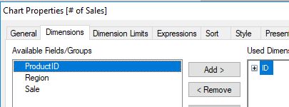
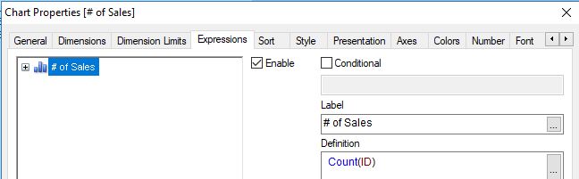
So first i want to creat a bar graph with the ID as the dimension and have shown the overall amount of sales of that ID (Count(ID Sales Region 1) + Count(ID Sales Region 2).
Under this graph i wanted to create 2 other bar graphs. One with the Sale Region 1 as the dimension and show the sales of the ID mentioned above. The second graph the same with Sale Region 2.
So my problem is i dont know how to implement it in the way that you would see in the first graph the overall sales of a ID. Then when clicking the ID it would change the other 2 graphs below. Because as Dimension in the first graph i just can choose the ID Sales Region 1 or ID Sales Region 2. I could implement another sheet with all my ID's but i can't find a corresponding key to match the data 😕
I hope you understand my problem and can help me out with it.
Kind regards
Daniel
Accepted Solutions
- Mark as New
- Bookmark
- Subscribe
- Mute
- Subscribe to RSS Feed
- Permalink
- Report Inappropriate Content
Hallo Daniel,
one solution might be to transform your input table e.g. like this:
tabSales:
LOAD ProductID,
    'Region 1' as Region,
    [Sale Region 1] as Sale,
    [ID Sales Region 1] as ID
FROM [https://community.qlik.com/thread/313404] (html, codepage is 1252, embedded labels, table is @1);

LOAD ProductID,
    'Region 2' as Region,
    [Sale Region 2] as Sale,
    [ID Sales Region 2] as ID
FROM [https://community.qlik.com/thread/313404] (html, codepage is 1252, embedded labels, table is @1);
based on this data model your charts are pretty straight forward:
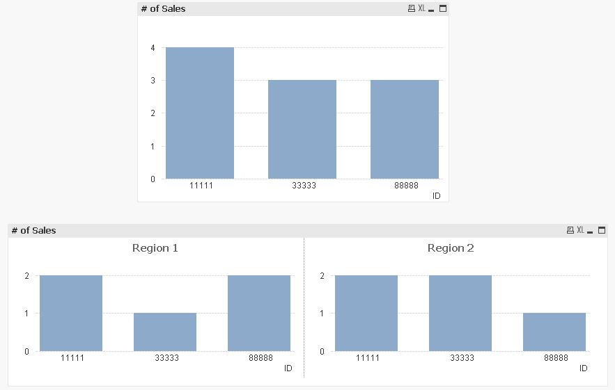
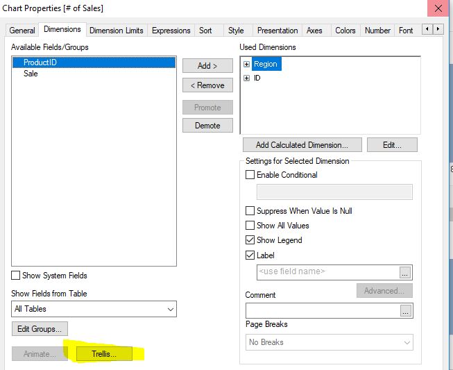
hope this helps
Gruß
Marco
- Mark as New
- Bookmark
- Subscribe
- Mute
- Subscribe to RSS Feed
- Permalink
- Report Inappropriate Content
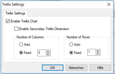
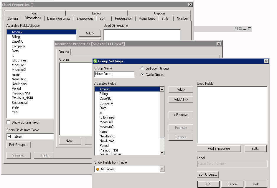
May be you want to use Cyclic Group dimensions. Once you add the dimensions just add that Group to the dimensions and your expression and see.
- Mark as New
- Bookmark
- Subscribe
- Mute
- Subscribe to RSS Feed
- Permalink
- Report Inappropriate Content
Hallo Daniel,
one solution might be to transform your input table e.g. like this:
tabSales:
LOAD ProductID,
    'Region 1' as Region,
    [Sale Region 1] as Sale,
    [ID Sales Region 1] as ID
FROM [https://community.qlik.com/thread/313404] (html, codepage is 1252, embedded labels, table is @1);

LOAD ProductID,
    'Region 2' as Region,
    [Sale Region 2] as Sale,
    [ID Sales Region 2] as ID
FROM [https://community.qlik.com/thread/313404] (html, codepage is 1252, embedded labels, table is @1);
based on this data model your charts are pretty straight forward:
hope this helps
Gruß
Marco
- Mark as New
- Bookmark
- Subscribe
- Mute
- Subscribe to RSS Feed
- Permalink
- Report Inappropriate Content
Thank you Vishwarath for your help, i tried it before but wasn't the solution for me.
- Mark as New
- Bookmark
- Subscribe
- Mute
- Subscribe to RSS Feed
- Permalink
- Report Inappropriate Content
Thank you very much Marco! Was exactly what i needed 
Gruß
Daniel