Unlock a world of possibilities! Login now and discover the exclusive benefits awaiting you.
- Qlik Community
- :
- All Forums
- :
- QlikView App Dev
- :
- Is this possible in Qlikview?
- Subscribe to RSS Feed
- Mark Topic as New
- Mark Topic as Read
- Float this Topic for Current User
- Bookmark
- Subscribe
- Mute
- Printer Friendly Page
- Mark as New
- Bookmark
- Subscribe
- Mute
- Subscribe to RSS Feed
- Permalink
- Report Inappropriate Content
Is this possible in Qlikview?
Hi,
I got a question if I could make the following in Qlikview:
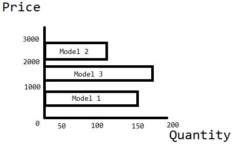
The table with data looks like
| Model | price per unit | quantity | date |
|---|---|---|---|
| model 1 | 200 | 2 | 14-01-2012 |
| model 1 | 220 | 1 | 18-01-2012 |
| model 2 | 555 | 5 | 05-02-2012 |
| model 3 | 852 | 1 | 08-02-2012 |
| model 1 | 190 | 4 | 09-02-2012 |
In the real situation ,there are more rows - captain obvious
Because every unit is custom, each has a diffrent price.
The price for a model is the average.
I guess this is all the information you need, if not tell me.
Kind regards,
ThijsJan
ps. I didn't know how to call the titel, but if you have a better solution please say it so I can change it.
- Tags:
- chart
- new_to_qlikview
- Mark as New
- Bookmark
- Subscribe
- Mute
- Subscribe to RSS Feed
- Permalink
- Report Inappropriate Content
Hi ThijsJan,
I don't quite follow the data example with the graph example, but if you are wanting the bars to move up and down the axis based on value, then the trick is to create the axis value as a dimension in the load script, eg ...
Data:
LOAD * INLINE [
Model, price per unit, quantity, date
model 1, 200, 2, 14-01-2012
model 1, 220, 1, 18-01-2012
model 2, 555, 5, 05-02-2012
model 3, 852, 1, 08-02-2012
model 1, 190, 4, 09-02-2012];
XDim:
LOAD
Model,
sum([price per unit] * quantity) as ModelTotalValue
resident Data group by Model;
Then when you create your bar-chart, use the new field (ModelTotalValue in my code) as the dimension, and include Model as one of the expressions but just set as Values on Data Points (no bar). Under the Axes tab, tick Continuous for the Dimension Axis.
flipside
- Mark as New
- Bookmark
- Subscribe
- Mute
- Subscribe to RSS Feed
- Permalink
- Report Inappropriate Content
[price per unit],
quantity,
date
FROM
C:\Users\alexandr_b\Documents\test1.xlsx
(ooxml, embedded labels, table is Лист1);
myModel: load Model,
avg([price per unit]) as AveragePricePerMonth,
sum(quantity) as SumQuantityPerModel
resident Model1
group by Model;
DROP TABLE Model1;
- Mark as New
- Bookmark
- Subscribe
- Mute
- Subscribe to RSS Feed
- Permalink
- Report Inappropriate Content
Thanks for the reply's, I will try it out now.
But if I group by load, is it then still possible to filter by date?
- Mark as New
- Bookmark
- Subscribe
- Mute
- Subscribe to RSS Feed
- Permalink
- Report Inappropriate Content
Yes, you are.
If you delete in my script row "DROP TABLE Model1;" and add List-object with expression [date]
BR