Unlock a world of possibilities! Login now and discover the exclusive benefits awaiting you.
- Qlik Community
- :
- Forums
- :
- Analytics
- :
- App Development
- :
- Re: Histogram with a Calculated Dimension
- Subscribe to RSS Feed
- Mark Topic as New
- Mark Topic as Read
- Float this Topic for Current User
- Bookmark
- Subscribe
- Mute
- Printer Friendly Page
- Mark as New
- Bookmark
- Subscribe
- Mute
- Subscribe to RSS Feed
- Permalink
- Report Inappropriate Content
Histogram with a Calculated Dimension
Hello dears!
Hope everything is well.
I have an application in which I present a key-performance indicator that tells me a calculated "Accuracy" for each element in my database called "Pair".
This accuracy is calculated as follows:
| Avg ( Aggr ( If ( Alt ( Sum (distinct [Demanded Qty] ), 0 ) = Alt ( Sum (distinct [Forecast Qty] ), 0 ), 100, If ( Alt ( Sum (distinct [Demanded Qty] ), 0 ) = 0 and Alt ( Sum (distinct [Forecast Qty] ), 0 ) <> 0, 0, If ( Alt ( Sum (distinct [Demanded Qty] ), 0 ) <> 0 and Alt ( Sum (distinct [Forecast Qty] ), 0 ) = 0, 0, 100 - If ( Alt ( Sum (distinct [Demanded Qty] ), 0 ) > Alt ( Sum (distinct [Forecast Qty] ), 0 ), ( Fabs ( Alt ( Sum (distinct [Demanded Qty] ), 0 ) - Alt ( Sum (distinct [Forecast Qty] ), 0 ) ) ) / Alt ( Sum (distinct [Demanded Qty] ), 0 ) * 100, If ( Alt ( Sum (distinct [Forecast Qty] ), 0 ) > Alt ( Sum (distinct [Demanded Qty] ), 0 ), ( Fabs ( Alt ( Sum (distinct [Demanded Qty] ), 0 ) - Alt ( Sum (distinct [Forecast Qty] ), 0 ) ) ) / Alt ( Sum (distinct [Forecast Qty] ), 0 ) * 100 ) ) ) ) ) , [%Pair] ) ) |
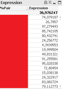
This expression returns me a number between 0 and 100 for each Pair, and I aggregate them as Average for overall value:
I would like to create an Histogram counting how many Pairs are with a determined Accuracy, whether with a Class() or not.
I created a bar chart with the following settings:
Dimension: The same as highlighted above.
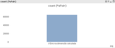
Expression: count (%Pair)
The chart fails with an error in calculated Dimension:
I can't calculate this expression previously in script because this Accuracy should recalculate respecting time frame filters.
Any ideas on how can I make this Histogram as I described?
Thank you in advance!
Accepted Solutions
- Mark as New
- Bookmark
- Subscribe
- Mute
- Subscribe to RSS Feed
- Permalink
- Report Inappropriate Content
Hi there!
I wish you could attend my lecture on Set Analysis and AGGR at the Masters Summit for Qlik - in one of my examples, I'm teaching just that - how to build a Histogram with an aggregated expression. Check out our schedule this fall, maybe you can join...
In a nutshell - a calculated dimension requires an array of values. The AGGR() function generates an array, but then the Avg() turns it into a single number. For your needs, you should drop the Avg() and leave the AGGR().
In order to get a bar chart with a reasonable number of bars, perhaps you want to round the results of AGGR() to the desired level. For example, rounding to 10 will give you 10 bars in your chart.
Cheers,
- Mark as New
- Bookmark
- Subscribe
- Mute
- Subscribe to RSS Feed
- Permalink
- Report Inappropriate Content
Hey Oleg, thanks for your answer!
Not even knowing what you kindly said: "a calculated dimension requires an array of values. The AGGR() function generates an array, but then the Avg() turns it into a single number", I've just managed to reach the solution removing Avg() from dimension.
And now reading your comment, everything makes sense. I appreciate, thank you for making it clear!

