Unlock a world of possibilities! Login now and discover the exclusive benefits awaiting you.
- Qlik Community
- :
- All Forums
- :
- QlikView App Dev
- :
- create a cross tab chart.
- Subscribe to RSS Feed
- Mark Topic as New
- Mark Topic as Read
- Float this Topic for Current User
- Bookmark
- Subscribe
- Mute
- Printer Friendly Page
- Mark as New
- Bookmark
- Subscribe
- Mute
- Subscribe to RSS Feed
- Permalink
- Report Inappropriate Content
create a cross tab chart.
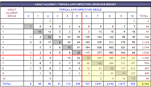
I want to create a table/pivot chart that looks something like this. Where two categories (Adult Allergy Decile, Topical Anti-Infective decile) are compared based on their counts. For example, when Adult Allergy Decile = 0 and Topical Anti-Infective decile = 0, the count is '1'. And when Adult Allergy Decile = 0 and Topical Anti-Infective decile = 1 the count is '8' and so on so forth. How can this be acheived in QV 9 SR5. Thanks.
- Mark as New
- Bookmark
- Subscribe
- Mute
- Subscribe to RSS Feed
- Permalink
- Report Inappropriate Content
You can try creating a pivot table chart with the two categories as dimension and your count as expression.
Then pivot the second dimension to the top by clicking and dragging the dimension in the chart to the top (there should be a blue line when clicking that you can move around).
Depending on your data model, the result should be pretty close to what you attached above.
Hope this helps,
Stefan
- Mark as New
- Bookmark
- Subscribe
- Mute
- Subscribe to RSS Feed
- Permalink
- Report Inappropriate Content
There is a category dimension called CATEGORY_NAME which has roughly 25 categories/values in there. When you say use 'two categories as dimension and count as expression', do you mean I've to rename CATEGORY_NAME as CATEGORY_NAME_1 and then bring the other category? In our example above, Allergy Decile & Topical Anti-Infective decile are one of those 25 CATEGORY_NAME. Is it almost like a self join to itself? I don't know how to design this in a datamodel. Thanks for your help.
- Mark as New
- Bookmark
- Subscribe
- Mute
- Subscribe to RSS Feed
- Permalink
- Report Inappropriate Content
It seems indeed that we first need to think how we can create an appropriate data model / how we can calculate the values we want to see, before we can start with a special visualization.
Could you describe your data model a bit more? Or at best, upload a small sample app (could be mock up data, of course)?
How do you calculate your deciles? I understand that they are not part of your data model yet, right?