Unlock a world of possibilities! Login now and discover the exclusive benefits awaiting you.
- Qlik Community
- :
- All Forums
- :
- QlikView App Dev
- :
- Stacked bar chart - segmented by year
- Subscribe to RSS Feed
- Mark Topic as New
- Mark Topic as Read
- Float this Topic for Current User
- Bookmark
- Subscribe
- Mute
- Printer Friendly Page
- Mark as New
- Bookmark
- Subscribe
- Mute
- Subscribe to RSS Feed
- Permalink
- Report Inappropriate Content
Stacked bar chart - segmented by year
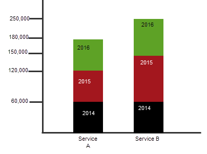
I am trying to create a stacked bar chart to compare the cost of 2 services over the coming 3 years. I want each segment of the bar to be the sum of cost per year.
For simplicity sake in illustration:
Service A is 60,000/ year. So, each of the segments in the bar would be the same size, each equal to 60k and total height of the bar = 180,000
Service B is 60,000 for 2014, 90,000 for 2015 and 100,000 for 2016. So, each colored segment of the bar would be equal to the sum of the cost per year, totaling to 250,000
In my data I have date and cost per month. Each date is the first day of every month of the year (1/1/2014, 2/1/2014, etc.); in the script I created a new field year(Date))
I would even like to show the cost per month within the bars.
- Tags:
- new_to_qlikview
Accepted Solutions
- Mark as New
- Bookmark
- Subscribe
- Mute
- Subscribe to RSS Feed
- Permalink
- Report Inappropriate Content
Put service and year in the deimension, Sum(Amount as expression. In the properties\style tab tick the stack option.
See attached qvw.
- Mark as New
- Bookmark
- Subscribe
- Mute
- Subscribe to RSS Feed
- Permalink
- Report Inappropriate Content
Hi,
If i understand correct means arrive the column Month(Date) as Month and created the DrillDown for Year, Month.
Use Drilldown name as dimension in stacked bar Charts and use expression like sum(Cost).
Regards,
- Mark as New
- Bookmark
- Subscribe
- Mute
- Subscribe to RSS Feed
- Permalink
- Report Inappropriate Content
Sorry, not sure I understand your response.
Here is a graphic that illustrates what I am trying to achieve: stacked bars by service, showing cost per year.
- Mark as New
- Bookmark
- Subscribe
- Mute
- Subscribe to RSS Feed
- Permalink
- Report Inappropriate Content
Put service and year in the deimension, Sum(Amount as expression. In the properties\style tab tick the stack option.
See attached qvw.