Unlock a world of possibilities! Login now and discover the exclusive benefits awaiting you.
- Qlik Community
- :
- All Forums
- :
- QlikView App Dev
- :
- Need to display 2 dimension in different axis and ...
- Subscribe to RSS Feed
- Mark Topic as New
- Mark Topic as Read
- Float this Topic for Current User
- Bookmark
- Subscribe
- Mute
- Printer Friendly Page
- Mark as New
- Bookmark
- Subscribe
- Mute
- Subscribe to RSS Feed
- Permalink
- Report Inappropriate Content
Need to display 2 dimension in different axis and 1 expression in qlikview chart.
Hi All,
I have two dimensions and 1 expression, which needs to display in a chart.
Dimensions:
Dimension 1 : Status (values A,B,C,.....)
Dimension 2: No of Days (1,2,3,4,.....)
Expressions:
Expression: count(distinct InvoiceNumber)
I want to show Dimension 1 in X axis and Dimension 2 in Y axis. Can anyone help me on how we can create the chart. I have attached the rough graph in this post. Please find it and kindly do the needful.
Thanks in advance!!!!!!
Accepted Solutions
- Mark as New
- Bookmark
- Subscribe
- Mute
- Subscribe to RSS Feed
- Permalink
- Report Inappropriate Content
Straight Forward, PFA
- Mark as New
- Bookmark
- Subscribe
- Mute
- Subscribe to RSS Feed
- Permalink
- Report Inappropriate Content
Create Scatter Chart and use same dimensions and Measure.
Note: Second dimension should holds numeric data
- Mark as New
- Bookmark
- Subscribe
- Mute
- Subscribe to RSS Feed
- Permalink
- Report Inappropriate Content
Hi Anil Babu,
Thanks for Immediate response.
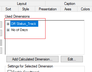
In the scatter chart, I have add Status and No of Days as dimension. (please check screenshot1)
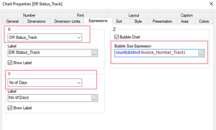
and in the expression tab, it is asking to select fields for x and y axis. (please check screenshot2). Here I have added status as x axis field and No of Days as Y axis field. But still Chart is not populating what I expected.


Thanks!!!!!
- Mark as New
- Bookmark
- Subscribe
- Mute
- Subscribe to RSS Feed
- Permalink
- Report Inappropriate Content
Not expected means? It is not coming or data predict is not valid?
- Mark as New
- Bookmark
- Subscribe
- Mute
- Subscribe to RSS Feed
- Permalink
- Report Inappropriate Content
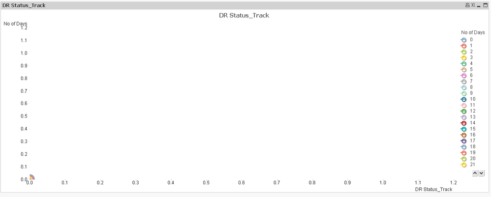
I am getting the chart like below.
It is not showing like in the rough graph which I attached in my first post.
IN the Y axis the values should be 1,2,3, but it is showing in 0.1,0.2 etcc...
In Xaxis the values should show A,B,C......, but it is showing in numbers.
and invoice count is showing at 0.0 coordination.
Thanks!!!!!
- Mark as New
- Bookmark
- Subscribe
- Mute
- Subscribe to RSS Feed
- Permalink
- Report Inappropriate Content
Odd to explain. Can we get sample data set?
- Mark as New
- Bookmark
- Subscribe
- Mute
- Subscribe to RSS Feed
- Permalink
- Report Inappropriate Content
Hi Anil,
Please find the sample data file attached to this post. Thanks in Advance!!!!
- Mark as New
- Bookmark
- Subscribe
- Mute
- Subscribe to RSS Feed
- Permalink
- Report Inappropriate Content
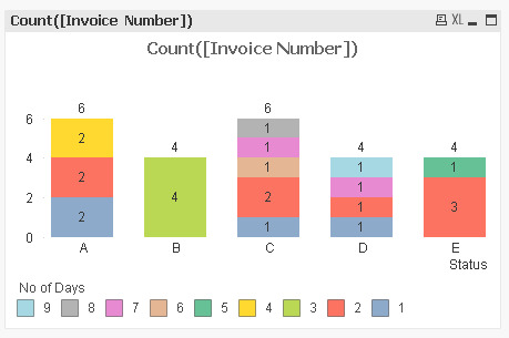
Like this?
- Mark as New
- Bookmark
- Subscribe
- Mute
- Subscribe to RSS Feed
- Permalink
- Report Inappropriate Content
Yes, this is good!!!!. Can you share the sample qvw file?
Thank you so much!!!!
- Mark as New
- Bookmark
- Subscribe
- Mute
- Subscribe to RSS Feed
- Permalink
- Report Inappropriate Content
Straight Forward, PFA

