Unlock a world of possibilities! Login now and discover the exclusive benefits awaiting you.
- Qlik Community
- :
- All Forums
- :
- QlikView App Dev
- :
- Graph Question
- Subscribe to RSS Feed
- Mark Topic as New
- Mark Topic as Read
- Float this Topic for Current User
- Bookmark
- Subscribe
- Mute
- Printer Friendly Page
- Mark as New
- Bookmark
- Subscribe
- Mute
- Subscribe to RSS Feed
- Permalink
- Report Inappropriate Content
Graph Question
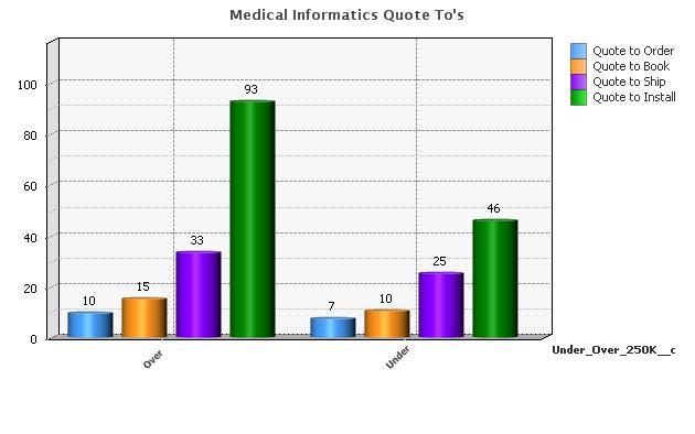
I have a pivot table whereby there is one dimension and four expressions. When I create a chart from the pivot table the dimension gets placed on the X axis and the the expressions are in the legend. It looks like this:
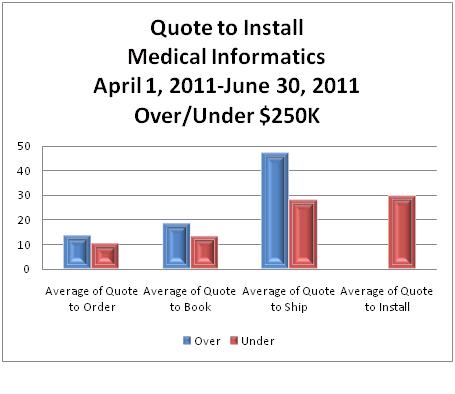
What I would like it to look like is this:
Is there a way to flip the axis?
- Mark as New
- Bookmark
- Subscribe
- Mute
- Subscribe to RSS Feed
- Permalink
- Report Inappropriate Content
There are no images ?? or might be they are uploaded in the wrong format. Can you please show a sample app or any other images? Normally under the Properties-> Axes you will have the setting for expressions etc. But this is again available only for some chart types.
- Mark as New
- Bookmark
- Subscribe
- Mute
- Subscribe to RSS Feed
- Permalink
- Report Inappropriate Content
Mady,
Thank you for the response..
This is how Qlikview displaysmy data…as you can see from my excel graph (fig 2) I need the data reversed.

- Mark as New
- Bookmark
- Subscribe
- Mute
- Subscribe to RSS Feed
- Permalink
- Report Inappropriate Content
I think its showing in Stacked View, You may try this,
Goto Properties-> Style -> select Grouped...hopefully that solves your problem
- Mark as New
- Bookmark
- Subscribe
- Mute
- Subscribe to RSS Feed
- Permalink
- Report Inappropriate Content
Mady,
That wont do it....if you can see I want the data in the legent to be the axis and the axis to be the legend....do you know if this is possile? I need the data transposed
- Mark as New
- Bookmark
- Subscribe
- Mute
- Subscribe to RSS Feed
- Permalink
- Report Inappropriate Content
I need the Qlikview graph to look like the excel graph....Qlikview is the first graph. Notice the difference of the X axis