Unlock a world of possibilities! Login now and discover the exclusive benefits awaiting you.
- Qlik Community
- :
- All Forums
- :
- QlikView App Dev
- :
- Convert a Text Chart into a bar chart
- Subscribe to RSS Feed
- Mark Topic as New
- Mark Topic as Read
- Float this Topic for Current User
- Bookmark
- Subscribe
- Mute
- Printer Friendly Page
- Mark as New
- Bookmark
- Subscribe
- Mute
- Subscribe to RSS Feed
- Permalink
- Report Inappropriate Content
Convert a Text Chart into a bar chart
Hi Guys,
I have a very basic question, i have done a calculation and represented it in text format with percent in the middle.for ex 77 % completed.
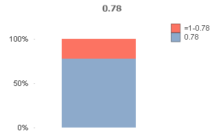
Just to make the graph visual i want to have a bar graph for same which have two bar graph one showing completed and other one showing total to be completed.
i can't create it as i dont have a dimension , can some body help me .
=num(count(distinct if([Rate Rectification]='Y' ,ACCOUNT_NO))
/count(distinct if([Rate Rectification]='Y' OR [Rate Rectification]='Pending' ,ACCOUNT_NO)), '#,##0%')
now from above calc i get 78 % can i show this as a bar graph filling up ? 78% green and 22 % red.
- Subscribe by Topic:
-
Calculation based total amount find the Usage
-
Chart bar
-
Dimension as expression
-
TEXT Chart
Accepted Solutions
- Mark as New
- Bookmark
- Subscribe
- Mute
- Subscribe to RSS Feed
- Permalink
- Report Inappropriate Content
If you need something like this, you need no dimension, put your expression in first expression, then define second expression as 1-first expression and define the numbers to be shown in percentage and define barchart design in staples
Or whatelse do you require?
- Mark as New
- Bookmark
- Subscribe
- Mute
- Subscribe to RSS Feed
- Permalink
- Report Inappropriate Content
thanks @Anonymous appreciate your help 🙂
