Unlock a world of possibilities! Login now and discover the exclusive benefits awaiting you.
- Qlik Community
- :
- Discover
- :
- Blogs
- :
- Product
- :
- Design
- :
- How to build a Dot Quadrant Chart in Qlik Sense
- Subscribe to RSS Feed
- Mark as New
- Mark as Read
- Bookmark
- Subscribe
- Printer Friendly Page
- Report Inappropriate Content
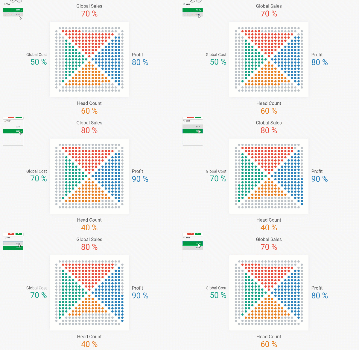
Our guest blogger Christophe Brault @christophebrault , will show you how to build a very different type of chart with Qlik Sense. A really smart addition to Qlik's wide chart library that illustrates how standard charts have more to offer when we look at them with the right eyes. Check out Christophe's website for more interesting examples with Qlik https://www.qreatic.fr/
How to build a Quadrant Dot chart, step by step
Have you ever felt restrained with Qlik Sense graphic objects before? Personally, if I'm not careful, I feel like I'm doing the same Dashboard over and over again. Sometimes you want something different, surprising or striking. Those are the days when thinking out of the box gets especially important.
I found the Dot Quadrant chart online and I was curious about how could we achieve something like that in Qlik, so I tried.
In this article I will not discuss when or why to use this visualization, but I'll focus on a detailed guide on how to built it, and more generally, how to hijack basic graphics in Qlik.
Building our grid
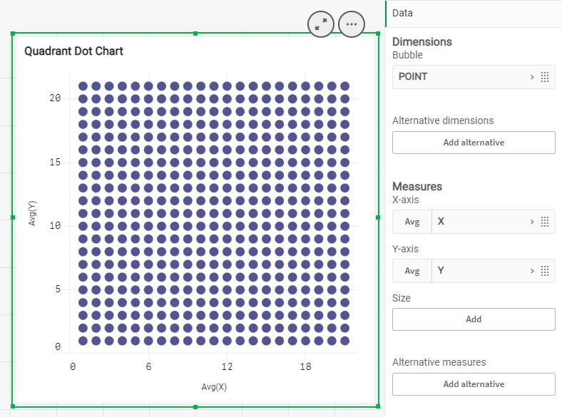
First, we need to create a grid that contains all the dots that will make the chart. We will use a Scatter Plot Chart to create a 21 x 21 grid. Notice how we are generating a 21 X 21 grid instead of a 20 by 20, since we need to delimit each sector.
Generate every point in the script
TMP:
LOAD RECNO() AS X AUTOGENERATE 21;
JOIN LOAD RECNO() AS Y AUTOGENERATE 21;
Prepare your data
DATA :
LOAD X &'|'& Y AS POINT,
X+Y AS TOTAL,
X,Y
RESIDENT TMP;
DROP TABLE TMP;
Create the Dot Quadrant chart using a scatter chart and filling dimension with the field called Point, and X Y as measures. Set the Range for both to Max with 22 and there is your grid.
Create triangles
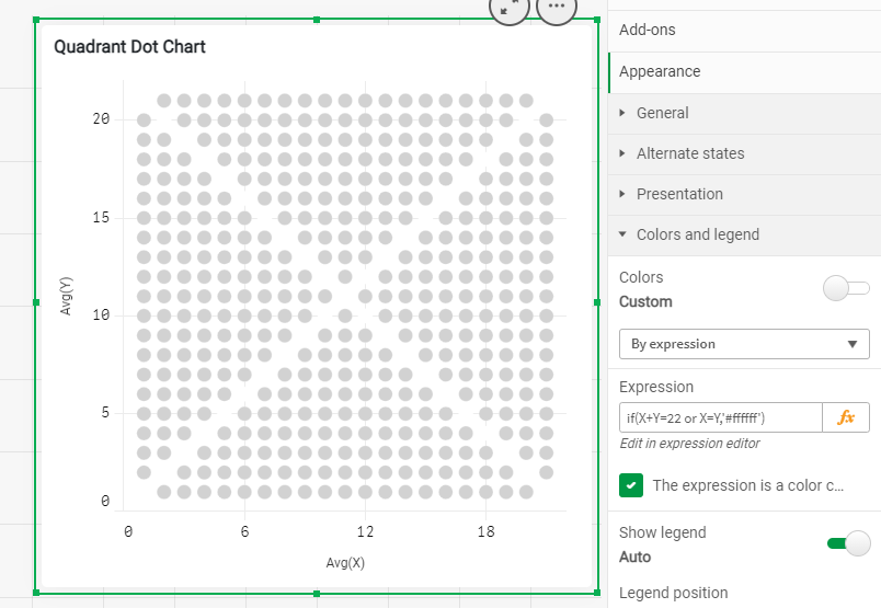
The first thing is to remove the points that separate our four sections. It’s easily done with X and Y. Use color "by Expression" in your chart to set the color to white so they disappear from view.
IF(X=Y OR X+Y=22, RGB(255,255,255))
To know what "triangle" each points belongs to you could use the conditions below
if(Total=22 or X=Y,'NONE',
 if(Total>=23 and Y>X,'TOP',
  if(Total<23 and Y>X,'LEFT',
   if(Total>=23 and Y<X,'RIGHT',
    if(Total<23 and Y<X,'BOTTOM')))))
Using those conditions you can generate a new field in your script called "POSITION" that will help you later on to target the right quarter of your Dot Quadrant Chart
Your loading script by now should look like the code below
TMP:
LOAD RECNO() AS X AUTOGENERATE 21;
JOIN
LOAD RECNO() AS Y AUTOGENERATE 21;

DATA:
// // DEFINE TRIANGLE POSITION
LOAD X,Y,TOTAL,POINT,
IF(TOTAL=22 OR X=Y,'NONE',
IF(TOTAL>=23 AND Y>X,'TOP',
IF(TOTAL<23 AND Y>X,'LEFT',
IF(TOTAL>=23 AND Y<X,'RIGHT',
IF(TOTAL<23 AND Y<X,'BOTTOM'))))) AS Position;

LOAD X&'|'&Y AS POINT,
X+Y AS TOTAL,
X,Y
RESIDENT TMP;

DROP TABLE TMP;
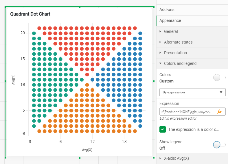
Once you know where each dot belongs to, is time to color each one of the quadrants. You can reuse the field "Position" in Color by Expression :
if(Position='NONE',rgb(255,255,255),
 if(Position='TOP',rgb(231, 76, 60),
  if(Position='RIGHT',rgb(41, 128, 185),
   if(Position='BOTTOM',rgb(230, 126, 34),
    if(Position='LEFT',rgb(22, 160, 133)
)))))
Displaying KPI in the grid
In my example, I have four metrics and one dimension, year, containing two values. Since each quarter is made up of 100 points, it is time to asing them a value from 1 to 100 starting from the center dot. This way you will be able to control how the sections will fill up. You want them to fill up starting from the center outwards.
In the load script, is time to create a new field called "NoPoint" as shown below
Top:
load Position,X,Y,RowNo() as NoPointT Resident Data
Where Position ='TOP'
Order by Y asc;

Right:
load Position,X,Y,rowno() as NoPointR Resident Data
Where Position ='RIGHT'
Order by X asc;

Bottom:
load Position,X,Y,RowNo() as NoPointB Resident Data
Where Position ='BOTTOM'
Order by Y desc;

Left:
load Position,X,Y,rowno() as NoPointL Resident Data
Where Position ='LEFT'
Order by X desc;


All:
LOAD Position,X,Y,NoPointT as NoPoint Resident Top;
Concatenate(All)
LOAD Position,X,Y,NoPointR as NoPoint Resident Right;
Concatenate(All)
LOAD Position,X,Y,NoPointB as NoPoint Resident Bottom;
Concatenate(All)
LOAD Position,X,Y,NoPointL as NoPoint Resident Left;

join(Data)
LOAD * resident All;

Drop tables All,Top,Right,Bottom,Left;
Finally, go back to the chart coloring properties panel and add each KPI like
Position='TOP' and Sum({$<Metric={'Sales'}>}Percentage)*100>=NoPoint
By know, your color expression should be something like this
if(X+Y=22 or X=Y,'#ffffff',
 if(Position='TOP' and Sum({$<Metric={'Sales'}>}Percentage)*100>=NoPoint,'#e74c3c',
  if(Position='RIGHT' and Sum({$<Metric={'Profit'}>}Percentage)*100>=NoPoint,'#2980b9',
   if(Position='BOTTOM',
    if(Sum({$<Metric={'Headcount'}>}Percentage)*100>=NoPoint,'#e67e22','#bdc3c7'),
     if(Position='LEFT',
      if(Sum({$<Metric={'Cost'}>}Percentage)*100>=NoPoint,'#16a085','#bdc3c7')
,'#bdc3c7')
         )
        )
       )
      )
To complete your chart remember to hide what you don't need in there, the Labels and Titles for X and Y and Voila !
Thanks for reading and find more chart hijacking at https://www.qreatic.fr/dailyqlikchallenge/category/Charts+Hijacking
Christophe Brault
PS: Check Christophe's Dot Quadrant app attached
You must be a registered user to add a comment. If you've already registered, sign in. Otherwise, register and sign in.


