Unlock a world of possibilities! Login now and discover the exclusive benefits awaiting you.
- Subscribe to RSS Feed
- Mark as New
- Mark as Read
- Bookmark
- Subscribe
- Printer Friendly Page
- Report Inappropriate Content
Within Qlik Sense, gauges are tied to a measure, with the data labeled a KPI. Gauges find their strength in displaying the progress toward a goal. As such, a major component of the gauge is found under ‘Appearance’ then ‘Presentation’ in the form of the ‘Range Limits’. Through range limits, users can provide the beginning and goal values of the gauge. Again, under ‘Presentation’, users can provide ‘limits’ within gauge, partitioning the gauge to show different subgoals or areas within the gauge, providing colors and values to track progress.
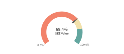
Gauges in Qlik are expressed in two different forms, the first being ‘Radial’ which displays the data as a dial, with the value being a needle that moves along the radius of the dial. The other form of gauge is the ‘Bar’. A rectangle that can be either horizontal or vertical, showing the maximum and minimum values on either side.
How can you use a gauge to visualize your data?
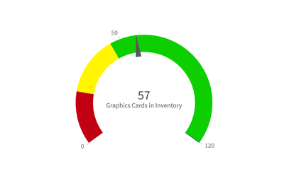
Let’s begin with the radial style of gauge. For this example, we can put ourselves into the mind of an district manager across a number of computer stores. Our computer stores sell a high number of graphics cards, and it is one of our main revenue drivers. As such, we need to make sure we always have a good amount in inventory. With Qlik Sense, we could tie the measure ‘Graphics Cards in Inventory’ to a gauge to visualize this item’s inventory value. In this example, you could associate different ranges within your gauge as good, order, and dangerously low, coloring them green, yellow, and red respectively. This example would look like this:
Now we have a visualize to show us the status of our inventory so we can make the appropriate actions to keep revenue where it needs to be. Also, with Qlik Sense, you can connect an alert to this chart so that you’ll be notified when your inventory dips into the yellow, and another when it drops to the red.
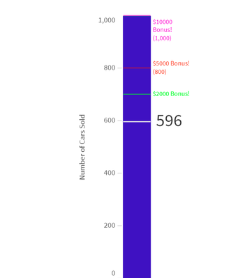
Now we’ll move onto the bar form of the gauge. For this example, we could put ourselves in the mind of a car sales manager. Our company has a promotion going saying that if we sell a total of a thousand cars during a certain amount of time throughout the district, we’ll get a bonus. With the bar chart, we can set the upper limit 1000, our measure to ‘Number of Cars Sold’ and our gauge is made. Now we can quickly view how close we are to our goal by the status of the cars sold. Our gauge should like this:
In this example we have also added markers throughout our journey to 100% of our goal. So now we can see how close we are to the $2,000, $5,000, and $10,000 bonuses. In other scenarios we could have money raised, contracts signed, anything that necessitates the tracking toward a goal.
These are only a few examples of how you could use a gauge. What are some examples you can think of where gauges may help you in visualizing your data?
You must be a registered user to add a comment. If you've already registered, sign in. Otherwise, register and sign in.


