Unlock a world of possibilities! Login now and discover the exclusive benefits awaiting you.
- Qlik Community
- :
- Discover
- :
- Blogs
- :
- Non-Technical
- :
- Community Manager Blog
- :
- A new look and feel is here!
- Subscribe to RSS Feed
- Mark as New
- Mark as Read
- Bookmark
- Subscribe
- Printer Friendly Page
- Report Inappropriate Content
Hello Qlik Community!
It was time for a change - time to modernize and simplify. We are so excited and proud of the updates pushed out today to give Qlik Community a fresh look!
There are so many changes to share. So, sit back, relax, and grab a beverage of choice. This is going to be a long blog 😊
Sticky Navigation
The navigation will stay in place when you’re scrolling down the page.
Simplified banner with personalization
The banner went is now a solid color with two focal points: a welcome message that differs on whether you are logged in or not and the search bar.
We received feedback that the search bar blended too much with the background and agreed! It is now a prominent feature on the banner. We also rounded the edges to give it a modern feel. What do you think?
When not logged in, you will see ‘Welcome to Qlik Community! But when logged in (and we hope you are!), the message changes to ‘Hi, <username>’. Personalization has been on our radar for some time now and we are so happy it is finally live!
Announcement banner
The announcement banner went from Qlik purple to Qlik gray. Yes, the purple was more prominent, but it did not allow us to customize announcements. We were very limited in the colors that we could use. A gray banner will allow us to use different colors to call out the exciting things happening at Qlik.
New Homepage layout
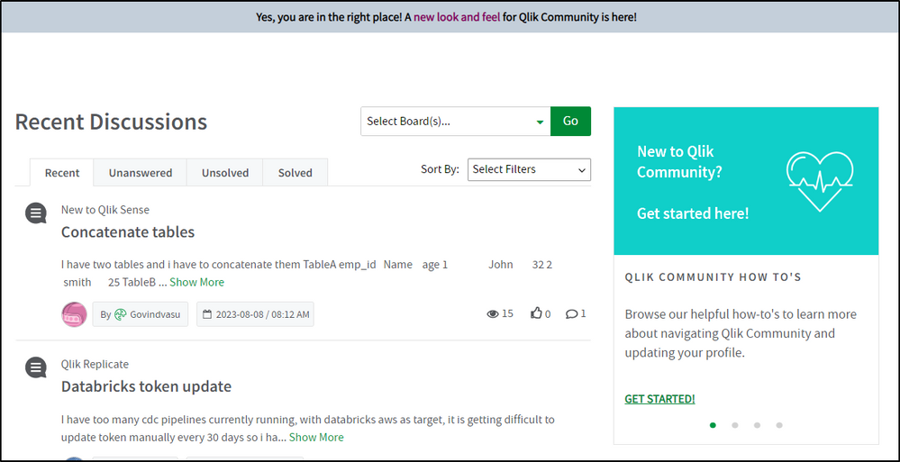
Discussions are now at the top! You can keep track and of what your peers are asking and be a part of the conversation more easily!
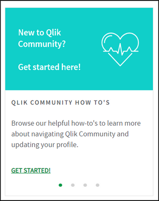
The previous 3 cards and carousel have been condensed to one carousel on the right. Use this area to get started on Qlik Community and view upcoming events!
In lieu of the homepage cards, we added the Resources link back in the top left.
Updated Leaderboard
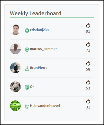
‘Leaderboard’ is now ‘Weekly Leaderboard’ because that is what it is! A kudo-based weekly leaderboard that gives everyone the opportunity to shine! Check it regularly to see if you make the Top 5! And who knows, you might one day end up as Sue’s Featured Member because of it 😉
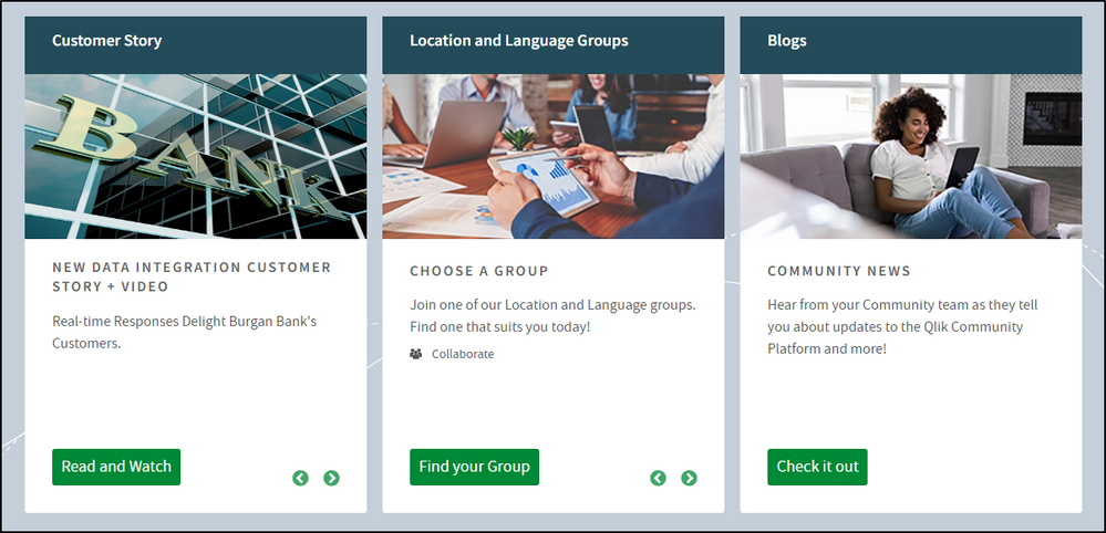
Hear from our Customers
Read more about how our customers have been successful with Qlik!
Are you a Qlik customer and interested in sharing your story? Send your submission to reference@qlik.com, if selected, the team will get back to you.
I think that’s it for the Homepage. Now on to the rest!
Landing pages
The banner on the landing pages for forums, groups, Support, Ideation, Qlik Gallery, blogs, events, programs under Learn and the Partner area are the same color as the homepage. We kept the existing images and they really pop now!
Refreshing banner descriptions
We are updating the banner descriptions throughout Qlik Community to explain the area simply and concisely.
Post pages
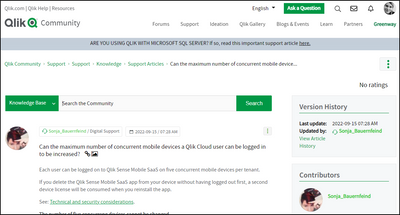
We went the opposite with posts – we removed the top banner completely. It took up too much space and now it looks really crisp. Removing the banner will also help improve SEO by allowing your posts to be indexed properly. This will result in more relevant search results. This is a change for all types of posts: forum, release notes, support articles, etc.
I’ll also add that when you’re create a new post, you will still see the landing page banner. However, when you’re editing your post, it will look like the post page.
I’m interested in your thoughts about this change specifically. Are the post pages too simple or different? Do we need to add a slim banner back without any text? Let us know your thoughts in the comments.
Removed Ideation Breadcrumbs
The Ideation area has had a huge overhaul over the past few months. We removed the breadcrumbs from this area to lessen confusion.
New Featured Member Badge
Featured Members will receive a new badge along with their Community shoutout! This badge has been awarded retroactively as well.
WOW! That is so much change at one time! It’s one of our biggest updates since redesigning the navigation.
Accessibility has been top of mind with the redesign and we tried to make the color choices as accessible as possible. While most areas of change will meet or exceed WCAG compliance ratios for color contrast, some might be a tad below that ratio. We will continue to work on this as Qlik Community is for everyone.
Change can be hard. But we hope you enjoy these changes as much as we do. Please let us know any feedback in the comments below. We would love to hear from you.
Your Admins,
- « Previous
-
- 1
- 2
- 3
- Next »
You must be a registered user to add a comment. If you've already registered, sign in. Otherwise, register and sign in.


