Unlock a world of possibilities! Login now and discover the exclusive benefits awaiting you.
- Qlik Community
- :
- All Forums
- :
- QlikView App Dev
- :
- How to display graph data labels in percentage for...
- Subscribe to RSS Feed
- Mark Topic as New
- Mark Topic as Read
- Float this Topic for Current User
- Bookmark
- Subscribe
- Mute
- Printer Friendly Page
- Mark as New
- Bookmark
- Subscribe
- Mute
- Subscribe to RSS Feed
- Permalink
- Report Inappropriate Content
How to display graph data labels in percentage format
Hi All,
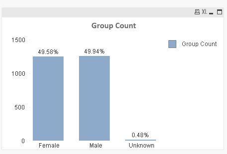
I have put up a bar graph with three dimensions and measure is count (member)
Female 1245
Mlae 1254
Unknown 12
For the above data set i have plotted bar graph. But i need the data labels to be in percentage. How should i do it.
- « Previous Replies
-
- 1
- 2
- Next Replies »
- Mark as New
- Bookmark
- Subscribe
- Mute
- Subscribe to RSS Feed
- Permalink
- Report Inappropriate Content
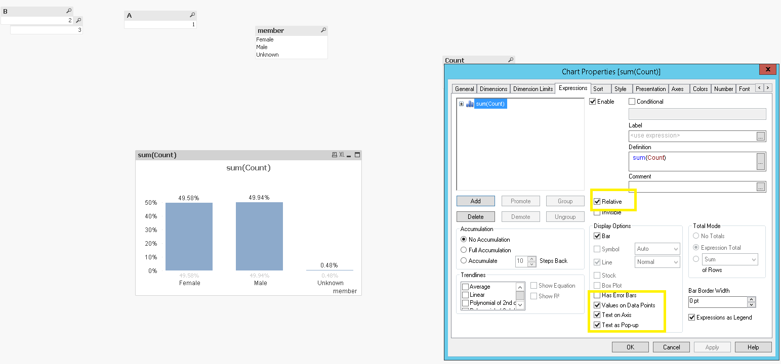
Write your expression and then mark "relative" and "Value on data point" checkbox.
![2017-05-26 14_22_36-QlikView x64 Personal Edition - [C__Users_Michele.Denardi_Desktop_test1.qvw_].png](/legacyfs/online/164876_2017-05-26 14_22_36-QlikView x64 Personal Edition - [C__Users_Michele.Denardi_Desktop_test1.qvw_].png)
If a post helps to resolve your issue, please accept it as a Solution.
- Mark as New
- Bookmark
- Subscribe
- Mute
- Subscribe to RSS Feed
- Permalink
- Report Inappropriate Content
May be
Count (member)/Count (Total member)
- Mark as New
- Bookmark
- Subscribe
- Mute
- Subscribe to RSS Feed
- Permalink
- Report Inappropriate Content
Hi Avinash,
See if the attached QVD is what you want.
I used sum instead of count to get the values.
Regards,
Felipe.
- Mark as New
- Bookmark
- Subscribe
- Mute
- Subscribe to RSS Feed
- Permalink
- Report Inappropriate Content
Here is one way you can achieve that. Take a look at the attached file:
- Mark as New
- Bookmark
- Subscribe
- Mute
- Subscribe to RSS Feed
- Permalink
- Report Inappropriate Content
you would also use percentage as below ,just need to supplied the Dimensions & Expression,
- Mark as New
- Bookmark
- Subscribe
- Mute
- Subscribe to RSS Feed
- Permalink
- Report Inappropriate Content
Hi Michele,
Can you pls explain it in the qliksense ?
- Mark as New
- Bookmark
- Subscribe
- Mute
- Subscribe to RSS Feed
- Permalink
- Report Inappropriate Content
Hi Thirumala,
Can you pls explain it with respect to Qliksense.
Regards,
Avinash
- Mark as New
- Bookmark
- Subscribe
- Mute
- Subscribe to RSS Feed
- Permalink
- Report Inappropriate Content
Hi Avinash,
I think you can use measure as Sum(count)/Sum(total count) and in the Number Formatting, you can select 'custom' and format pattern as '#,##0.00%'
Thanks,
Vignesh U.
- Mark as New
- Bookmark
- Subscribe
- Mute
- Subscribe to RSS Feed
- Permalink
- Report Inappropriate Content
Hi Vignesh,
Can you pls show it in qliksense.
I hve tried doing but m not getting it.
- « Previous Replies
-
- 1
- 2
- Next Replies »