Unlock a world of possibilities! Login now and discover the exclusive benefits awaiting you.
- Qlik Community
- :
- All Forums
- :
- QlikView App Dev
- :
- Qlikview Waterfall chart how to get % contributor ...
- Subscribe to RSS Feed
- Mark Topic as New
- Mark Topic as Read
- Float this Topic for Current User
- Bookmark
- Subscribe
- Mute
- Printer Friendly Page
- Mark as New
- Bookmark
- Subscribe
- Mute
- Subscribe to RSS Feed
- Permalink
- Report Inappropriate Content
Qlikview Waterfall chart how to get % contributor values within the bars
Friends,
I plan to make an waterfall chart (stacked). something like below. I am using dimension less bar charts with only expressions. I am able to construct the waterfall stacked bar chart using the expression offset. But, seek help on how to get their corresponding % contributor within the respective bars next to their values in brackets please.
Any sugestions will be much appreciated. thanks
| Paid time 100 hrs (100%) | ||||||||||||
| Worked time 80 hrs (80%) | ||||||||||||
| Holiday10 hrs(10%) | ||||||||||||
| Sick 5 hrs (5%) | ||||||||||||
| Lost 5 hrs(5%) | ||||||||||||
- Mark as New
- Bookmark
- Subscribe
- Mute
- Subscribe to RSS Feed
- Permalink
- Report Inappropriate Content
Hi Satikata,
It is a bit fiddly, but you could use the Text in Chart feature on the Presentation tab and then move each label above the expression.
I have attached a simple example, based on your data, of how this could work.
Hope this helps.
Rod
- Mark as New
- Bookmark
- Subscribe
- Mute
- Subscribe to RSS Feed
- Permalink
- Report Inappropriate Content
Hi Rod,
Many Thanks for your valuable input. It did really help me solve the issue.
How can i close it in the discussion forum please and mark it solved? Sorry
for asking it, i am brand new to this.
Best Regards,
SJ
On Mon, Apr 24, 2017 at 12:25 AM, Rod Jager <qcwebmaster@qlikview.com>
- Mark as New
- Bookmark
- Subscribe
- Mute
- Subscribe to RSS Feed
- Permalink
- Report Inappropriate Content
Check here on how to close a thread and mark correct and helpful responses 
- Mark as New
- Bookmark
- Subscribe
- Mute
- Subscribe to RSS Feed
- Permalink
- Report Inappropriate Content
Dear All,
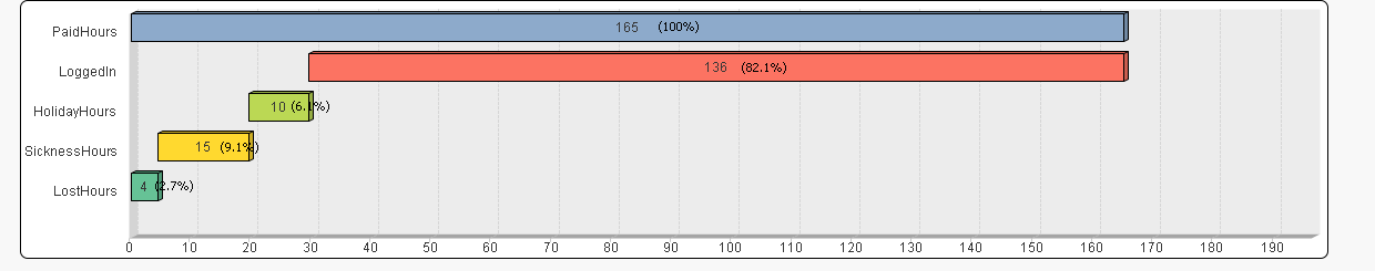
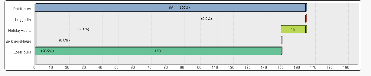
Thanks for previous inputs on this issue. I have created the "calculated %" text in chart in presentation tab, placed it on the bars which works perfectly in terms of value.
But, sometimes the position of the text ( in bars) where it displays goes outside of the bars.
As you can see below Capture1 is fine but, capture2 the texts are in different place. How to make it display at correct place please?
- Mark as New
- Bookmark
- Subscribe
- Mute
- Subscribe to RSS Feed
- Permalink
- Report Inappropriate Content
Hi Satikata,
As you have probably noticed, text in charts isn't dynamic in terms of placement. The only thing I can suggest is that you consider:
- making the text box as wide as the interval axis
- set formatting of the text in chart field to right justified
- add some logic to the text box that adds leading spaces to each value based on the calculated value eg
=repeat(' ' , sum({$<label={'Paid time 100 hrs'}>}value)) & 'Paid time 100 hrs (' & num(sum({$<label={'Paid time 100 hrs'}>}value), '0%') & ')'
I have updated the previous sample to demonstrate how this could work.
Hope this helps.
Rod