Unlock a world of possibilities! Login now and discover the exclusive benefits awaiting you.
- Qlik Community
- :
- All Forums
- :
- QlikView App Dev
- :
- "Text on axis" or "Text as pop-up" - formatting op...
- Subscribe to RSS Feed
- Mark Topic as New
- Mark Topic as Read
- Float this Topic for Current User
- Bookmark
- Subscribe
- Mute
- Printer Friendly Page
- Mark as New
- Bookmark
- Subscribe
- Mute
- Subscribe to RSS Feed
- Permalink
- Report Inappropriate Content
"Text on axis" or "Text as pop-up" - formatting options? Or other ideas for "timeline" graphs.
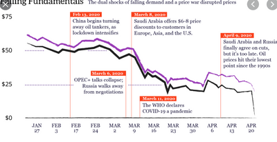
I'm trying to build a sort of "timeline" graph. It's a multiple line chart, but in addition there are some "events" that I want to mark on the chart.
The idea is to show context to what was happening when the data lines change. This is an example from Google images:
I guess this Google one was manually put together rather than anything dynamic. My "events" are in the data - so each event has a date and a title, and those events vary by company (the main filtering field for selection in my QVW). Then my lines are other info about that company e.g. share price, turnover or whatever.
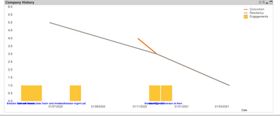
This 2nd picture is my current - very rough! - attempt with QlikView. It's dummy data so data points on the lines are minimal but you get the idea. I've put on a "count(distinct Event)" type expression as a bar chart giving the yellow markers - really just as a starting point for seeing where these events are. Happy to leave in the bars if it makes it clearer for the user.
Then I really want to pull in the title field associated to these events. So I've got another expression which is invisible and has "text on axis" and "text as pop-up" ticked. That does the job in a very basic way - it shows the event titles when you hover over a yellow bar, and always shows them as a sort of secondary horizontal axis (blue font in the 2nd image). But you can see it's pretty squashed, not really readable.
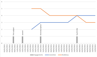
This 3rd picture is Excel, you use "values from cells" as "values on data points", and can then format these values quite flexibly - e.g. where you want it relative to the bar chart series, alignment, size etc.
Any tips on how to format "text on axis" better in QliKView? I can use the expression "text format" and "text colour" but only with limited options. Is there an HTML expression for alignment I could put into the expression's "text format"?
Or does anyone else have a completely different way to use QlikView for this sort of timeline chart?
Thanks all!
#combo chart, visualization, timeline, events, text on axis, text as pop-up, chart expressions, graph
- Mark as New
- Bookmark
- Subscribe
- Mute
- Subscribe to RSS Feed
- Permalink
- Report Inappropriate Content
Any comments at all are welcome, even from somebody telling me it's not possible!
😀


