Unlock a world of possibilities! Login now and discover the exclusive benefits awaiting you.
- Qlik Community
- :
- All Forums
- :
- QlikView App Dev
- :
- Re: counting Inactive users for last 90 days
- Subscribe to RSS Feed
- Mark Topic as New
- Mark Topic as Read
- Float this Topic for Current User
- Bookmark
- Subscribe
- Mute
- Printer Friendly Page
- Mark as New
- Bookmark
- Subscribe
- Mute
- Subscribe to RSS Feed
- Permalink
- Report Inappropriate Content
counting Inactive users for last 90 days
Hello All,
I need your help in one set analysis expression.
I need to calculate the number of users with no activity in the last 90 days.
and plot a line chart with week and month as x axis.
This is how the data looks like.
| User | activity | activity date |
| A | 1 | 1.12.2019 |
| B | 2 | 2.1.2020 |
| C | 2 | 26.1.2020 |
| D | 1 | 5.2.2020 |
| E | 3 | 20.2.2020 |
| F | 3 | 26.3.2020 |
Please help me with this.
- « Previous Replies
-
- 1
- 2
- Next Replies »
- Mark as New
- Bookmark
- Subscribe
- Mute
- Subscribe to RSS Feed
- Permalink
- Report Inappropriate Content
Based on the input data provided, can you provide the numerical output?
- Mark as New
- Bookmark
- Subscribe
- Mute
- Subscribe to RSS Feed
- Permalink
- Report Inappropriate Content
Hello sunny Thanks for your reply.
we need line graph of daily total amount of unique users that have gone passive = 90 days since have passed from the date when they have been active in any way
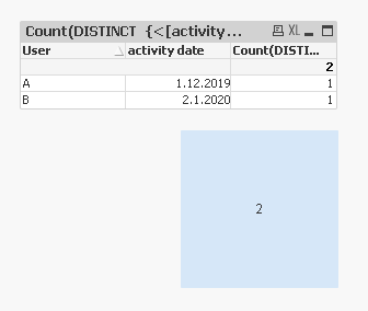
based on the above data for today the count would be 2 . user A and B have had no activity since 90 days.
I hope this is what you asked.
Please let me know if you need some more information
- Mark as New
- Bookmark
- Subscribe
- Mute
- Subscribe to RSS Feed
- Permalink
- Report Inappropriate Content
A static count make sense, but you mentioned that you want it on a line chart? That is what is confusing me. If you want this count in a text box then it would make sense.
- Mark as New
- Bookmark
- Subscribe
- Mute
- Subscribe to RSS Feed
- Permalink
- Report Inappropriate Content
Hello Sunny,
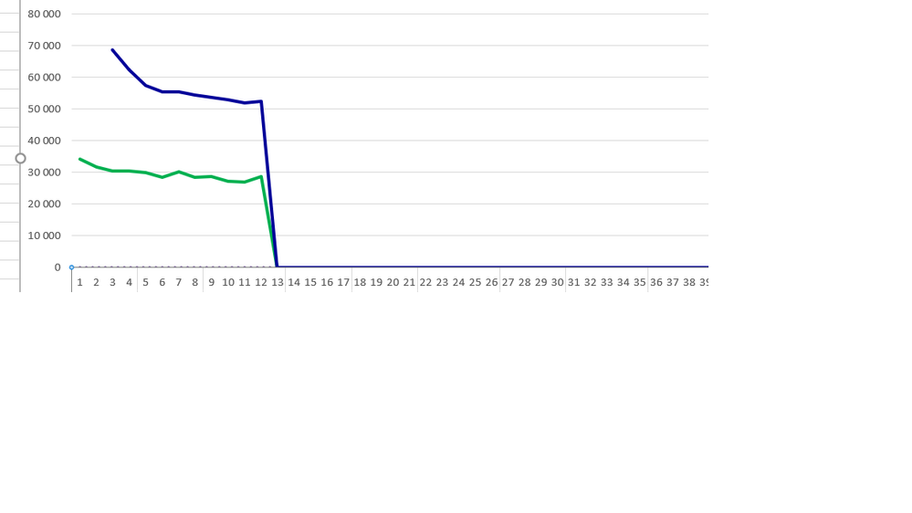
Thats what the customer has requested that they want to see the count of inactive users in a line chart for every week .
something like in the below image.
Please let me know how this can be done in the text box for selected time period.
- Mark as New
- Bookmark
- Subscribe
- Mute
- Subscribe to RSS Feed
- Permalink
- Report Inappropriate Content
I would do something like this
Count(DISTINCT {<[activity date] = {"<$(=Date(Today() - 90, 'D.M.YYYY'))"}>} User)- Mark as New
- Bookmark
- Subscribe
- Mute
- Subscribe to RSS Feed
- Permalink
- Report Inappropriate Content
Attaching a sample for you to look at
- Mark as New
- Bookmark
- Subscribe
- Mute
- Subscribe to RSS Feed
- Permalink
- Report Inappropriate Content
Thanks a lot Sunny.
Really appreciate your help.
So the line graph is not possible for this KPI?
I just wanted to confirm before i answer to the business customer
- Mark as New
- Bookmark
- Subscribe
- Mute
- Subscribe to RSS Feed
- Permalink
- Report Inappropriate Content
I just don't know where will A and B will plot on the graph? Like this?
- Mark as New
- Bookmark
- Subscribe
- Mute
- Subscribe to RSS Feed
- Permalink
- Report Inappropriate Content
Hello sunny plot should not be the individual user ...
x-axis is the date dimension and y-axis is the count of inactive users.
- « Previous Replies
-
- 1
- 2
- Next Replies »


