Unlock a world of possibilities! Login now and discover the exclusive benefits awaiting you.
- Qlik Community
- :
- All Forums
- :
- QlikView App Dev
- :
- bubble chart in qlik sense
Options
- Subscribe to RSS Feed
- Mark Topic as New
- Mark Topic as Read
- Float this Topic for Current User
- Bookmark
- Subscribe
- Mute
- Printer Friendly Page
Turn on suggestions
Auto-suggest helps you quickly narrow down your search results by suggesting possible matches as you type.
Showing results for
Creator III
2018-01-29
06:53 AM
- Mark as New
- Bookmark
- Subscribe
- Mute
- Subscribe to RSS Feed
- Permalink
- Report Inappropriate Content
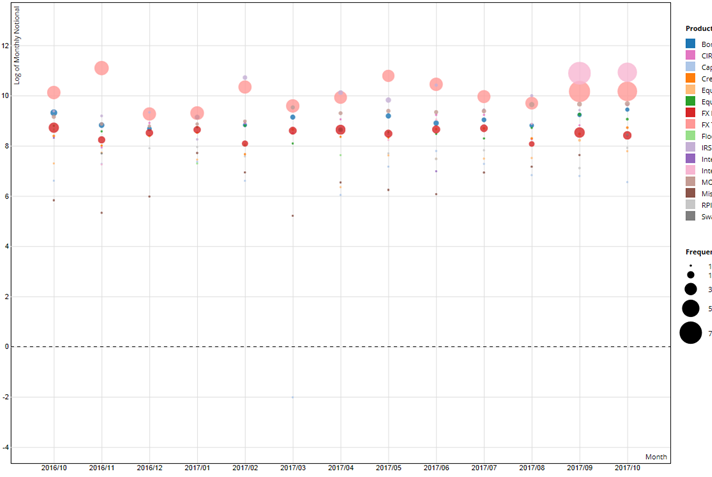
bubble chart in qlik sense
Hi ,
We are looking to build similar chart as shown in image.
x-axis: Month
y-axis: Amount
size of bubble: Freq.
Colour: Product
Interactive: Hover over bubbles for month, amount, freq. and product
Is there any extension available to build similar chart? I am not able to build using existing scatter chart in qlik sense.
2,791 Views
2 Replies
Contributor III
2018-01-29
06:56 AM
- Mark as New
- Bookmark
- Subscribe
- Mute
- Subscribe to RSS Feed
- Permalink
- Report Inappropriate Content
Please use this extension for the same:
2,324 Views
Creator III
2018-01-31
03:24 PM
- Mark as New
- Bookmark
- Subscribe
- Mute
- Subscribe to RSS Feed
- Permalink
- Report Inappropriate Content
Abhijith,
This extension allows you to choose the chart, but it lacks a lot in regards to formatting. The bubble chart for example I could not find a place for legend. Also, the bubble chart is very different, and shows the data in a sophisticated way, but in opinion not effectively.
LD
2,324 Views