Unlock a world of possibilities! Login now and discover the exclusive benefits awaiting you.
- Qlik Community
- :
- All Forums
- :
- QlikView App Dev
- :
- Problem with Chart
- Subscribe to RSS Feed
- Mark Topic as New
- Mark Topic as Read
- Float this Topic for Current User
- Bookmark
- Subscribe
- Mute
- Printer Friendly Page
- Mark as New
- Bookmark
- Subscribe
- Mute
- Subscribe to RSS Feed
- Permalink
- Report Inappropriate Content
Problem with Chart
Hi everybody,
i have a problem, how to build a bar chart of the following data:
Tables:
- partner
- tickets
- visited courses
Tableconnections:
---> tickets (partner ID)
partner (partnerID)
---> visited courses (partner ID)
The dimension of the chart shoud be the date.
The formula/graph would be:
- Amount of tickets
- Amount of visited courses
The dates are different fields of the tables "tickets" and "visited courses".
If i take the date of "tickets" as dimension, the visitied courses are only one horizontal line/bar.
The same problem otherwise.
If i make an extra table for dates and connect them to "tickets" and "visited courses", qlikview gets an circleconnection.
How can i solve this problem?
Regards
Michael
- Tags:
- chart
- Mark as New
- Bookmark
- Subscribe
- Mute
- Subscribe to RSS Feed
- Permalink
- Report Inappropriate Content
First of all, make sure that date fields in your tickets table and visited courses tables are different.
In this extra table for dates, load all possible values found in your tickets_date and visited_courses_date.
Later on, duplicate this field into 2: using the same names as in your two tables: tickets_date and visited_courses_date, avoiding the loop.
- Mark as New
- Bookmark
- Subscribe
- Mute
- Subscribe to RSS Feed
- Permalink
- Report Inappropriate Content
Hi,
thanks for your solution, but the loop is still there.
Now i have an extra table (TempKalender), where all dates are doubled (seminare_date, ticket_date).
See tablelayout:
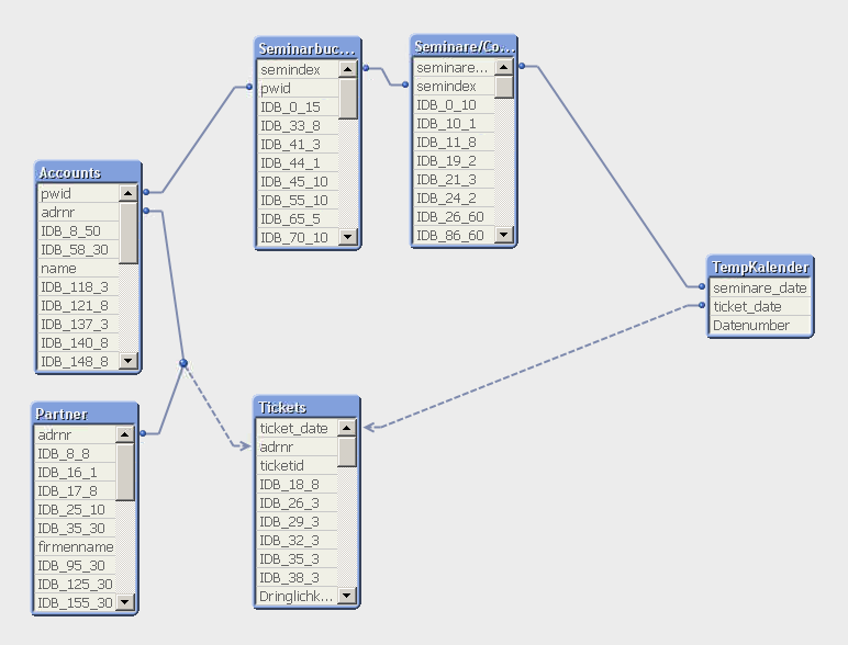
Legend (German = English):
seminare_date = visited_courses_date
Did i get you wrong?
- Mark as New
- Bookmark
- Subscribe
- Mute
- Subscribe to RSS Feed
- Permalink
- Report Inappropriate Content
Check if it makes sense to duplicate Accounts table in two different tables (assuming partners / tickets are not directly related to seminares), where Partner and Tickets tables would be linked to the first, and Seminare to the second one.
- Mark as New
- Bookmark
- Subscribe
- Mute
- Subscribe to RSS Feed
- Permalink
- Report Inappropriate Content
But then i have two Listboxes of the same Names of Partners for one Chart (if i want to select)?
The other solution may be to merge Tickets and Seminare to one Table (via SQL statement in the loading script).