Unlock a world of possibilities! Login now and discover the exclusive benefits awaiting you.
- Qlik Community
- :
- All Forums
- :
- QlikView App Dev
- :
- Need to create Report based on the 2 dimension
- Subscribe to RSS Feed
- Mark Topic as New
- Mark Topic as Read
- Float this Topic for Current User
- Bookmark
- Subscribe
- Mute
- Printer Friendly Page
- Mark as New
- Bookmark
- Subscribe
- Mute
- Subscribe to RSS Feed
- Permalink
- Report Inappropriate Content
Need to create Report based on the 2 dimension
Hi Guys
I have the Source data below
Source data
Response | ||
Nme | Field(avg) | Field2(avg) |
A | 50 | 60 |
B | 12 | 15 |
C | 20 | 40 |
D | 50 | 60 |
E | 12 | 15 |
F | 20 | 40 |
G | 50 | 60 |
H | 12 | 15 |
I | 20 | 40 |
J | 50 | 60 |
K | 12 | 15 |
L | 20 | 40 |
M | 50 | 60 |
and i want to create report as like the below screen shot (0-16) is Count
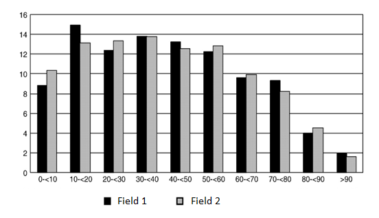
Each bar represents average of Response. please assist me on the same
- Mark as New
- Bookmark
- Subscribe
- Mute
- Subscribe to RSS Feed
- Permalink
- Report Inappropriate Content
Hi.
There is a great function class() to do that.
For one field you can create calculated dimension with aggr and count the number of records:
=aggr(Class(Avg(Field), 10), Nme)
To solve that for two fields simultaneously, I suggest transform your data into one measure form if its possible. So that instead of two measure fields you have one field for field names and one field for values. Then you can use field names as dimension and also create calculated basket dimension:
=aggr(class(Avg(Value), 10, Nme, FieldName)
- Mark as New
- Bookmark
- Subscribe
- Mute
- Subscribe to RSS Feed
- Permalink
- Report Inappropriate Content
i dont what to include the nme field in the chart, 0-16 is count of the percentage and dimension should be like same in screen shot
- Mark as New
- Bookmark
- Subscribe
- Mute
- Subscribe to RSS Feed
- Permalink
- Report Inappropriate Content
I don't tell you to include Nme in the chart.
Read the help about aggr() function and calculated dimensions.
2 dimensions: calculated dimension for baskets and dimension that contains field names (either Field1 or Field2).