Unlock a world of possibilities! Login now and discover the exclusive benefits awaiting you.
- Qlik Community
- :
- All Forums
- :
- QlikView App Dev
- :
- My pie is not working with Dimension limits set to...
- Subscribe to RSS Feed
- Mark Topic as New
- Mark Topic as Read
- Float this Topic for Current User
- Bookmark
- Subscribe
- Mute
- Printer Friendly Page
- Mark as New
- Bookmark
- Subscribe
- Mute
- Subscribe to RSS Feed
- Permalink
- Report Inappropriate Content
My pie is not working with Dimension limits set to 'show only values that accumulate to'
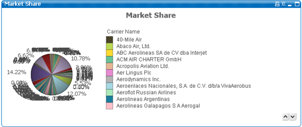
My Pie Chart – (no restrictions) – not starting at Color 1 – Sort Carrier Name A ̵ > Z
My Colors

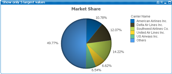
Qlikview for Developers.pdf - Pie Chart – (no restrictions) – starting at Color 1

My Pie Chart – (restrictions as below) – not starting at Color 1 – Sort Carrier Name A ̵ > Z


Qlikview for Developers.pdf - Pie Chart – (restrictions as above) – starting at Color 1

Accepted Solutions
- Mark as New
- Bookmark
- Subscribe
- Mute
- Subscribe to RSS Feed
- Permalink
- Report Inappropriate Content
Show only values that accumulate, largest values, is a bug introduced in QV12.10 SR7. It will use "smallest values" even when checking "largest".
-Rob
- Mark as New
- Bookmark
- Subscribe
- Mute
- Subscribe to RSS Feed
- Permalink
- Report Inappropriate Content
un check show others option and see
- Mark as New
- Bookmark
- Subscribe
- Mute
- Subscribe to RSS Feed
- Permalink
- Report Inappropriate Content
Hello - is persistent colors checked in another graph within the same app?
- Mark as New
- Bookmark
- Subscribe
- Mute
- Subscribe to RSS Feed
- Permalink
- Report Inappropriate Content
I unchecked the others - I'm fairly new with Qlikview - I show all the problems I can see.


My main concern is that the Dimension Limits doesn't seem to be working for 'show only values that accumulate to:'
'Show only' and 'Show only values that are' work fine

- Mark as New
- Bookmark
- Subscribe
- Mute
- Subscribe to RSS Feed
- Permalink
- Report Inappropriate Content
My main concern is that the Dimension Limits doesn't seem to be working for 'show only values that accumulate to:'
'Show only' and 'Show only values that are' work fine
- Mark as New
- Bookmark
- Subscribe
- Mute
- Subscribe to RSS Feed
- Permalink
- Report Inappropriate Content
- Since dimensions used in a aggr() function will always be sorted by load order
Create a Straight Table using Carrier Name as Dimension and Sum ([# Transported Passengers]) as Expression. Sort the table by Sum ([# Transported Passengers]) Numeric Value descending. Send the sorted file to Excel and rename the fields.
- Load the file
- Create your Pie Chart - Showing only values that accumulate to 50% relative to the total
Add the following Calculated Dimension -
=If(Aggr(RangeSum(Above(Sum([# Pie Transported Passengers]),0,RowNo()))/Sum(TOTAL [# Pie Transported Passengers]), [Pie Carrier Name])<= 0.51, [Pie Carrier Name], 'Others')
Add the following Expressions -
Sum ([# Pie Transported Passengers]) – Select Relative and Value on Data Points
if(Count (DISTINCT [Pie Carrier Name]) = 1, [Pie Carrier Name], 'Others') – Select Value on Data Points
Result

I got my ideas mainly from

- Mark as New
- Bookmark
- Subscribe
- Mute
- Subscribe to RSS Feed
- Permalink
- Report Inappropriate Content
I'm sure this question has been posted and answered somewhere else before - but I can't seem to figure it out.
Is there a way that I can select the 'Others' color from 'Special Segments' under Colors to show with my manually calculated 'Others' pie slice.
If not maybe someone can guide me how to set a specific color form my 'Others' pie slice.
- Mark as New
- Bookmark
- Subscribe
- Mute
- Subscribe to RSS Feed
- Permalink
- Report Inappropriate Content
Show only values that accumulate, largest values, is a bug introduced in QV12.10 SR7. It will use "smallest values" even when checking "largest".
-Rob
- Mark as New
- Bookmark
- Subscribe
- Mute
- Subscribe to RSS Feed
- Permalink
- Report Inappropriate Content
Thank You Rob