Unlock a world of possibilities! Login now and discover the exclusive benefits awaiting you.
- Qlik Community
- :
- All Forums
- :
- QlikView App Dev
- :
- Ignore filter pane selection when multiple charts ...
- Subscribe to RSS Feed
- Mark Topic as New
- Mark Topic as Read
- Float this Topic for Current User
- Bookmark
- Subscribe
- Mute
- Printer Friendly Page
- Mark as New
- Bookmark
- Subscribe
- Mute
- Subscribe to RSS Feed
- Permalink
- Report Inappropriate Content
Ignore filter pane selection when multiple charts on sheet
Good afternoon
Very new to this so please excuse my ignorance.
I am currently playing with a horse racing data set and on a sheet, I have two filter panes: course, distance.
Also on the page I have a pie chart that uses the following set analysis to the results by favouritism rank:
Count({<WIN_LOSE={1}>}EVENT_ID)
So for example, if I want to look at the at the % of favourites who have won in a group 1
race at Ascot, I see the following:
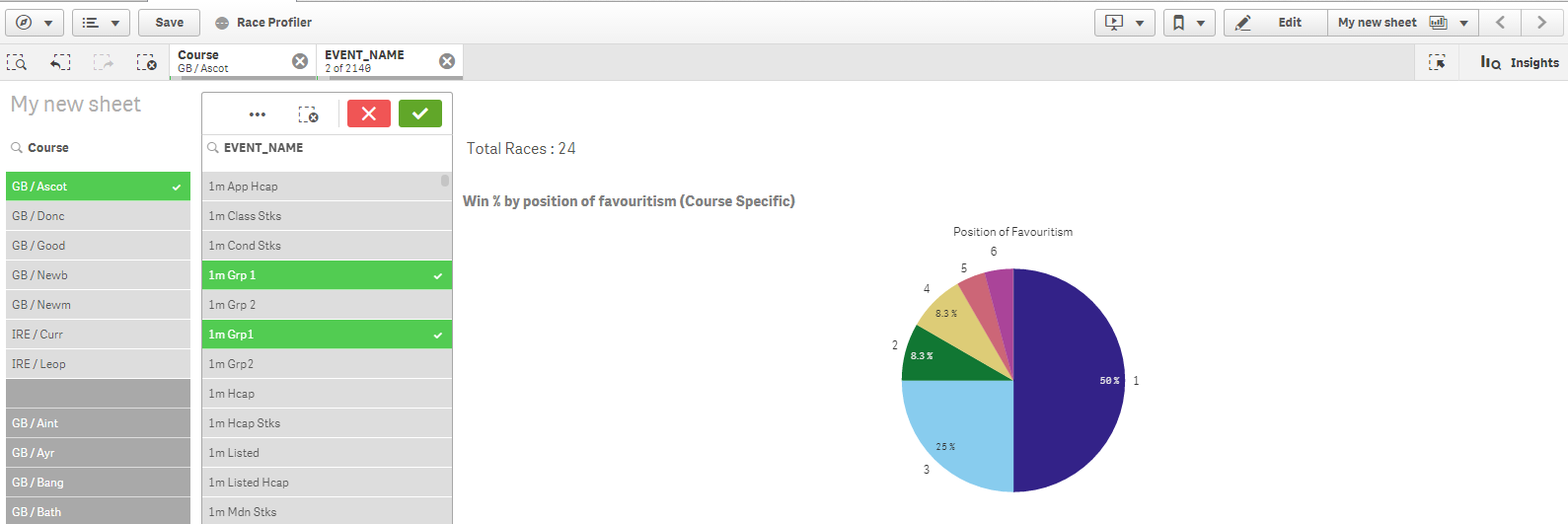
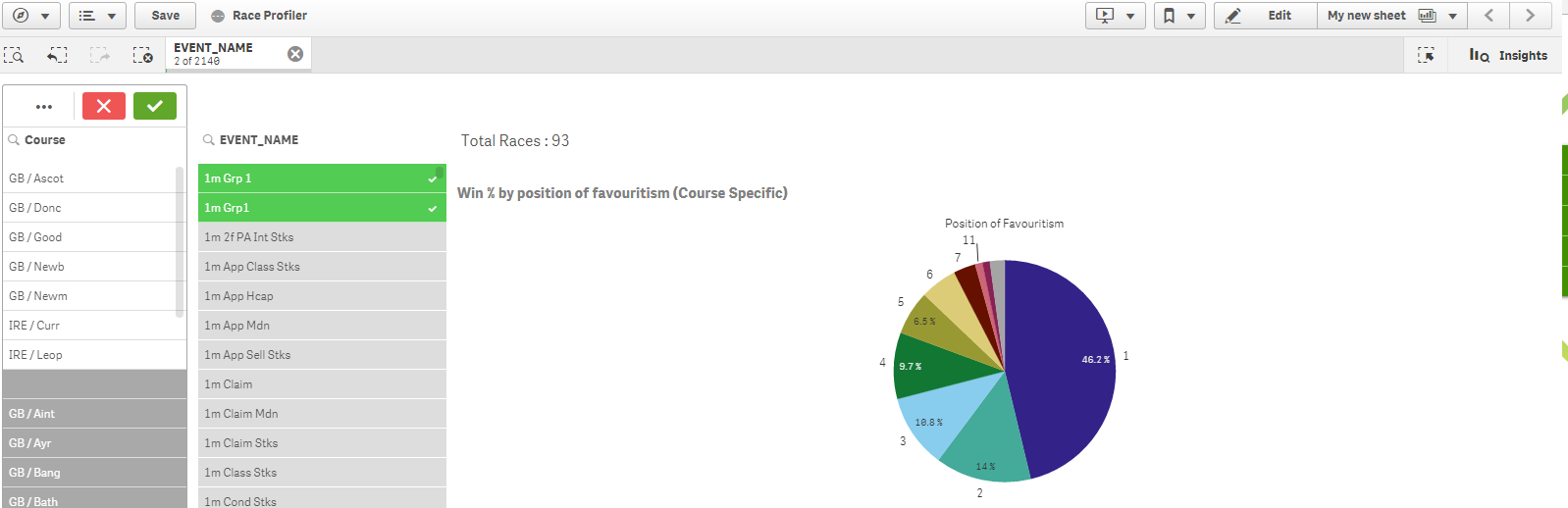
What I would like to do is have another comparative pie chart alongside this which effectively excludes the course filter and displays group 1 wins for all courses i.e. ignoring the course selection so effectively this chart would be produced along side the above example:
Is this possible? I suspect it would be but may involve changing the set analysis on one of the charts to ignore the course filter.
Any help, gratefully received.
Accepted Solutions
- Mark as New
- Bookmark
- Subscribe
- Mute
- Subscribe to RSS Feed
- Permalink
- Report Inappropriate Content
Perhaps like this: Count({<Course=, WIN_LOSE={1}>}EVENT_ID)
talk is cheap, supply exceeds demand
- Mark as New
- Bookmark
- Subscribe
- Mute
- Subscribe to RSS Feed
- Permalink
- Report Inappropriate Content
Perhaps like this: Count({<Course=, WIN_LOSE={1}>}EVENT_ID)
talk is cheap, supply exceeds demand
- Mark as New
- Bookmark
- Subscribe
- Mute
- Subscribe to RSS Feed
- Permalink
- Report Inappropriate Content
Hello Gysbert
You are indeed correct. I knew it was going to be simple and now I feel like an idiot. Thank you very much for your help and have a great weekend.