Unlock a world of possibilities! Login now and discover the exclusive benefits awaiting you.
- Qlik Community
- :
- All Forums
- :
- QlikView App Dev
- :
- How to add values in a pie chart with different co...
- Subscribe to RSS Feed
- Mark Topic as New
- Mark Topic as Read
- Float this Topic for Current User
- Bookmark
- Subscribe
- Mute
- Printer Friendly Page
- Mark as New
- Bookmark
- Subscribe
- Mute
- Subscribe to RSS Feed
- Permalink
- Report Inappropriate Content
How to add values in a pie chart with different colors
Hi,
I have a pie chart with one dimension and one expression.
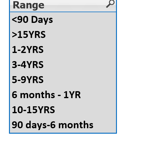
My dimension having 8 values with different date ranges like <90days,6months to 1yr,>1Year, >2Years up to 15 Years.
Now i can see 8 segments in pie chart with different colors.
I want to show sum of these values( <90days , 6months to 1yr,>1Year) in one segment and rest of 5 values in other 5 segments.
How can i add these 3 in the pie chart? i want to display 3%, 3% and 16% together in one segement with same color like 22%
Can anyone help
Accepted Solutions
- Mark as New
- Bookmark
- Subscribe
- Mute
- Subscribe to RSS Feed
- Permalink
- Report Inappropriate Content
OK, same approaches, but with your actual ranges and field name.
[Date Range Group]:
LOAD * INLINE [
Date Range Group,Range
<1YR,<90 Days
<1YR,90 days-6 months
<1YR,6 months - 1 YR
1-2YRS,1-2YRS
3-4YRS,3-4YRS
5-9YRS,5-9YRS
10-15YRS,10-15YRS
>15YRS,>15YRS
];
Or:
=if(match([Range],'<90 Days','90 days-6 months','6 months - 1YR'),'<1YR',[Range])
- Mark as New
- Bookmark
- Subscribe
- Mute
- Subscribe to RSS Feed
- Permalink
- Report Inappropriate Content
I'm unclear what your 8 values are, so this won't be exact, but use a new table to group them as desired, like:
[Date Range Group]:
LOAD * INLINE [
Date Range Group, Date Range
Other, >15YRS
Other, >10-15YRS
Other, >5-10YRS
>2-5YRS, >2-5YRS
>1-2YRS, >1-2YRS
6months to 1yr, 6months to 1yr
3-<6months, 3-<6months
<3months, <3months
];
Then use Date Range Group as your dimension instead of Date Range.
Could probably also be done with a calculated dimension:
=if(match([Date Range],'>15YRS','>10-15YRS','>5-10YRS'),'Other',[Date Range])
- Mark as New
- Bookmark
- Subscribe
- Mute
- Subscribe to RSS Feed
- Permalink
- Report Inappropriate Content
Hi John, Thanks for reply.
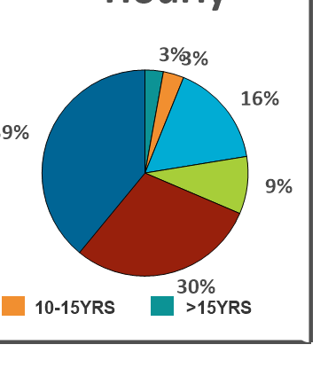
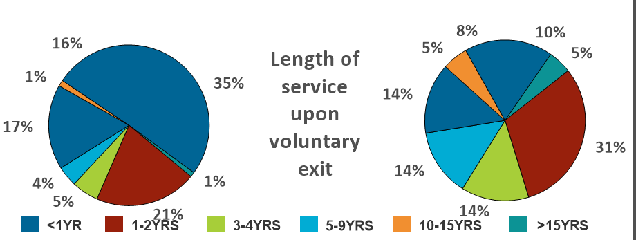
My Dimension is the below one Range. and o/p is below pie.The blue color segment having the values of <90days,90days to 6months and 6months- 1yr.I want to combine these three values and want to display as 68% in Blue color [1st Pie chart]
- Mark as New
- Bookmark
- Subscribe
- Mute
- Subscribe to RSS Feed
- Permalink
- Report Inappropriate Content
OK, same approaches, but with your actual ranges and field name.
[Date Range Group]:
LOAD * INLINE [
Date Range Group,Range
<1YR,<90 Days
<1YR,90 days-6 months
<1YR,6 months - 1 YR
1-2YRS,1-2YRS
3-4YRS,3-4YRS
5-9YRS,5-9YRS
10-15YRS,10-15YRS
>15YRS,>15YRS
];
Or:
=if(match([Range],'<90 Days','90 days-6 months','6 months - 1YR'),'<1YR',[Range])
- Mark as New
- Bookmark
- Subscribe
- Mute
- Subscribe to RSS Feed
- Permalink
- Report Inappropriate Content
Thanks John,
Its working fine.