Unlock a world of possibilities! Login now and discover the exclusive benefits awaiting you.
- Qlik Community
- :
- All Forums
- :
- QlikView App Dev
- :
- How to Set chart axis..
- Subscribe to RSS Feed
- Mark Topic as New
- Mark Topic as Read
- Float this Topic for Current User
- Bookmark
- Subscribe
- Mute
- Printer Friendly Page
- Mark as New
- Bookmark
- Subscribe
- Mute
- Subscribe to RSS Feed
- Permalink
- Report Inappropriate Content
How to Set chart axis..
Hi Folks,
i have a query like relation 3 columns , those needs to be displayed in chart.
execdate availability type
01 jan 78 Type1
02 jan 87 Type1
01 jan 65 Type1
03 jan 82 Type1
01 jan 75 Type2
04 jan 82 Type2
05 jan 74 Type2
03 jan 81 Type2
now i want to plot a chart like
x- axis : exec date
y axis : availability
graph should be a line graph it should draw line like the availability for the exec date against type
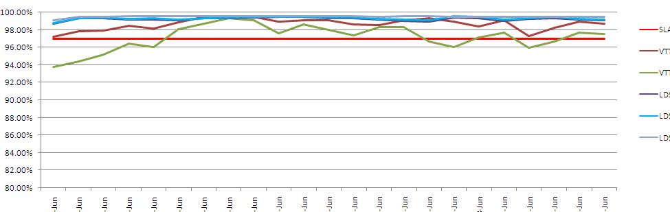
kindly find the attached image for reference.
qlikquery : Chart obtained in qlikview
Expected chart : Expected Chart
For me i was unable to keep exec date in x-axis and availability in y axis. please advice the necessary to achieve this.
Thanks in Advance...
With Regards
Deepak Subramoniam
- Mark as New
- Bookmark
- Subscribe
- Mute
- Subscribe to RSS Feed
- Permalink
- Report Inappropriate Content
What is the expression that you have used here?
- Mark as New
- Bookmark
- Subscribe
- Mute
- Subscribe to RSS Feed
- Permalink
- Report Inappropriate Content
Hi,
one solution might be:
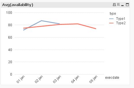
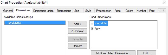
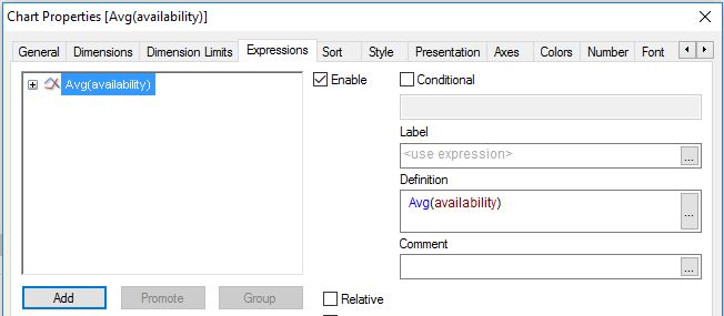
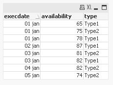
table1:
LOAD Date#(execdate,'DD MMM') as execdate,
    availability,
    type
INLINE [
    execdate, availability, type
    01 jan, 78, Type1
    02 jan, 87, Type1
    01 jan, 65, Type1
    03 jan, 82, Type1
    01 jan, 75, Type2
    04 jan, 82, Type2
    05 jan, 74, Type2
    03 jan, 81, Type2
];
hope this helps
regards
Marco
- Mark as New
- Bookmark
- Subscribe
- Mute
- Subscribe to RSS Feed
- Permalink
- Report Inappropriate Content
Dear Marco Wedel
Thanks a lot its working , the graph was only visible only for average expression , if i change the expression to only value , then graph was not displaying instead the chart area was dispayed with a text like "No data to display".
Thanks in Advance...
With Regards
Deepak Subramoniam
- Mark as New
- Bookmark
- Subscribe
- Mute
- Subscribe to RSS Feed
- Permalink
- Report Inappropriate Content
glad it worked.
please close your thread if your question is answered (by marking an answer correct)
thanks
regards
Marco