Unlock a world of possibilities! Login now and discover the exclusive benefits awaiting you.
- Qlik Community
- :
- All Forums
- :
- QlikView App Dev
- :
- Hide/change colour on stacked bar segments, to get...
- Subscribe to RSS Feed
- Mark Topic as New
- Mark Topic as Read
- Float this Topic for Current User
- Bookmark
- Subscribe
- Mute
- Printer Friendly Page
- Mark as New
- Bookmark
- Subscribe
- Mute
- Subscribe to RSS Feed
- Permalink
- Report Inappropriate Content
Hide/change colour on stacked bar segments, to get "Floating bars"
Hi all,
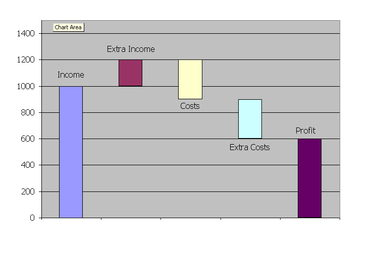
I want to be able to make a stacked bar chart for show the movement in profits per month, where I can show the effect of each P&L line on profit.
In Excel, I can easily change the segment settings to show no lines or colour, but I have no idea how to do this in QV (see the example below for reference)
Any suggestions?
- Tags:
- chart
Accepted Solutions
- Mark as New
- Bookmark
- Subscribe
- Mute
- Subscribe to RSS Feed
- Permalink
- Report Inappropriate Content
Hi,
Do you have 2 expressions?if so
Use invisible option for that expression(which has the limit).
or
use Bar offset you find that on clicking the + icon of the expression.
Celambarasan
- Mark as New
- Bookmark
- Subscribe
- Mute
- Subscribe to RSS Feed
- Permalink
- Report Inappropriate Content
Hi,
Do you have 2 expressions?if so
Use invisible option for that expression(which has the limit).
or
use Bar offset you find that on clicking the + icon of the expression.
Celambarasan
- Mark as New
- Bookmark
- Subscribe
- Mute
- Subscribe to RSS Feed
- Permalink
- Report Inappropriate Content
The invisible option wasn't possible for the effect I wanted, but Bar Offset certainly was.
Thanks Celambarasan