Unlock a world of possibilities! Login now and discover the exclusive benefits awaiting you.
- Qlik Community
- :
- All Forums
- :
- QlikView App Dev
- :
- Hi, I am completely new to Qlik and trialing it fo...
- Subscribe to RSS Feed
- Mark Topic as New
- Mark Topic as Read
- Float this Topic for Current User
- Bookmark
- Subscribe
- Mute
- Printer Friendly Page
- Mark as New
- Bookmark
- Subscribe
- Mute
- Subscribe to RSS Feed
- Permalink
- Report Inappropriate Content
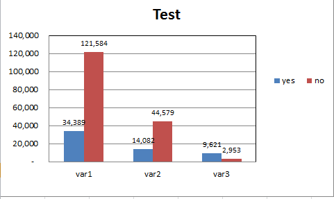
Hi, I am completely new to Qlik and trialing it for my workplace. I did the below chart in excel from a summarised table. An example of the raw data is shown in the table below. I am an excel and Tableau user an am struggling to create this in Qlikview
- « Previous Replies
-
- 1
- 2
- Next Replies »
Accepted Solutions
- Mark as New
- Bookmark
- Subscribe
- Mute
- Subscribe to RSS Feed
- Permalink
- Report Inappropriate Content
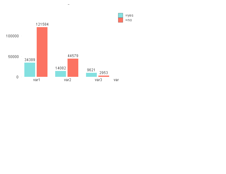
It is something like this you had in mind then? I created two calculated dimensions for Vars and Answers (yes/no) and just made some random numbers to show for each value since I don't have any data source to use:

- Mark as New
- Bookmark
- Subscribe
- Mute
- Subscribe to RSS Feed
- Permalink
- Report Inappropriate Content
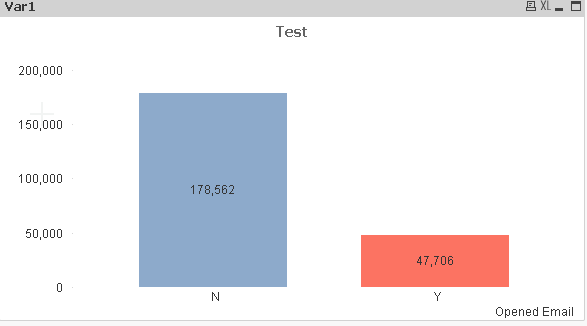
What I am trying to do is plot counts of var1, var2 and var 3 by the legend value as above.
One of the things I am trying to plot is where var 1 is > 0. I have made some progress but the zero's are still being included.
This is what I have in my conditional statement in the expressions tab: count([#var1]> 0) but it isn't working.
Below is where I am at with my chart which is still including zero values.
- Mark as New
- Bookmark
- Subscribe
- Mute
- Subscribe to RSS Feed
- Permalink
- Report Inappropriate Content
attach your data source it can created in qlik
Vikas
If the issue is solved please mark the answer with Accept as Solution & like it.
If you want to go quickly, go alone. If you want to go far, go together.
- Mark as New
- Bookmark
- Subscribe
- Mute
- Subscribe to RSS Feed
- Permalink
- Report Inappropriate Content
Hi,
Please share the data file.
- Mark as New
- Bookmark
- Subscribe
- Mute
- Subscribe to RSS Feed
- Permalink
- Report Inappropriate Content
Hi,
Can you attach some raw data so that it would be easier to provide the solution.
Regards,
jagan.
- Mark as New
- Bookmark
- Subscribe
- Mute
- Subscribe to RSS Feed
- Permalink
- Report Inappropriate Content
It is something like this you had in mind then? I created two calculated dimensions for Vars and Answers (yes/no) and just made some random numbers to show for each value since I don't have any data source to use:
- Mark as New
- Bookmark
- Subscribe
- Mute
- Subscribe to RSS Feed
- Permalink
- Report Inappropriate Content
follow the below process
1)New sheet Objects-->Charts-->select bar chart ![]()
2)click next-->add dimension(Field of(Var1,var2,var3))
3)add two expressions-->>=yes and select value on data points
-->=No and select value on data points
- Mark as New
- Bookmark
- Subscribe
- Mute
- Subscribe to RSS Feed
- Permalink
- Report Inappropriate Content
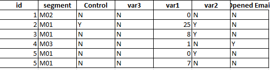
Hi, just trying to load the data but can't see how to, sorry.
I am trying to measure if an email sent affected var1, var2 and var3
var1 - I only want counts of values > 0
var2 and var3 - I only want counts of 'Y'
I also will have a list box for status which I will be filtering on.
Here is the data sample again:
| ID | Cell Name | Status | var1 | var2 | var3 | Opened Email |
| 1 | M02 | 7 | 6 | N | N | N |
| 2 | M01 | 7 | 5 | Y | N | N |
| 3 | M01 | 7 | 5 | Y | N | N |
| 4 | M03 | 7 | 0 | N | N | N |
| 5 | M01 | 7 | 18 | Y | N | N |
| 6 | M01 | 7 | 3 | N | N | N |
| 7 | M01 | 7 | 51 | Y | Y | N |
| 8 | M02 | 7 | 6 | Y | N | Y |
| 9 | M05 | 7 | 2 | Y | N | N |
| 10 | M02 | 7 | 4 | Y | N | N |
- Mark as New
- Bookmark
- Subscribe
- Mute
- Subscribe to RSS Feed
- Permalink
- Report Inappropriate Content
Hi, thanks for your response. Please see my comments above to Petter.
The Yes/No is derived from another variable and I have conditions for my counts.
- Mark as New
- Bookmark
- Subscribe
- Mute
- Subscribe to RSS Feed
- Permalink
- Report Inappropriate Content
Sorry, cant see how to attach it.
- « Previous Replies
-
- 1
- 2
- Next Replies »