Unlock a world of possibilities! Login now and discover the exclusive benefits awaiting you.
- Qlik Community
- :
- All Forums
- :
- QlikView App Dev
- :
- Gauge Chart won't show the correct segment lower b...
- Subscribe to RSS Feed
- Mark Topic as New
- Mark Topic as Read
- Float this Topic for Current User
- Bookmark
- Subscribe
- Mute
- Printer Friendly Page
- Mark as New
- Bookmark
- Subscribe
- Mute
- Subscribe to RSS Feed
- Permalink
- Report Inappropriate Content
Gauge Chart won't show the correct segment lower bound values
Hi all,
I am struggling with this problem for a few hours: My segments have the following ranges defined in the lower bounds:
Yellow: 14 - 18.5
Green: 18.5 - 25
Orange: 25 - 30
Red: 30 - 37
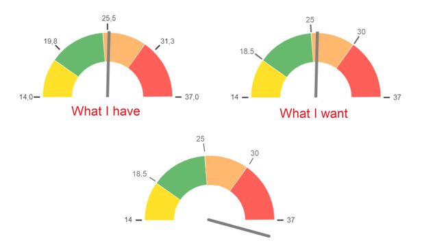
It presents me some unwanted boundaries (19,8 25,5 31,3). I would like to see the lower bounderies.
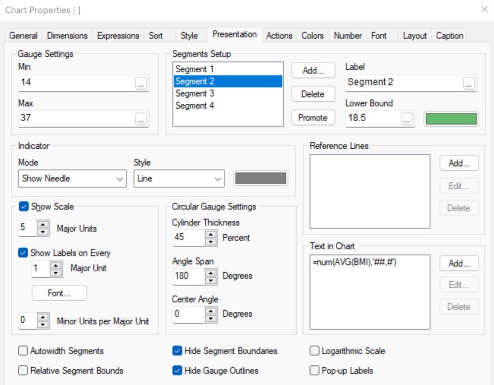
And is it possible to create a gauge as shown as the 3rd? The measurement goes 'wild' or just beyond the 180 degree presentation of the range? Just to show: 'off the charts'? These are my presentation settings:
Thanks in advance.
Accepted Solutions
- Mark as New
- Bookmark
- Subscribe
- Mute
- Subscribe to RSS Feed
- Permalink
- Report Inappropriate Content
Hi MrBosch,
In as much as your ranges aren't equal I don't see how you can create the chart to show the boundaries. The gauge chart will equally distribute the displayed values. I would suggest making the ranges equal, if your requirements aren't set in stone, and adjust the scales if necessary.
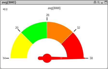
For the second request, I also don't see the pointer going beyond whatever Max gauge value you set it to. What you could try is making the pointer red or some other color if the avg(BMI) is greater than 37. Since the Max value can be an expression this too can by dynamic. One example: if(avg(BMI)>37,rgb(255,0,0))
HTH,
John
(aka johncaqc)
- Mark as New
- Bookmark
- Subscribe
- Mute
- Subscribe to RSS Feed
- Permalink
- Report Inappropriate Content
Hi John,
Thanks for your answer. The fact that indeed the ranges are not equally distributed must have been the root cause for the weird-values-problem. Unfortunately the segment borders are carved in stone for this field so I do need a solution for that. But... your reply also made me think... and: tadaa!
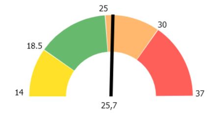
What I did was turn off all scale and (auto) segment indicators and just simply added the 5 lower-bound-and min-max-segment-values as 'Text in Chart'-numbers and then control+shift moved and placed them into the correct position.
[Sidenote for all those who will get an incorrect reading of the needle when no selection is made (and the gauge chart was created as 'Create Quick Chart' based upon a field) --> just remove the dimension (Tab: Dimensions on Chart Properties: leave empty) and all will be fine.]
Hope this might benefit someone someday.
- Mark as New
- Bookmark
- Subscribe
- Mute
- Subscribe to RSS Feed
- Permalink
- Report Inappropriate Content
Hi MrBosch,
In as much as your ranges aren't equal I don't see how you can create the chart to show the boundaries. The gauge chart will equally distribute the displayed values. I would suggest making the ranges equal, if your requirements aren't set in stone, and adjust the scales if necessary.
For the second request, I also don't see the pointer going beyond whatever Max gauge value you set it to. What you could try is making the pointer red or some other color if the avg(BMI) is greater than 37. Since the Max value can be an expression this too can by dynamic. One example: if(avg(BMI)>37,rgb(255,0,0))
HTH,
John
(aka johncaqc)
- Mark as New
- Bookmark
- Subscribe
- Mute
- Subscribe to RSS Feed
- Permalink
- Report Inappropriate Content
Hi John,
Thanks for your answer. The fact that indeed the ranges are not equally distributed must have been the root cause for the weird-values-problem. Unfortunately the segment borders are carved in stone for this field so I do need a solution for that. But... your reply also made me think... and: tadaa!
What I did was turn off all scale and (auto) segment indicators and just simply added the 5 lower-bound-and min-max-segment-values as 'Text in Chart'-numbers and then control+shift moved and placed them into the correct position.
[Sidenote for all those who will get an incorrect reading of the needle when no selection is made (and the gauge chart was created as 'Create Quick Chart' based upon a field) --> just remove the dimension (Tab: Dimensions on Chart Properties: leave empty) and all will be fine.]
Hope this might benefit someone someday.


