Unlock a world of possibilities! Login now and discover the exclusive benefits awaiting you.
- Qlik Community
- :
- All Forums
- :
- QlikView App Dev
- :
- Doubt to create a Chart
- Subscribe to RSS Feed
- Mark Topic as New
- Mark Topic as Read
- Float this Topic for Current User
- Bookmark
- Subscribe
- Mute
- Printer Friendly Page
- Mark as New
- Bookmark
- Subscribe
- Mute
- Subscribe to RSS Feed
- Permalink
- Report Inappropriate Content
Doubt to create a Chart
Dear All,
I am new in Qlikview, and still learning how to create graphics.
I need some help to create a line chart that contain in Dimension the Date in weeks, and the Expression is the Sum of Hectares.
The difficult part is that, I need to create 2 lines graphic ( Plan and Actual) and the dates are in different columns but in the same line.
As displayed here:
| Field | Planned Week Sowing Date | Real Week Sowing Date | Hectares |
| 1 | 18/08/2014 | 25/08/2014 | 40 |
| 2 | 18/08/2014 | 25/08/2014 | 50 |
| 3 | 25/08/2014 | 25/08/2014 | 24 |
| 4 | 01/09/2014 | 01/09/2014 | 65 |
| 5 | 01/09/2014 | 08/09/2014 | 84 |
| 6 | 08/09/2014 | 08/09/2014 | 75 |
| 7 | 08/09/2014 | 15/09/2014 | 85 |
| 8 | 15/09/2014 | 22/09/2014 | 96 |
| 9 | 15/09/2014 | 15/09/2014 | 85 |
| 10 | 15/09/2014 | 13/10/2014 | 100 |
In Excel this is the table I should have to create the graphic. (Pivot Table)
| Date | Plan | Actual |
| 18/08/2014 | 90 | |
| 25/08/2014 | 24 | 114 |
| 01/09/2014 | 149 | 65 |
| 08/09/2014 | 160 | 159 |
| 15/09/2014 | 281 | 170 |
| 22/09/2014 | 96 | |
| 13/10/2014 | 100 |
And the graphic I need to create is something similar to:
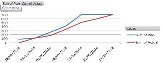
I created the a new column (Week Total) will all my dates, and created the Dimension:
=date(if([Week Total]=[Planned Week Sowing Date] or [Week Total]=[Real Week Sowing Date],[Week Total],))
Now I need to create the conditional or definition from my expression.
Can someone help me to create this?
- Tags:
- new_to_qlikview
Accepted Solutions
- Mark as New
- Bookmark
- Subscribe
- Mute
- Subscribe to RSS Feed
- Permalink
- Report Inappropriate Content
You can use CROSSTABLE LOAD prefix in the script:
CROSSTABLE (Week, Type, 2)
LOAD Field, Hectares, [Planned Week Sowing Date] AS Plan, [Real Week Sowing Date] as Actual
FROM YourTable;
This should result in a data table with four fields, Field, Hectares, Week, Type.
Then create a chart with dimensions Week and Type
and as expression
=Sum(Hectares)
- Mark as New
- Bookmark
- Subscribe
- Mute
- Subscribe to RSS Feed
- Permalink
- Report Inappropriate Content
Thank you for your quick answer. It works perfectly.
Just one more doubt.
In case that I want to "Hide" or "Make it invisible" the line of Actual when Dates>(TODAY)?
Is it possible?
Thank you
- Mark as New
- Bookmark
- Subscribe
- Mute
- Subscribe to RSS Feed
- Permalink
- Report Inappropriate Content
Do you want to filter the values in the script or in the chart?
In the script, you can load your resident table with a WHERE clause:
C1:
CROSSTABLE (Type, Week, 2)
LOAD Field, Hectares, [Planned Week Sowing Date] AS Plan, [Real Week Sowing Date] as Actual
FROM YourTable;
TABLE:
NOCONCATENATE
LOAD * RESIDENT C1
WHERE Type ='Plan' OR Week <= Today();
DROP TABLE C1;
In the chart, you can use something like
=sum(if( Type ='Plan' or Week <= Today(), Hectares))
- Mark as New
- Bookmark
- Subscribe
- Mute
- Subscribe to RSS Feed
- Permalink
- Report Inappropriate Content
Hi,
It is more interesting for me to filter on the Graphic, but the point is that I don´t want to filter both lines. In other words the PLAN should be till the end, and the line of the Real should be only till the Today() date.
What is happening is that my line is going till the Today() date and than jumping in a unique line to my End date.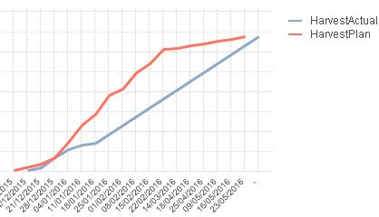
If I add you suggestion it will only filter the "X" axis and will only display till the 25/01/16. But then I lose my Plan view on a longer forecast.
Any suggestion???
Thanks
- Mark as New
- Bookmark
- Subscribe
- Mute
- Subscribe to RSS Feed
- Permalink
- Report Inappropriate Content
I your attached screenshot, it seems that your rightmost x-axis value is NULL. Try enabling 'Suppress When Value is NULL' on dimension tab.
- Mark as New
- Bookmark
- Subscribe
- Mute
- Subscribe to RSS Feed
- Permalink
- Report Inappropriate Content
Thank you swuehl. That worked.