Unlock a world of possibilities! Login now and discover the exclusive benefits awaiting you.
- Qlik Community
- :
- All Forums
- :
- QlikView App Dev
- :
- Bubble Chart help
- Subscribe to RSS Feed
- Mark Topic as New
- Mark Topic as Read
- Float this Topic for Current User
- Bookmark
- Subscribe
- Mute
- Printer Friendly Page
- Mark as New
- Bookmark
- Subscribe
- Mute
- Subscribe to RSS Feed
- Permalink
- Report Inappropriate Content
Bubble Chart help
Hi Everyone,
It is my first assistance request in this community. I have just started trying out Qlikview for my company and my first challenge is below.
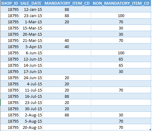
The sample data below is only showing 1 shop_id out of thousands. What I would like to achieve is a bubble chart that shows the score average of each ITEM_CD by the count ITEM_CD in any particular month.
The expected result will show in the month the percentage of each ITEM_CD and the total ITEMS for the month. We can also visually see Where both mandatory and non-mandatory were sold in the month.
I have attached an excel sample below.
Thanks a lot in advance for you assistance.
Eric
Accepted Solutions
- Mark as New
- Bookmark
- Subscribe
- Mute
- Subscribe to RSS Feed
- Permalink
- Report Inappropriate Content
Like this
- Mark as New
- Bookmark
- Subscribe
- Mute
- Subscribe to RSS Feed
- Permalink
- Report Inappropriate Content
Like this