Unlock a world of possibilities! Login now and discover the exclusive benefits awaiting you.
- Qlik Community
- :
- All Forums
- :
- QlikView App Dev
- :
- Average Trend Line in Bar Chart
- Subscribe to RSS Feed
- Mark Topic as New
- Mark Topic as Read
- Float this Topic for Current User
- Bookmark
- Subscribe
- Mute
- Printer Friendly Page
- Mark as New
- Bookmark
- Subscribe
- Mute
- Subscribe to RSS Feed
- Permalink
- Report Inappropriate Content
Average Trend Line in Bar Chart
Dear All,
I know there is a Reference Line, but that is not what I am looking for.
What I want is a line with average data points for any year for the whole company group additionally in the bar chart (see graphic).
Is that possible?
See attached qvw.
- « Previous Replies
-
- 1
- 2
- Next Replies »
Accepted Solutions
- Mark as New
- Bookmark
- Subscribe
- Mute
- Subscribe to RSS Feed
- Permalink
- Report Inappropriate Content
I guess it has to do with 1 expression vs. 2 expression. When we have 1 expression each dimensions pick up a different color, but with two the colors are distributed across the expression, instead of within the expression. You can use if statement to get this fixed.
Something like this:
=If(Avg(1) > 0, LightMagenta(), LightGray())
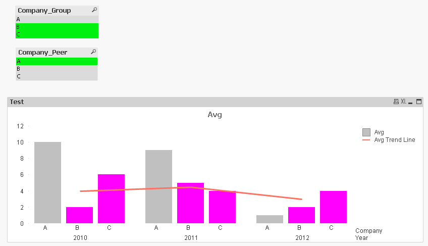
UPDATE: So here we have LightGray for Peer companies and LightMagenta for companies.
- Mark as New
- Bookmark
- Subscribe
- Mute
- Subscribe to RSS Feed
- Permalink
- Report Inappropriate Content
Something like this?
- Mark as New
- Bookmark
- Subscribe
- Mute
- Subscribe to RSS Feed
- Permalink
- Report Inappropriate Content
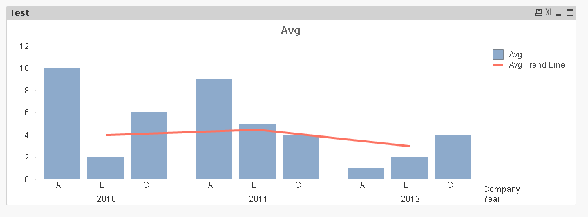
Close, I have removed Company_Peer for the trend line.
But why is it not colored for any company as before and shown in the legend?
- Mark as New
- Bookmark
- Subscribe
- Mute
- Subscribe to RSS Feed
- Permalink
- Report Inappropriate Content
I guess it has to do with 1 expression vs. 2 expression. When we have 1 expression each dimensions pick up a different color, but with two the colors are distributed across the expression, instead of within the expression. You can use if statement to get this fixed.
Something like this:
=If(Avg(1) > 0, LightMagenta(), LightGray())
UPDATE: So here we have LightGray for Peer companies and LightMagenta for companies.
- Mark as New
- Bookmark
- Subscribe
- Mute
- Subscribe to RSS Feed
- Permalink
- Report Inappropriate Content
Is there no other solution or workaround?
I would like to have different colours as defined in the colormap. I have a lot of companies so I think using an if statement is not a good idea.
Second, as I have longer company names than A,B,C I would like to display them in the legend.
- Mark as New
- Bookmark
- Subscribe
- Mute
- Subscribe to RSS Feed
- Permalink
- Report Inappropriate Content
I guess the only other way I can imagine is to use two charts overlapping each other
- Mark as New
- Bookmark
- Subscribe
- Mute
- Subscribe to RSS Feed
- Permalink
- Report Inappropriate Content
Consequence is that I cannot copy the chart as one image to clipboard, right?
- Mark as New
- Bookmark
- Subscribe
- Mute
- Subscribe to RSS Feed
- Permalink
- Report Inappropriate Content
Yes and some other such as scrolling won't work... etc
- Mark as New
- Bookmark
- Subscribe
- Mute
- Subscribe to RSS Feed
- Permalink
- Report Inappropriate Content
That is too bad 😞
Is there a function for the if statement using colour map consecutively?
- Mark as New
- Bookmark
- Subscribe
- Mute
- Subscribe to RSS Feed
- Permalink
- Report Inappropriate Content
Here is a dynamic way to assign color to companies using ColorMix Wizard. Legend is still a problem 
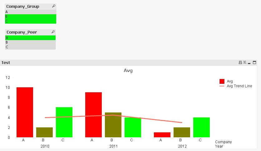
ColorMix1 ((1+Sign(2*(RangeSum(Above(Count({<Company=p(Company)>+<Company=p(Company_Peer)>}Company), 0, RowNo()))-RangeMin (top(total RangeSum(Above(Count({<Company=p(Company)>+<Company=p(Company_Peer)>}Company), 0, RowNo())),1,NoOfRows(total))))/(RangeMax (top(total RangeSum(Above(Count({<Company=p(Company)>+<Company=p(Company_Peer)>}Company), 0, RowNo())),1,NoOfRows(total)))-RangeMin (top(total RangeSum(Above(Count({<Company=p(Company)>+<Company=p(Company_Peer)>}Company), 0, RowNo())),1,NoOfRows(total))))-1)*Sqrt(Fabs((2*(RangeSum(Above(Count({<Company=p(Company)>+<Company=p(Company_Peer)>}Company), 0, RowNo()))-RangeMin (top(total RangeSum(Above(Count({<Company=p(Company)>+<Company=p(Company_Peer)>}Company), 0, RowNo())),1,NoOfRows(total))))/(RangeMax (top(total RangeSum(Above(Count({<Company=p(Company)>+<Company=p(Company_Peer)>}Company), 0, RowNo())),1,NoOfRows(total)))-RangeMin (top(total RangeSum(Above(Count({<Company=p(Company)>+<Company=p(Company_Peer)>}Company), 0, RowNo())),1,NoOfRows(total))))-1))))/2, ARGB(255, 255, 0, 0), ARGB(255, 0, 255, 0))
- « Previous Replies
-
- 1
- 2
- Next Replies »