Unlock a world of possibilities! Login now and discover the exclusive benefits awaiting you.
- Qlik Community
- :
- All Forums
- :
- Qlik NPrinting
- :
- Qlik Designer Excel Template
- Subscribe to RSS Feed
- Mark Topic as New
- Mark Topic as Read
- Float this Topic for Current User
- Bookmark
- Subscribe
- Mute
- Printer Friendly Page
- Mark as New
- Bookmark
- Subscribe
- Mute
- Subscribe to RSS Feed
- Permalink
- Report Inappropriate Content
Qlik Designer Excel Template
Hello,
I'm working on creating a report in Excel using NPrinting. I have a table with up and down arrows showing the increase/decrease in values based on 2 years. When trying to add the table in NPrinting Designer, unable to import the table with borders and alignment from the source. If I uncheck the 'Source Format' option, I'm able to import the table but lose the color codes for the up/down arrows. I tried using conditional formatting in Excel but the expression in Qlik Sense is too large to use in Excel. Is there any workaround for this issue? Please help.
Accepted Solutions
- Mark as New
- Bookmark
- Subscribe
- Mute
- Subscribe to RSS Feed
- Permalink
- Report Inappropriate Content
Sorry @analyticsuser - I am not sure what the actual problem is.
- options which I provided you with are based on Qlik data so if you were already able to do it in Qlik you can easily do it in Excel
- for this you could either replace▲ and ▼ with 1 and -1 directly in Qlik and in NPrinting use formats as I explained
- or for each month you could create one more column in Qlik Sense telling you for each row what the colour of arrow should be for each month and then you can bring that to excel and use conditional formatting
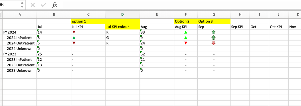
Samples attached in attachement:
- Mark as New
- Bookmark
- Subscribe
- Mute
- Subscribe to RSS Feed
- Permalink
- Report Inappropriate Content
Of course there is workaround and it is super simple. For this I normally disable "Keep source format" and use fully excel formatting for everything as it gives you full control how that table needs to look like.
Create additional columns in Qlik Sense and output your conditional values in them (values which you can use in excel to create very simple excel conditional formatting). For example:
If("your complex expression" <x,'R',If("your complex expression" <y,'A','G'))
Bring those extra columns to your NPritning template and put them in hidden columns
That way you will have column in your excel table which will have logic to provide you details how to apply conditional format (say: R-red,A-amber, G-green). Then in excel you use simple conditional formatting based on those values. Obviously using that logic you can build your conditional formatting as complex as it needs be in Qlik and at the same time as simple as it gets in excel.
For arrows I noramlly use:
- ▲▼ characters and output them as text and colour based on the same principle,
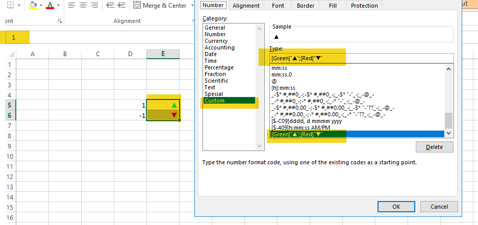
- or I just use 1 and -1 as output and I use excel number format to achieve conditional colours:
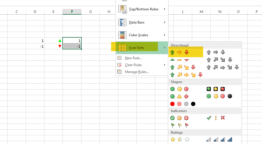
- as another alternative for arrows you can again use 1 and -1 as output and use icon sets for visual representation:
As you can see there are many ways of achieving this.
cheers
- Mark as New
- Bookmark
- Subscribe
- Mute
- Subscribe to RSS Feed
- Permalink
- Report Inappropriate Content
Hello Lech,
Thank you for providing the solution. However, for the up and down arrows, I need to do a comparison between the current year vs previous year values, and this would be for all 12 months. Should the conditional formatting be applied column wise or row wise and for all 12 months to get the colors for indicators? Please find the attached file.
- Mark as New
- Bookmark
- Subscribe
- Mute
- Subscribe to RSS Feed
- Permalink
- Report Inappropriate Content
Sorry @analyticsuser - I am not sure what the actual problem is.
- options which I provided you with are based on Qlik data so if you were already able to do it in Qlik you can easily do it in Excel
- for this you could either replace▲ and ▼ with 1 and -1 directly in Qlik and in NPrinting use formats as I explained
- or for each month you could create one more column in Qlik Sense telling you for each row what the colour of arrow should be for each month and then you can bring that to excel and use conditional formatting
Samples attached in attachement:
- Mark as New
- Bookmark
- Subscribe
- Mute
- Subscribe to RSS Feed
- Permalink
- Report Inappropriate Content
Hi Lech,
Thank you for the multiple options. Option 1 worked, but if I have to hide the column containing color of the arrow, I'll have to hide it for each month x 12 months. Also, I have other objects in the template which were getting affected. But Option 1 does work.
I tried option 2, by changing the ▲ and ▼ to 1,-1 in Qlik Sense and setting to 'Number' format and in Excel used the custom option from Format cells and assigned colors along with arrow icons. finally, was able to achieve the desired outcome. Thanks again for the solutions and detailed explanation. Definitely learnt new way of doing things in Qlik and Excel.


