Unlock a world of possibilities! Login now and discover the exclusive benefits awaiting you.
- Qlik Community
- :
- Forums
- :
- Analytics
- :
- New to Qlik Analytics
- :
- Re: how to setup the lines colors in line chart?
- Subscribe to RSS Feed
- Mark Topic as New
- Mark Topic as Read
- Float this Topic for Current User
- Bookmark
- Subscribe
- Mute
- Printer Friendly Page
- Mark as New
- Bookmark
- Subscribe
- Mute
- Subscribe to RSS Feed
- Permalink
- Report Inappropriate Content
how to setup the lines colors in line chart?
Hi ,
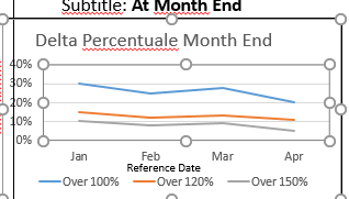
In Below chart we have created three measures in line chart.i need setup the line colors like
over100% ,measure is blue
over120% ,measure is orange
over150% ,measure is grey. and also subtitle and inside chart title"Delta Percentuale Month End".please help me on this
Thanks
Daisy
- Mark as New
- Bookmark
- Subscribe
- Mute
- Subscribe to RSS Feed
- Permalink
- Report Inappropriate Content
Hi Daisy,
From the looks of your visualisation the percentage categories are coming from another dimension flagging if the item measured falls into one of the 3 categories. If that's the case then you can colour by expression with a pick match. This is assuming you're using one measure with 2 dimensions of [Reference Date] and [% Category] to split your measure.
Go to the line chart properties - colors and legend. Under colors, untick the option to give you access to the drop down menu. Choose color by expression. In there you can add a pick match using your columns. This is an example so you'll just need to add the correct column name.
pick(match([% Category], 'Over 100%', 'Over 120%', 'Over 150%'), '#4287f5', '#f5b042', '#9e9d9d')
The pick match functions will choose the HEX colour based on the position of the category.
Regards
Anthony
- Mark as New
- Bookmark
- Subscribe
- Mute
- Subscribe to RSS Feed
- Permalink
- Report Inappropriate Content
Hi Anthony,
I am using date column as a dimension and write the three different expressions and given label names over100%,over210% and over150%.I need assign blue color for measure 1,orange for measure 2 and grey measure 3.
actually it is possible using master items. But i have total 8 charts and each chart 3 exp total 24 master measure need to be create. That is difficult.
is there any other way to assign those colors .
Thanks
daisy
- Mark as New
- Bookmark
- Subscribe
- Mute
- Subscribe to RSS Feed
- Permalink
- Report Inappropriate Content
That does sound like a lot of master measures.
I don't know what your data looks like but the easiest way to colour your measures will be to create a column that is prepopulated with the categories. If you can achieve this in your source data or in the load script then you can create this as a master dimension. This dimension can be coloured with your blue orange and grey and use it across your visualisations using consistent colouring.
If you shared the syntax of the measure you're creating we might be able to come up with the calculation required to get this into your source data.
