Unlock a world of possibilities! Login now and discover the exclusive benefits awaiting you.
- Qlik Community
- :
- Forums
- :
- Analytics
- :
- New to Qlik Analytics
- :
- Re: Histogram x-axis display
Options
- Subscribe to RSS Feed
- Mark Topic as New
- Mark Topic as Read
- Float this Topic for Current User
- Bookmark
- Subscribe
- Mute
- Printer Friendly Page
Turn on suggestions
Auto-suggest helps you quickly narrow down your search results by suggesting possible matches as you type.
Showing results for
Creator III
2023-01-30
11:07 PM
- Mark as New
- Bookmark
- Subscribe
- Mute
- Subscribe to RSS Feed
- Permalink
- Report Inappropriate Content
Histogram x-axis display
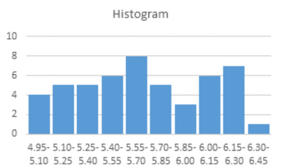
I want to create graphs (histograms and heatmaps) that specify the range of the x-axis, like the attached image.
Do you know what to do?
For example:
x-axis: 4.95<=x <=5.10, 5.10<=x<=5.25, .....6.30<=x<=6.45, 6.45<=x
Labels (11)
Labels
- Subscribe by Topic:
-
Chart
-
Data Load Editor
-
Developers
-
dimension
-
expression
-
filter
-
General Question
-
Script
-
Set Analysis
-
Variables
-
Visualization
513 Views
1 Solution
Accepted Solutions
Champion III
2023-01-31
01:33 AM
- Mark as New
- Bookmark
- Subscribe
- Mute
- Subscribe to RSS Feed
- Permalink
- Report Inappropriate Content
the Class() function can help here as well
=class(fieldname, 0.15 )
refer more below
Vineeth Pujari
If a post helps to resolve your issue, please accept it as a Solution.
If a post helps to resolve your issue, please accept it as a Solution.
2 Replies
MVP
2023-01-30
11:10 PM
- Mark as New
- Bookmark
- Subscribe
- Mute
- Subscribe to RSS Feed
- Permalink
- Report Inappropriate Content
You could use the interval match function and map the values according to your desired interval
Champion III
2023-01-31
01:33 AM
- Mark as New
- Bookmark
- Subscribe
- Mute
- Subscribe to RSS Feed
- Permalink
- Report Inappropriate Content
the Class() function can help here as well
=class(fieldname, 0.15 )
refer more below
Vineeth Pujari
If a post helps to resolve your issue, please accept it as a Solution.
If a post helps to resolve your issue, please accept it as a Solution.
Community Browser
