Unlock a world of possibilities! Login now and discover the exclusive benefits awaiting you.
- Qlik Community
- :
- Forums
- :
- Analytics
- :
- New to Qlik Analytics
- :
- Re: Create a 4 color quadrant chart
- Subscribe to RSS Feed
- Mark Topic as New
- Mark Topic as Read
- Float this Topic for Current User
- Bookmark
- Subscribe
- Mute
- Printer Friendly Page
- Mark as New
- Bookmark
- Subscribe
- Mute
- Subscribe to RSS Feed
- Permalink
- Report Inappropriate Content
Create a 4 color quadrant chart
Hi All,
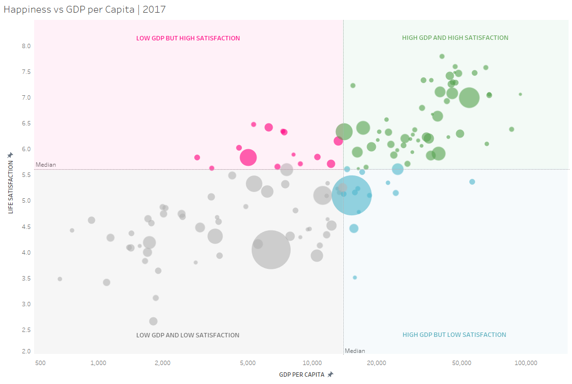
I want to create a four color quadrant chart in qliksense with different color in each quadrant and labels. The below chart is created in Tableau, is there any way this can be replicated in QlikSense?

- Mark as New
- Bookmark
- Subscribe
- Mute
- Subscribe to RSS Feed
- Permalink
- Report Inappropriate Content
The background colouring is not possilbe in Qlik's scatterplot I believe. But you should be able to colour the bubbles
For dimension use, [GDP per capita]&'-'&[Life satisfaction], and remove the labels.
The two measures should be only([GDP per capita]) and only([Life satisfaction])
The size of the bubbles (third measure) should be whatever quantity you are trying to measure.
Under Colout choose custom, and colour by measure. Then you can build the bubble similar to below (but with some extra conditions.)
Try adding reference lines to compensate for the lack of background colours.
If(only([GDP per capita])<$(=Median([GDP per capita])), rgb(200,255,255), rgb(20,20,20))
(You might want to use a weighted median here? I am not sure what the best way to compute that is.)
Please like and mark my answer as a solution, if it resolved your issue.
Senior Analytics Consultant, Atea Norge
- Mark as New
- Bookmark
- Subscribe
- Mute
- Subscribe to RSS Feed
- Permalink
- Report Inappropriate Content
Hi Røse,
Thank you so much for your response. I tried to write that condition in the reference line expression (Addon > X - axis reference lines > reference line expression =If(only([Qualitative Impact Rank])<$(=Median([Qualitative Impact Rank])), rgb(200,255,255), rgb(20,20,20))
It removed the Y axis reference line.
Will this formula color give one color till 50% and the other color for the next 50%? Please let me know if I'm writing it under the wrong area or any mistake in my formula?

- Mark as New
- Bookmark
- Subscribe
- Mute
- Subscribe to RSS Feed
- Permalink
- Report Inappropriate Content
Great effort @E_Røse, I just wanted to add that the Tableau method is kind of a cheat as its tied to an area of the chart, rather than a specific data point. So, if the data point were to change, the annotation would remain fixed, so not attempting this is probably the better way to go here.
Steve