Unlock a world of possibilities! Login now and discover the exclusive benefits awaiting you.
- Qlik Community
- :
- Forums
- :
- Analytics
- :
- New to Qlik Analytics
- :
- Continuous Scale on x-axis is ugly
- Subscribe to RSS Feed
- Mark Topic as New
- Mark Topic as Read
- Float this Topic for Current User
- Bookmark
- Subscribe
- Mute
- Printer Friendly Page
- Mark as New
- Bookmark
- Subscribe
- Mute
- Subscribe to RSS Feed
- Permalink
- Report Inappropriate Content
Continuous Scale on x-axis is ugly
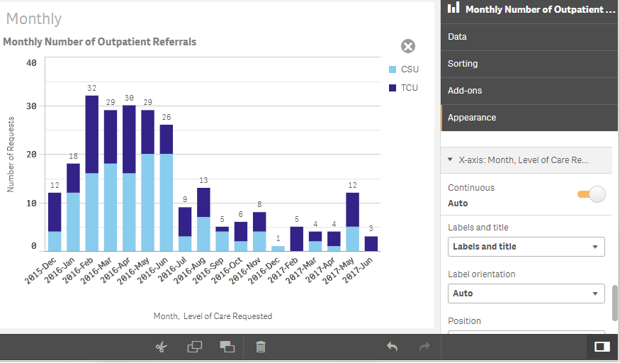
The appearance of the graph below is close to my target....
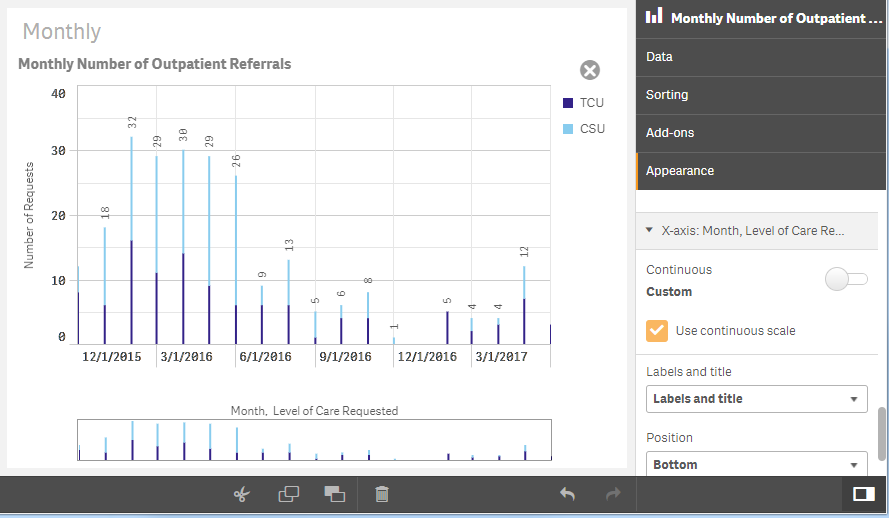
BUT... the X axis is supposed to be continuous, and isn't. It is missing the zero value that is calculated for January 2017. Alternatively, the ugly graph below shows what happens when I select "use continuous scale". My January zero shows up as it should, but the bars are skinny to represent a single day of the month.
I have a derived field in my data load : ...Dual(Month($1), monthstart($1)) AS [_YearMonth] Tagged ('$axis', '$yearmonth', '$simplified', '$hidden')...
I think I need to expand the values to extend the entire span of the month, but I don't know an elegant way to do this. Does anyone know the proper method to fix this?
Thanks.
- Mark as New
- Bookmark
- Subscribe
- Mute
- Subscribe to RSS Feed
- Permalink
- Report Inappropriate Content
Did you find any solution of the issue above, Please let us know as well.