Unlock a world of possibilities! Login now and discover the exclusive benefits awaiting you.
- Qlik Community
- :
- Forums
- :
- Analytics
- :
- New to Qlik Analytics
- :
- Combo chart wouldn't display the correct range on ...
- Subscribe to RSS Feed
- Mark Topic as New
- Mark Topic as Read
- Float this Topic for Current User
- Bookmark
- Subscribe
- Mute
- Printer Friendly Page
- Mark as New
- Bookmark
- Subscribe
- Mute
- Subscribe to RSS Feed
- Permalink
- Report Inappropriate Content
Combo chart wouldn't display the correct range on primary axis
Hi, I am working on Qlik Sense Desktop and currently developing a Ad-Hoc combo chart with VizLib combo chart extension and users can select the dimension(s) and measure(s) to be displayed on the combo chart. I have 2 filter panes, one is for dimension and one is for measure. In order to filter out unselected dimension(s) or measure(s), I used calculated conditions in the data section. I have both integer values (in millions) and percentage values for the measures, thus, I used the primary y-axis for the integer values and secondary y-axis for the percentage values. The combo chart displays the bars and lines correctly when I have both measures from primary and secondary axis selected or just measures from the secondary axis (which are the percentage values). When I only have measures from the primary axis selected, weirdly, the values in the primary axis alongside the lines or bars will be displayed too high and are not visible within the chart. The range of the values on the primary axis are all off, it will only work if I set the Min/Max values manually but its not practical. I set all the formatting to auto for all the measures and the problem still persist. Is there a way to make the chart's axis display the values range dynamically or is there some settings that I missed from VizLib combo chart? Any help would be greatly appreciated.
- Mark as New
- Bookmark
- Subscribe
- Mute
- Subscribe to RSS Feed
- Permalink
- Report Inappropriate Content
Do you have screenshot for that where you have drastically high between selection vs non-selection?
- Mark as New
- Bookmark
- Subscribe
- Mute
- Subscribe to RSS Feed
- Permalink
- Report Inappropriate Content
Hi @Anil_Babu_Samineni, here are the screenshots
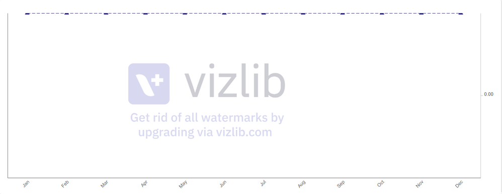
This is what it looks like if I selected only measure(s) that is set to display on primary axis. The values are not visible in the axis as well as the bars or lines. The axis range is set to auto.
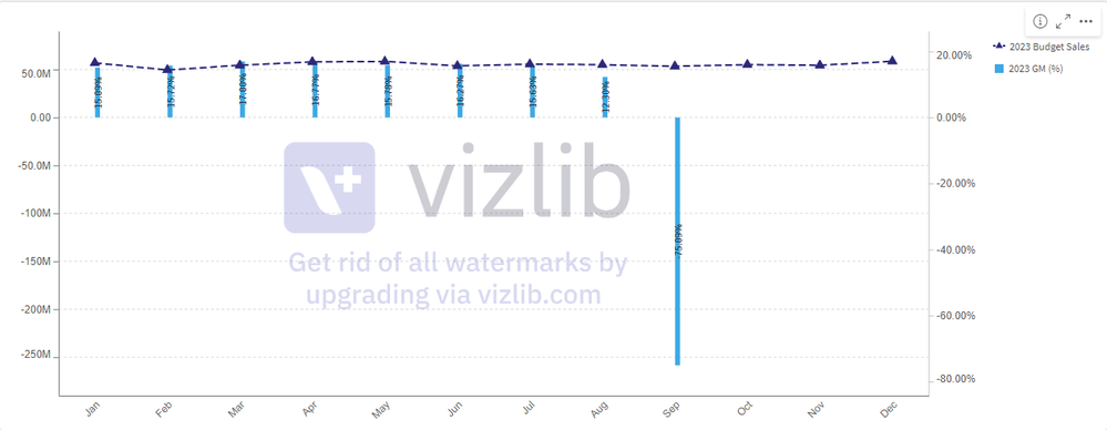
If I selected measures that is set to display on both primary and secondary axis, the chart is fine.
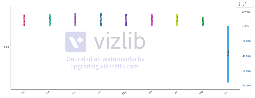
Weirdly if I only selected measure(s) that is set to display on the secondary axis, the chart looks fine.
- Mark as New
- Bookmark
- Subscribe
- Mute
- Subscribe to RSS Feed
- Permalink
- Report Inappropriate Content
If you can read the document Combo chart | Qlik Sense on Windows Help, you will understand the requirement for Combo chart, It required one dimension at least to start visual.
Better you can add one conditional error handling to select one dimension at least.
- Mark as New
- Bookmark
- Subscribe
- Mute
- Subscribe to RSS Feed
- Permalink
- Report Inappropriate Content
Yes, I have one dimension (Month) selected as you can see the months in the x-axis.
- Mark as New
- Bookmark
- Subscribe
- Mute
- Subscribe to RSS Feed
- Permalink
- Report Inappropriate Content
But that shows secondary axis what i can preview from screenshot? Do you have sample file to test with?
- Mark as New
- Bookmark
- Subscribe
- Mute
- Subscribe to RSS Feed
- Permalink
- Report Inappropriate Content
So sorry for the late reply. Here is a sample of the combo chart, you can try selecting one dimension and measure(s) from the filter pane. If one dimension and one measure that is set to display on the primary y-axis are selected, the chart won't show but if one measure set to display on the secondary y-axis is selected, the chart show just fine. The primary axis only work if a measure from the secondary axis is selected as well which is not what I wanted. I realized setting the minimum value manually on the primary y-axis in the 'Appearance' will work but it's not what I wanted as well. Really not sure where did I missed here.


