Unlock a world of possibilities! Login now and discover the exclusive benefits awaiting you.
- Qlik Community
- :
- Forums
- :
- Analytics
- :
- App Development
- :
- Re: Line chart y-axis scaling
- Subscribe to RSS Feed
- Mark Topic as New
- Mark Topic as Read
- Float this Topic for Current User
- Bookmark
- Subscribe
- Mute
- Printer Friendly Page
- Mark as New
- Bookmark
- Subscribe
- Mute
- Subscribe to RSS Feed
- Permalink
- Report Inappropriate Content
Line chart y-axis scaling
Hi All,
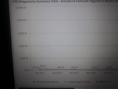
i have created 5 measures among that few of the lines having less data in hundreads like 200,150 ect and few of lines having high data like 5k,4k etc.
Due to high data for few lines, y-axis scale is ranging like 2000,4000 etcs.as few of the lines having less data those lines are clubing and not visisble properly.
How can i range scale in hundreads like 500,1000 etc.so that all the lines will appear.
I tried under properties to set the custom range min to 0,max to 6000 and min/max as 0 to 6000 but scaling is not happening.
Thanks in advance...
- Tags:
- Y axis scaling range
- Mark as New
- Bookmark
- Subscribe
- Mute
- Subscribe to RSS Feed
- Permalink
- Report Inappropriate Content
That chart is showing a max value on the Y axis as 6000 already. What happens if you set the max to 1000? That should make the outlier appear off the top of the chart, denoted with a little arrow.
The issue with fixing axis values is that when you make selections your chart will not respond to those.
You may be better off having separate charts, so each can have it's own scale?
Steve
- Mark as New
- Bookmark
- Subscribe
- Mute
- Subscribe to RSS Feed
- Permalink
- Report Inappropriate Content
Hi Steve,
Thanks for the reply.
Even if i make max value to 10000 or 20000, no use bcz axis scale will increase but scale division is not happening and few of lines are clubing not visiible properly.
I cannot make separate charts for each measure bcz its requirement to have all the 5 measures in one chart.
Is there any way to to split yaxis scaling to 0,500,1000 like that.

