Unlock a world of possibilities! Login now and discover the exclusive benefits awaiting you.
- Qlik Community
- :
- Forums
- :
- Analytics
- :
- App Development
- :
- Context aware mashups, detecting if running on mob...
- Subscribe to RSS Feed
- Mark Topic as New
- Mark Topic as Read
- Float this Topic for Current User
- Bookmark
- Subscribe
- Mute
- Printer Friendly Page
- Mark as New
- Bookmark
- Subscribe
- Mute
- Subscribe to RSS Feed
- Permalink
- Report Inappropriate Content
Context aware mashups, detecting if running on mobile devices or desktop
Summary:
The article explains how to develop context aware mashups, meaning how it is possible for developers to let their mashups detect if they are running within a mobile device or desktop browser instances. Once the context is detected the application will seamlessly refresh the content and displays what is intended per context i.e. different content, resources and layouts will be used for each mode. Mobiles provide a limited real estate while desktops provide more resources, thus it is important to manage the content based on these factors.
Description:
The default mashups generated in Qlik Sense Dev-Hub provides the minimum skeleton needed for a web application to be built with support for Qlik Sense content. Yet sometimes mashups end up being loaded in different environments and at times it is important to control what to show in what environment given some criteria, such as, are we running on a mobile device with a small screen or are we running on a desktop with a large display. From a user experience perspective, it is important to manage the content given that mobile device resources are not the same as of desktops. Thus we need to know what to show and not when the context changes.
In addition to the above, this article attempts to shed some light for beginners on how to load different dependencies using require.js. We will see how the syntax looks like especially if the JavaScript files are not placed in the mashup root folder, some people may find it confusing how the path to their resources should look like.
The attached code and snippets touch base on the concept of being modular and how modules communicate with each other when working with mashups. It is meant to be straight forward and works in the same way as in any standard JavaScript application.
Note that the attached code samples and snippets come with code comments in case something is not clear enough in this article.
The code has been intentionally developed in the form of MVC design pattern “as a snippet” and not as a concrete implementation, so you are most welcome to introduce your own thoughts here. For the sake of learning, code separation was done to serve the following:
- Demo how to load dependencies using our RequireJS. The one found in the auto-generated JS file in the Dev-Hub.
- Ease of readability for developers how like to keep things tidy.
- Separation of code in a style close to principles found in Object Oriented.
- This code is subject to more tuning thus this serves as a proof of concept only.
- It may also set the foundations for building MVC driven implementations while using other flavors of JavaScript.
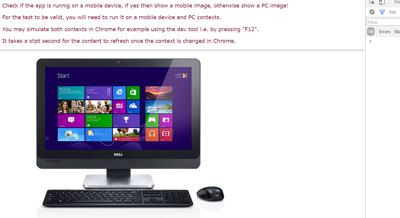
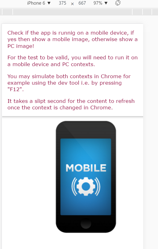
The images below are from our mashup rendered in desktop and mobile modes. As you see, when the context is that of a desktop, an image of a PC is shown while on a mobile, an image of a mobile device is show. In both cases the application auto-detects and
displays the images matching the current context.
Kindly note that the mashup was developed in Qlik Sense 3.1.2 desktop variant.
Desktop use case image
Mobile use case image
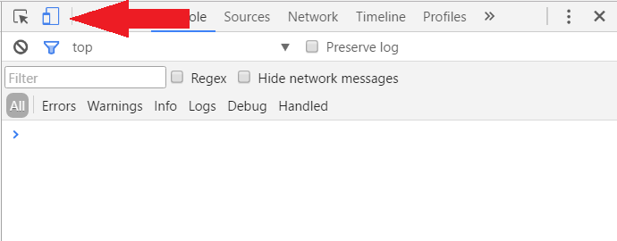
Icon in Chrome used to switch between mobile and desktop image
Solution:
Got to Qlik Sense Dev-Hub and create a new mashup, in this case I called it MobileVsDesktop.
In the MobileVsDesktop.js and particularly in the require statement where "js/qlik" is used, in this part of the code we will add three dependencies. They are MobileDetector, ImageFactory and Main. Basically these are three JavaScript files. We could have loaded them in MobileVsDesktop.html by putting them in the <head> section but I chose not to do so, simply to demo how dependencies can be loaded from within the auto-generated JS file in Dev-Hub. The code should look something like this:
require(
["js/qlik","./js/model/MobileDetector.js","./js/view/ImageFactory.js","./js/controller/Main.js"],
function ( qlik, MobileDetector, ImageFactory, Main) {
…
…
Our dependencies are highlight above in the red color, and as you see from the path, they are residing inside a subfolder called “js”, this folder is sitting in the root of the mashup folder.
The arguments in the function call highlighted in green are not necessary in this case, they are passed here to the anonymous callback function for the sake of demoing how you can pass on your dependencies into your application context. The obvious example here is the use of “qlik” object, later in the code you can use it for opening a qvf file for example and doing other calls specific to “qlik”object.
Inside the “js” subfolder there are three subfolders, they are model, view and controller. In each folder there is a JavaScript file that does a specific task and communicate with the other JavaScript code to perform the remoaning task or tasks. In this case we want to detect the context, if mobile then load the corresponding content if not then load something else and then refresh the view. Hence our main files for this implementation are:
- MobileDetector.js: Responsible for detecting if the application is running on a mobile device or not.
- ImageFactory.js: Creates images for a given context.
- Main.js: Used for initializing couple objects such as the MobileDetector and ImageFactory, also to create the images.
The context detection task is done in MobileDetector.js and the code for that is:
var MobileDetector = {
// Returns true if Android mobile, otherwise null
Android: function() {
return navigator.userAgent.match(/Android/i);
},
// Returns true if BlackBerry mobile, otherwise null
BlackBerry: function() {
return navigator.userAgent.match(/BlackBerry/i);
},
// Returns true if iOS mobile, otherwise null
iOS: function() {
return navigator.userAgent.match(/iPhone|iPad|iPod/i);
},
// Returns true if Opera mobile, otherwise null
Opera: function() {
return navigator.userAgent.match(/Opera Mini/i);
},
// Returns true if Windos mobile, otherwise null
Windows: function() {
return navigator.userAgent.match(/IEMobile/i);
},
// Returns true otherwise null
isMobile: function() {
return (this.Android() || this.BlackBerry() || this.iOS() || this.Opera() || this.Windows());
}
};
In this implementation there are no callback functions invoked when the context changes, it is a very linear approach. Meaning when the application is loaded it then reads the browser mode and decide what resources to grab, after that the view is refreshed. There is nothing special about the code detecting the browser mode we are dealing with. This snippet can be found in the open source space or JavaScript forums.
Once the above steps are completed then Main.js in the end will do a JavaScript refresh call of the browser. If you look inside Main.js the sequence of calls is:
- Initializing the image factory:
ImageFactory.init(MobileDetector.isMobile()); - Creates the image, will be based on the context, if mobile otherwise desktop / PC etc:
ImageFactory.createImage(null); /* Passing null value as image source just to keep things simple for the time being!*/ - Refresh content when the window size has changed. If this part is removed then the user needs to press "F5" to see the final result:
$(window).resize(function(){window.location.reload();});
The full project and its resources are attached to this article, kindly feel free to amend the content as you see appropriate. Note that the attached code samples and snippets come with code comments in case something is not clear in this article.