Unlock a world of possibilities! Login now and discover the exclusive benefits awaiting you.
- Subscribe to RSS Feed
- Mark as New
- Mark as Read
- Bookmark
- Subscribe
- Printer Friendly Page
- Report Inappropriate Content
In our Qlik Demo Team we are trying to create mashups that are suitable for all devices. This is why we created another version of a Horizontal Bar Chart that we use almost exclusively. This has various options like setting the bar height, color, text color, text hover color etc. It can also change from regular Horizontal Bar Chart to Horizontal Stacked Bar Chart, Grouped Bar Chart or a Lollipop.
All of the UI/UX guidance is coming from my colleague Michael Anthony | Qlik
Installation
- Download Zip file from Branch: http://branch.qlik.com/#!/project/57161998713777448667b063
- Desktop - Unzip at the extension folder (C:\Users<user>\Documents\Qlik\Sense\Extensions\SenseUIBarChart)
- Server - Upload the zip file
Settings
Dimension and Measures
- Set 1 dimension for the Labels and
- up to 5 Measures for Grouped, Stacked Bar or Lollipop
General Settings
- Text Color
- Font Size
Bar
- Height
- Comma separated colors for the stacked bar fill color
- Fill color when you mouse over
- Text Color for each bar
- Text Color when you mouse over
- Border Weight
- Border Spacing
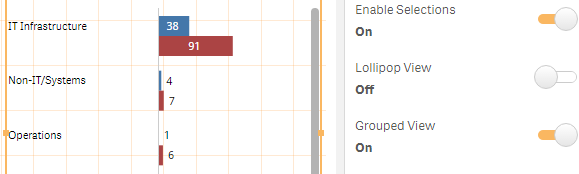
- Enable Selections
- Toggle between Stacked and Grouped Bar Chart
Tooltip
- Enable Tooltip
- Show Dimension in the Tooltip
X-Axis
- Show X-Axis
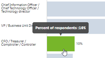
- Show Legend (check Stacked Bar image below)
Y-Axis
- Show Y-Axis
- Label Width (Usually 150px, even for the smallest device )
- Number of visible characters, if you want to truncate your labels.
Even though we still have a long way to go to make this perfect, features are always welcome!
YIANNI
Files
You must be a registered user to add a comment. If you've already registered, sign in. Otherwise, register and sign in.