Unlock a world of possibilities! Login now and discover the exclusive benefits awaiting you.
- Qlik Community
- :
- Discover
- :
- Blogs
- :
- Product
- :
- Design
- :
- Line Chart tricks: Displaying what's important
- Subscribe to RSS Feed
- Mark as New
- Mark as Read
- Bookmark
- Subscribe
- Printer Friendly Page
- Report Inappropriate Content
Continuing the line charts topic I've started a few weeks ago, let see how to adjust a line chart to help us to see what we want to.
Displaying what is important
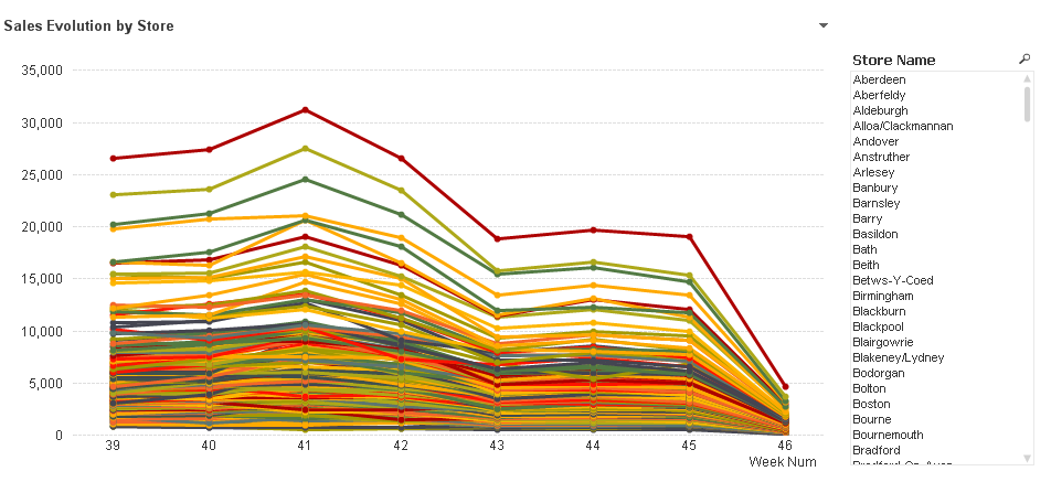
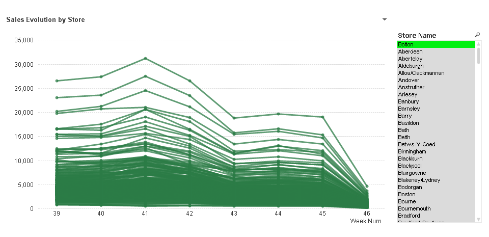
In the example below I want to display Sales evolution by store over time, but it happens that this company has too many stores (lines) to easily identify them individually in the chart.
I still can get some value out of this chart; global trend is still visible. Seems like sales are decreasing over time, but details are lost in the color mess.
As color is not helping me to better decode this chart, I will unify line colors.
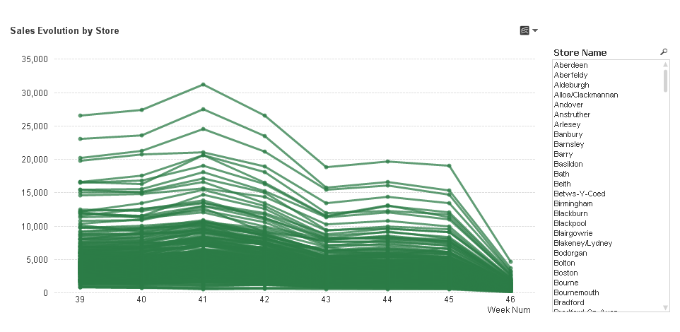
Now I can see much better my company’s trend, sales amount is decreasing, based on the overlap of individual store behaviors but details are still hidden in green.
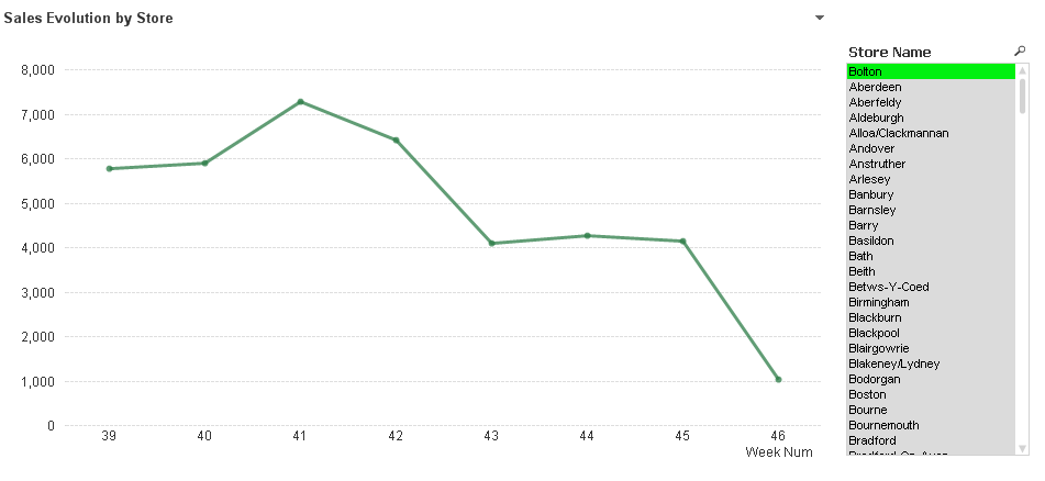
Selecting a store I could isolate it and get its details. This is great and fast, but it avoids me from seeing the selected store in context. What I would like to see is the sales evolution of particular store vs all others.
The next step will be to avoid the chart to be filtered out when a store name is selected, to do so I will include set analysis in my expression.
Original expression: sum(Sales)
New expression: sum({<Store=, [Store Name]=>} Sales)
By doing that my chart won’t be filtered by Store or Store Name selections
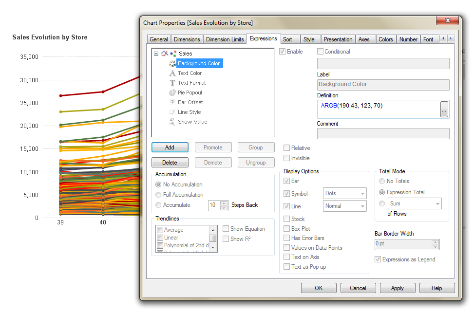
Now, what I need is to highlight the store within the chart. Again I will use the Background Color properties for the expression to achieve that.
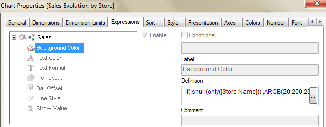
if(isnull(only([Store Name])) ,ARGB(20,200,200,200),ARGB(190,43, 123, 70))
This expression will gray out all non-selected stores and highlight our selection(s).
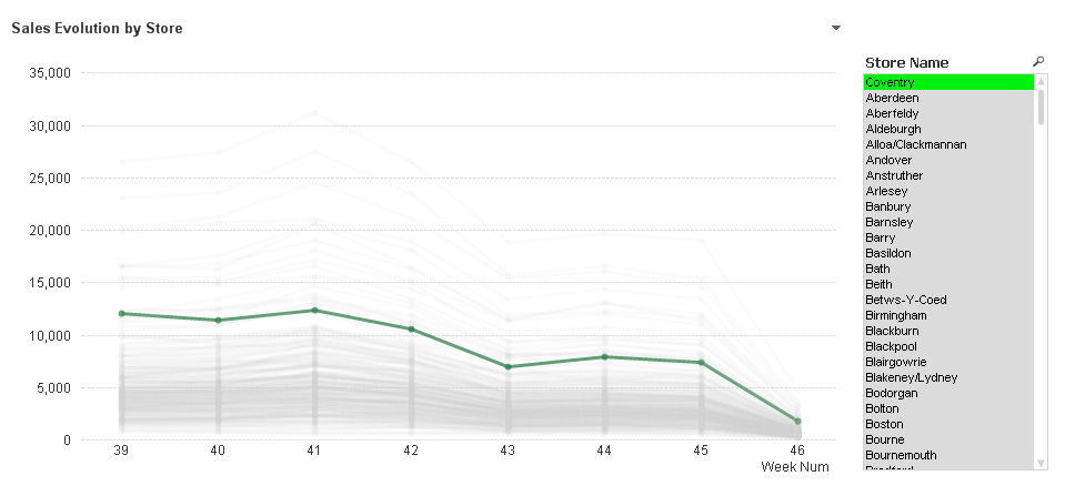
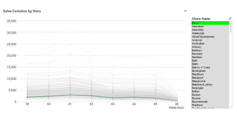
With this new chart, my selections will help me to see store details and to keep selected store(s) in context. I can see the global trend and compare it with any store just by searching and selecting.
Extra tip: If you look carefully at the two charts above, you may notice a slightly color difference in the second image dark green line, this is because the green line is under several semi-transparent gray lines making it look little bit different.
Sorting the dimension will help you to prevent this. In this case I’m sorting Store Name by sales amount using the following expression.
aggr(sum(Sales),[Store Name])
You can see this chart working as part of Retailer EPOS Data Analysis demo.
Line charts beyond your imagination
These are some creative and really cool non-standard uses of line charts I have seen lately:
Parallel Co-Ordinates Chart
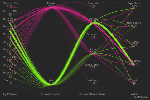
This chart variation was firstly introduced by Alistair Eaves some time ago. The chart is great for showing data paths between various dimensions; letting people to understand something so hard to see as flows dynamics in the data. Check out the demo
Dynamic Network Flow Charts
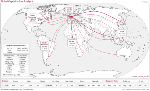
If you are a frequent flyer you will probably have read all magazines in your front pocket. One of my favorites readings on board are these maps with all the routes airlines operate through the world. Matthew Crowther stretched out QlikView line chart object to display information in the same way but keeping the QV soul (association) in it. If you want to know how to do it, you should read: New Qlikview Chart Type: Dynamic Network Flow Charts | QVDesign
The Associated Curve Chart
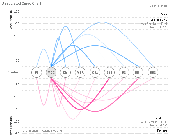
Based on the same principles but pushing things a little bit more Matthew presented this new chart, he called Associated Curve Chart. You can check it out at Matthew's blog
Enjoy Qliking!
AMZ
- « Previous
-
- 1
- 2
- 3
- Next »
You must be a registered user to add a comment. If you've already registered, sign in. Otherwise, register and sign in.