Unlock a world of possibilities! Login now and discover the exclusive benefits awaiting you.
- Subscribe to RSS Feed
- Mark as New
- Mark as Read
- Bookmark
- Subscribe
- Printer Friendly Page
- Report Inappropriate Content
What is Time Series Analysis?
Time series analysis helps us understand and learn about the changes in our data over time. It involves collecting data points at consistent intervals over a set period of time, and using statistical methods to identify trends, patterns, and relationships in the data.
Time series analysis can also be used for forecasting future data based on historical trends and patterns as we will see later in this post.

Where can it be used?
Time series is used in a variety of industries, including finance, economics, retail, and meteorology, to help understand trends/patterns or make predictions and forecasts based on historical data, or simply to develop insights into how things change over time.
For instance Retailers can use time series data in a number of ways to support their decision making and improve business performance, including:
- Sales forecasting to project sales trends in the future and predict demand, plan for inventory, and optimize supply chain to avoid overstocking or shortages.
- Customer behavior analysis to understand how their customers’ habits change over time and identify spending habits and purchasing patterns which can help optimize marketing targeting efforts.
- Pricing analysis to understand how prices change over time affect sales and customer behavior.
- Inventory management to identify demand for specific products.
Ways to visualize Time Series data:
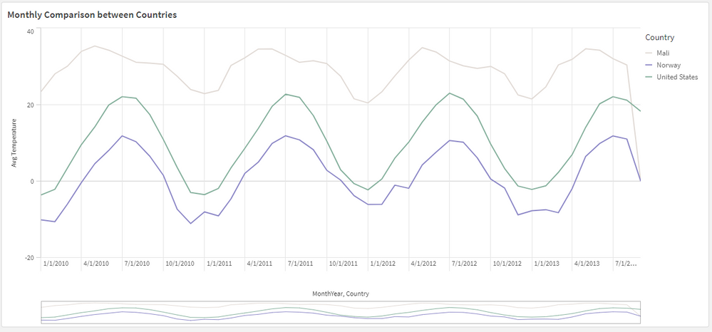
When it comes to looking at time-based data, we usually tend to use a Line Chart as it offers a simple and quick way to view changes related to a measure (Y-axis) over the course of time (X-axis).

Other charts however can help visualize the information better, here are some examples:
- A heatmap chart as seen on Github’s commit history shows a darker colored squares when more commits are made during a day and lighter color for less commits allowing us to easily notice the more productive days.
- A simple slope chart can be used when the time interval is limited and we want to see direct transitions over time, for instance comparing total sales data by industry between two years. Check out my other post to learn more about how this slope chart was created using Qlik's open source libraries.
Time Series Forecasting in Qlik Sense
Time series forecasting allows us to predict where a particular metric is going to be in the future based on historical data.
Qlik Sense makes it easy to do this on the Line chart.
Let’s build a chart with forecast that looks at average temperatures in the US (The QVF for this example is downloadable at the end of the post)
- Create a filter pane and select United States to limit data to one country.
- Create a Line Chart using:
- Dimension: MonthYear
- Measure: Sum(AverageTemperature)
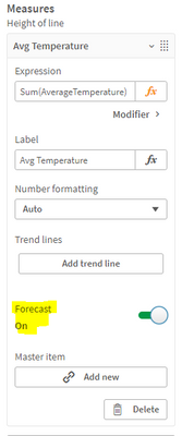
- Expand the Measure field and turn ON the “Forecast” setting
- Move to the Dimension field and you can see that 2 new settings have appeared:
- Forecast steps: the number of data points to be forecasted (we choose 12). Keep in mind that the further we go out in time, the broader the confidence becomes due to the increased uncertainty.
- Step size: the granularity of the forecast steps (we choose Month to forecast for the upcoming year)
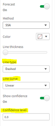
- You can also change the method used for the forecast (SSA or OLS) and the appearance of the trend line
- Confidence level describes the probabilistic range of the forecast and can be adjusted from 0 to 1. If 0.9 is selected, that means that 90% of the time, we will be within the blue range.
Using Insight Advisor:
Qlik has recently added the “Trend with Forecast” analysis type to Insight advisor. You can simply use the suggested measure and dimension and generate the chart:

To learn more about time series forecasting, check out this help article.
Thank you!
You must be a registered user to add a comment. If you've already registered, sign in. Otherwise, register and sign in.


