Unlock a world of possibilities! Login now and discover the exclusive benefits awaiting you.
- Subscribe to RSS Feed
- Mark as New
- Mark as Read
- Bookmark
- Subscribe
- Printer Friendly Page
- Report Inappropriate Content
When you make a chart, you should start by asking yourself “What do I want to show?” The answer is usually Sales, Quantity or some other number. This is your Measure. In QlikView we have traditionally called this an “Expression”, but "Measure" is really the correct word. (There are expressions that are not measures, e.g. expressions used as labels, or as sort order definitions).
The second question you should ask yourself is “How many times should this be calculated? Per what do I want to show this measure?” The answer could be once per Month, per Customer, per Supplier or something similar. This is your Dimension.
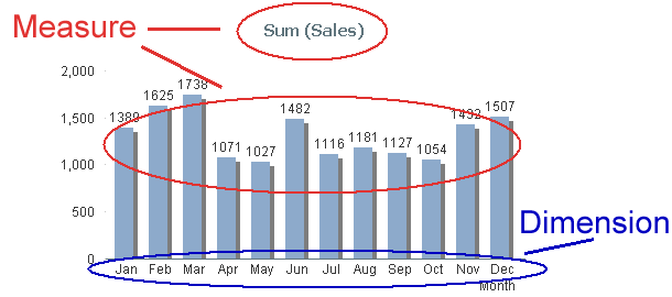
In the bar chart below, you have one bar per month, and a general rule is that you always have one data point per distinct dimensional value: But depending on which visualization form you have chosen, it can be a row (in a table), a point (in a scatter chart) or a slice (in a pie chart).
Measures
A database or a QlikView app can consist of thousands or millions of records that each contains a small piece of information. A Measure is simply a calculation that can be made over multiple records in this data set. The calculation always returns one single value that summarizes all relevant records. This type of calculation is called an aggregation. There are several aggregation functions: Sum(), Count(), Min(), Max(), etc.
Examples:
- Each record contains a sales number. Then Sum(Sales) is a relevant measure that calculates the total sales value.
- Each record represents an order and “OrderID” is the key. Then Count(OrderID) is a relevant measure that calculates the number of orders.
A Measure can be used almost anywhere in QlikView: In charts, in text boxes, as label for objects, in gauges, etc. Typical measures are all KPI:s, Revenue, Number of orders, Performance, Cost, Quantity, Gross Margin, etc.
Once again: A Measure is always based on an aggregation. Always!
Dimensions
Contrary to Measures, dimensions are descriptive attributes – typically textual fields or discrete numbers. A dimension is always an array of distinct values and the measure will be calculated once per element in the array.
Example:
- The field “Customer” is used as dimension. The individual customers will then be listed and the measure will be calculated once per customer.
Typical dimensions are Customer, Product, Location, Supplier, Activity, Time, Color, Size, etc.
Like a For-Next loop
You can regard a chart like a For-Next loop: The Dimension is the loop variable; the calculations will be made once per dimensional value. So the Dimension determines how many rows/bars/points/slices the chart will have. The Measure is what is calculated in each loop.
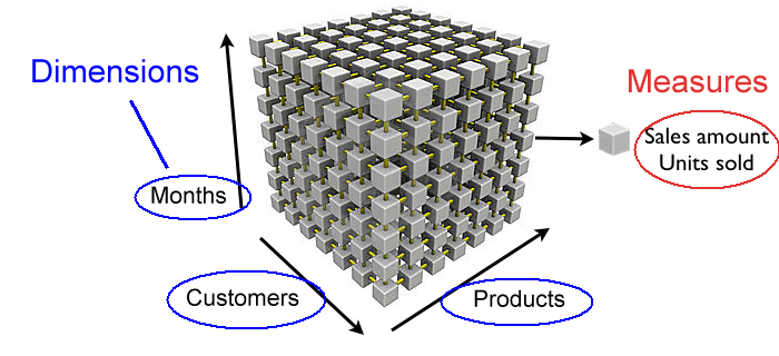
Several Dimensions
If you have two or three dimensions in a chart, the dimensional values no longer form an array, but instead a matrix or a cube, where the measures are calculated once per cell in the cube.
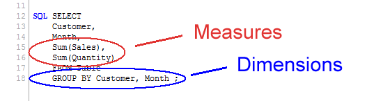
SQL
You can also compare a chart with an SQL SELECT statement. The GROUP BY symbols are the dimensions and the aggregations are the Measures.
With this, I hope that the difference between Dimensions and Measures is a little clearer.
- « Previous
-
- 1
- 2
- Next »
You must be a registered user to add a comment. If you've already registered, sign in. Otherwise, register and sign in.